Exhibition | Jean-Étienne Liotard: A Cosmopolitan Artist
Press release (12 November 2015) from the Getty:
Jean-Étienne Liotard: A Cosmopolitan Artist
J. Paul Getty Museum, Los Angeles, 20 October 2015 — 24 April 2016
Curated by Ketty Gottardo

Jean-Étienne Liotard, Portrait of Maria Frederike van Reede-Athlone at Seven Years of Age, 1755–56, pastel on vellum, 54.9 x 44.8 cm (Los Angeles: Getty Museum)
Swiss artist Jean-Étienne Liotard (1702–1789) excelled at the delicate art of pastel. His finest portraits display an astonishing realism achieved through intense observation and remarkable technical skill and feature royalty, aristocrats, and the bourgeoisie. Jean-Étienne Liotard: A Cosmopolitan Artist, comprised of pastels and drawings from the Getty Museum’s collection and two spectacular loans from a private collection, is now open and continues through April 24, 2016, at the Getty Center.
“For most of his very long career, Liotard worked as an itinerant portraitist,” says Timothy Potts, director of the J. Paul Getty Museum. “The works of art in this room testify to the artist’s numerous travels and fame as well as to his astonishing facility in the medium of pastel.”
The remarkable success of pastel in the eighteenth century was due to the high demand for portraits from the nobility and bourgeoisie. The ease and swiftness with which pastel could be used allowed for much shorter sittings that pleased artists and sitters alike. Unlike oil painting, pastel does not need to dry, so drawings could be executed quickly, with changes and corrections easily made. The Portrait of Lord Mountstuart features a young English aristocrat whom Liotard encountered during a brief stay in Geneva in the midst of his Grand Tour to Italy; Mademoiselle Jacquet was a famous singer at the Paris Opera; Jean Tronchin was among Liotard’s cultivated Swiss patrons; and the magnificent Portrait of Baroness Maria Frederike, one of the Getty’s most-beloved treasures, is probably the most famous portrait he executed in Holland.
In his Treatise on Painting (1781), Liotard recommended the use of nine tones—four light, four dark, and one medium—to build up pastel images. Colors were blended with brushes, fingers, a stump, or even his own long beard. Liotard preferred to use vellum—made from calf skin—for his support, which imitated the texture of skin in portraits. “The delicate tone of skin seen in Liotard’s Portrait of Jean Tronchin (1759) is remarkable. Liotard used the texture of the vellum, along with a fine sfumato effect, to define his rich, fleshy, and aged face,” says Ketty Gottardo, associate curator of drawings and curator of the installation.
Liotard innovated a drawing technique that reinforced his compositions with large areas of tone applied to the verso (back), which would create glowing, translucent effects on the recto (front). After drawing the basic outlines of a composition, Liotard would turn over the sheet of paper and hold it against a window or source of light in order to trace it onto the verso with a thin stick of black chalk. Then he would fill in entire areas of the verso with watercolor, chalk, or pastel which served to enhance the colors on the front.
Additional information is available at Iris: The Online Magazine of the Getty.
Exhibition | Art of the Fold: Drawings of Drapery and Costume
Press release (2 September 2015) for the exhibition now on view at the Getty:
Art of the Fold: Drawings of Drapery and Costume
The J. Paul Getty Museum, Los Angeles, 6 October 2015 — 10 January 2016
Curated by Stephanie Schrader

Louis Carrogis de Carmontelle, The Duchess of Chaulnes as a Gardener in an Allée, 1771, watercolor and gouache over black and red chalk (The J. Paul Getty Museum)
Drawn from the J. Paul Getty Museum’s renowned permanent collection, Art of the Fold: Drawings of Drapery and Costume explores how artists harnessed the expressive potential of cloth to convey meaning.
“From the fourteenth to the eighteenth centuries, the convincing depiction of voluminous folds of fabric was a standard part of artistic training and practice,” explains Timothy Potts, director of the J. Paul Getty Museum. “Focusing on the relationship between the body and clothing, artists of this period exploited drapery and costume to enhance the depiction of a figure’s emotional state and place in society. The drawings in this exhibition demonstrate the many ways in which artists employed drapery to evoke moods, shape identities, and tell stories.”
In Standing Female Saint (about 1450), from the Circle of Martin Schongauer, the abstract pattern of drapery folds generates an agitated sense of motion. Rather than outlining the body beneath it, the flowing tunic accentuates an emotional fervor typical of German fifteenth-century devotional imagery.
Drapery also played a crucial part in artists’ characterization of the human figure. In Hans Brosamer’s Study of a Pleated Skirt and Study of a Hanging Drapery (about 1500) the artist accurately depicts the tonal variations and ranges of light and shade created by folded fabric, capturing the natural flow of cloth with a refined linear quality and variegated hatchings. By isolating drapery from a human form, while at the same time making it anthropomorphic, the artist celebrates drapery as an independent subject.
In drawings of soldiers, peasants, nobles, and foreigners, clothing served as a primary indicator of social standing and class. In Jacob Jordaens’ Man Kneeling, Facing Right (about 1630) the artist applied opaque watercolor in thick layers creating angular, broken folds that animate the pose and heighten the sense of piety. Often a figure’s clothing indicates status or rank in the social hierarchy, and the flamboyant uniforms of the mercenary soldiers and the elegant attire of the upper classes convey their status.
In their depictions of costume, artists often departed from strict naturalism and relied upon their vivid imaginations. “Drawings of foreigners suggest how dress is embellished and exoticized, whereas theatrical costumes further illustrate how clothing can mask the identities of individuals represented,” says Stephanie Schrader, curator of drawings at the J. Paul Getty Museum, who organized the exhibition.
A checklist of the 38 works on view is available as a PDF file here.
Exhibition | The Luxury of Time: European Clocks and Watches
From The Met:
The Luxury of Time: European Clocks and Watches
The Metropolitan Museum of Art, New York, 16 November 2015 — 27 March 2016

Clockmaker: Ferdinand Berthoud (French, 1727–1807); Case maker: Balthazar Lieutaud (French, ca. 1720–1780, master 1749). Longcase astronomical regulator (detail), ca. 1768–70. Case: oak veneered with ebony and brass, with gilt-bronze mounts; Dial: white enamel; Movement: gilded brass and steel; Height: 90.5 in. (229.9 cm). The Metropolitan Museum of Art, New York, (1982.60.50).
Time is all around us, displayed on our phones and computers. Today, almost nobody needs to own a watch or a clock to tell the time. Access to the right time is not the luxury it once was. Yet the fascination with clocks and watches persists, and the thriving market for mechanical timekeepers is deeply aware of their history. Clocks and watches have always been about more than just telling time: they have been treasured as objects of desire and wonder, personal items imbued with value that goes beyond pure functionality. As works of art, they represent the marriage of innovation and craftsmanship.
This exhibition explores the relationship between the artistry of the exterior form of European timekeepers and the brilliantly conceived technology that they contain. Drawn from the Museum’s distinguished collection of German, French, English, and Swiss horology from the sixteenth through the nineteenth century, the extraordinary objects on view show how clocks and watches were made into lavish furniture or exquisite jewelry.
The creation of timekeepers required that clockmakers work with cabinetmakers, goldsmiths and silversmiths, enamelers, chasers and gilders, engravers, and even those working in sculpture and porcelain. These craftsmen were tasked with accommodating internal mechanisms by producing cases that, in both shape and function, adapted to timekeeping technologies. Their exteriors are often as complicated as the movements they house. Examining the dialogue between inside and out, adornment and ingenuity, The Luxury of Time
reveals the complex evolution of European clockmaking and
the central place of timekeepers in the history of decorative arts.
◊ ◊ ◊ ◊ ◊
The catalogue is scheduled for publication in February. From Yale UP:
Clare Vincent and Jan Hendrik Leopold, with Elizabeth Sullivan, European Clocks and Watches in The Metropolitan Museum of Art (New York: The Metropolitan Museum of Art, 2016), 288 pages, ISBN: 978-1588395795, $65.
 Among the world’s great technological and imaginative achievements is the invention and development of the timepiece. Examining for the first time the Metropolitan Museum’s unparalleled collection of European clocks and watches created from the early middle ages through the 19th century, this fascinating book enriches our understanding of the origins and evolution of these ingenious works. It showcases 54 extraordinary clocks, watches, and other timekeeping devices, each represented with an in-depth description and new photography showing the exterior as well as the inner mechanisms. Included are an ornate celestial timepiece that accurately predicts the trajectory of the sun, moon, and stars and a longcase clock by David Roentgen that shows the time in the ten most important cities of the day. These works, created by clockmakers, scientists, and artists in England, Germany, France, Italy, and the Netherlands, have been selected for their artistic beauty and design excellence, as well as for their sophisticated and awe-inspiring mechanics. Built upon decades of expert research, this publication is a long-overdue survey of these stunning visual and technological marvels.
Clare Vincent is associate curator, European Sculpture and Decorative Arts, The Metropolitan Museum of Art. J. H. Leopold was former assistant keeper in charge of the horological collections at The British Museum. Elizabeth Sullivan is research associate, European Sculpture and Decorative Arts, The Metropolitan Museum of Art.
New Book | How to Read Chinese Ceramics
Published by The Met and distributed by Yale UP:
Denise Patry Leidy, How to Read Chinese Ceramics (New York: The Metropolitan Museum of Art, 2015), 144 pages, ISBN: 978-1588395719, $25.
 Chinese ceramics are among the most significant and widely collected decorative arts produced anywhere in the world, with a history that spans millennia. Despite the saturation of Chinese ceramics in global culture—in English, the word ‘china’ has become synonymous with ‘porcelain’—the function of these works and the meaning of their often richly decorated surfaces are not always readily apparent.
This new installment in the successful How to Read series enlightens readers on Chinese ceramics of all kinds, using highlights from the outstanding collection of The Metropolitan Museum of Art as a teaching tool. Accessible to a general audience and written by an expert on the subject, this book explains and interprets 40 masterworks of Chinese ceramics. The works represent a broad range of subject matter and type, from ancient earthenware to 20th-century porcelain, and from plates and bowls to vases and sculptural figures. Lavish illustrations showcase these stunning works and the decorations that adorn them, including symbolic scenes, flowers, and Buddhist and Chinese historical figures.
Denise Patry Leidy is curator in the Department of Asian Art, The Metropolitan Museum of Art.
An interview with Leidy is available here»
Exhibition | Chinese Lacquer: Treasures from the Irving Collection

清乾隆 剔彩玉玦形漆盒 / Box in the Shape of an Archaic Jade Jue, Qianlong period (1736–95), carved red and green lacquer; 3.2 x 9.2 x 13 cm (New York: Metropolitan Museum of Art, 2015.500.1.9a, b).
◊ ◊ ◊ ◊ ◊
Now on view at The Met:
Chinese Lacquer: Treasures from the Irving Collection, 12th–18th Century
The Metropolitan Museum of Art, New York, 15 August 2015 — 19 June 2016
Lacquer, the resin of a family of trees found throughout southern China—as well as in Southeast Asia, Korea, and Japan—is an amazing material. When exposed to oxygen and humidity, lacquer hardens or polymerizes, becoming a natural plastic and an ideal protective covering for screens, trays, and other implements. Mixed with pigments, particularly cinnabar (red) and carbon (black), lacquer has been also used as an artistic media for millennia.
This installation, which features all of the most important examples of Chinese lacquer in the Museum’s collection, explores the laborious techniques used to create scenes based on history and literature, images of popular gods and mythical and real animals, and representations of landscapes and flowers and birds.
Exhibition | Chinese Textiles: Ten Centuries of Masterpieces

清中期 納紗繡戯服男帔 / Theatrical Robe for a Male Role, second half of the 18th century, silk florentine stitch embroidery on silk gauze, 140.7 x 226.7 cm (New York: The Metropolitan Museum of Art, 32.30.10).
◊ ◊ ◊ ◊ ◊
Now on view at The Met:
Chinese Textiles: Ten Centuries of Masterpieces from the Met Collection
The Metropolitan Museum of Art, London, 15 August 2015 — 19 June 2016
This installation, which explores the cultural importance of silk in China, showcases the most important and unusual textiles from the Museum’s collection. In addition to three rare pieces dating from the Tang dynasty (618–906), when China served as a cultural hub linking Korea and Japan to Central and West Asia, and ultimately to the Mediterranean world, the exhibition also includes eleventh- and twelfth-century tapestries from Central Asia, as well as contemporaneous Chinese examples of this technique.
Spectacular embroideries—including an imperial fourteenth-century canopy decorated with phoenixes and flowers, and a monumental late seventeenth- or early eighteenth-century panel showing phoenixes in a garden—are also on view, together with theatrical garments, court costumes, and early examples of badges worn at court to designate rank.
Exhibition | Supernatural Shakespeare
Marking the 400th anniversary of the Bard’s death, Shakespeare 400 promises “a year of celebrations” in 2016, not only in the UK but around the world. The AIC will be among those participating:
Supernatural Shakespeare
Art Institute of Chicago, 11 April — 10 October 2016

Moses Haughton II, after Henry Fuseli, The Nursery of Shakespeare, 1810 (Art Institute of Chicago, Gift of Chalkley Hambleton)
The title characters of William Shakespeare’s plays might get the most name recognition, but the Bard’s meddling witches and mischievous faerie folk often steal the scenes and have rightly become some of his most memorable characters. This focused Shakespeare 400 installation features three atmospheric engravings of fantastical Shakespearian scenes by various artists emulating works by the renowned Gothic artist Henri Fuseli (1741–1825). Fuseli himself favored heroic subjects taken from Shakespeare along with other celebrated writers including Dante Alighieri and John Milton. Fuseli’s theatrical paintings hang in the nearby gallery: his macabre Head of a Damned Soul from Dante’s ‘Inferno’ (1770/78) and his mystical Milton Dictating to His Daughter (1794) among them.
The selections for the intimate Supernatural Shakespeare presentation copy several paintings Fuseli created for the 1790s Boydell Shakespeare Gallery in London, one of the catalysts for the Romantic revival of Shakespeare in the early 1800s. The Nursery of Shakespeare (1810) depicts the baby Bard already beset by host of phantasmal inspirations. The Witches Appear to Macbeth and Banquo (1798) portrays the three sorceresses getting ready to triple the antihero’s toil and trouble, while Titania and Bottom with Ass’s Head (1796) features the enchanted odd couple carousing in their sylvan bower.
On May 1, these fantastical characters and prints are joined by song as musicians from the Chicago Symphony Orchestra play selections from Felix Mendelssohn’s beloved A Midsummer Night’s Dream in the Art Institute’s Fullerton Hall.
New Book | Venetian Painting Matters, 1450–1750
Forthcoming from Brepols:
Jodi Cranston, ed., Venetian Painting Matters, 1450–1750 (Turnhout: Brepols, 2015), 200 pages, ISBN: 9782503535265, $115.
 This book brings together essays about painting in Venice during three centuries of remarkable artistic production, influence, and exchange. The chronological scope of the anthology reflects the crucial interrelationship between the life of the arts and the republic, but also indicates the longevity of the distinctive, but not in the least isolated, mode of making and looking that engaged painters and viewers both inside and outside of Venice. The focused themes that emerge in the essays—the artist’s self-perception, the role of innovation and tradition in formal and material aspects of pictorial composition, the artistic exchange between Venice and other cities, both east and west, and the unique political and social pressures on artistic production and reception—reflect the Venetian engagement with many of the central concerns that preoccupied early modern artists. The dialogue established between Venetian art and society underpins all of the essays in the anthology; however, their critical focus remains on the formal, stylistic, and structural aspects of the pictures and how these visual mechanisms express meaning and shape viewer response.
Conference | The Matter of Mimesis
From the conference website:
The Matter of Mimesis: Studies on Mimesis and Materials in Nature, Art, and Science
CRASSH, Cambridge, 17–18 December 2015

Adam Ludwig Wirsig, Marmora Et Adfines Aliquos Lapides Coloribus Suis Exprimi (Nürnberg 1775)
This interdisciplinary conference aims to bring together scholars from the sciences, social sciences and humanities in order to address material practices of mimesis. Aristotle, in one of the first definitions of the concept, argues that mimesis, or the imitation of nature, refers to both form and material. Thus far, scholarship has mostly focused on the role of form in mimetic practices, while the mimetic role of materials, despite the many disciplines in which these are central to making and knowing, remains significantly understudied.
Materials play a fundamental role in mimetic practices, from the earliest known examples to some of the most recent. Ancient ceramic vessels, for instance, some nearly four millennia old, imitate the visual appearance of other materials like metal or straw, while medieval artisans gave wood the costly appearance of marble, or made paper seem like gilded leather. The industrial revolution and chemical innovation created many new opportunities for material mimesis, crowned with the invention of plastics, which can be transformed into almost anything imaginable. Today, computer science allows us to flip pages of digital paper and navigate the visible world in three dimensions, while material science has invented biomaterials that replace the cells of our bodies, smart materials that can assume the appearance of their surroundings, and drugs that imitate the material of neurotransmitters, to name but a few. The role of materials in mimesis is by no means limited to the past: the practice will continue to have an impact in the future which cannot be foreseen.
Conveners
Emma Spary (University of Cambridge)
Marjolijn Bol (University of Amsterdam and Max Planck Institute for the History of Science)
◊ ◊ ◊ ◊ ◊
T H U R S D A Y , 1 7 D E C E M B E R 2 0 1 5
9.30 Registration and Coffee
10.00 Welcome and Introduction, Marjolijn Bol and Emma Spary
10.15 Session 1: Substitution
• Ann-Sophie Lehmann (University of Groningen), Closing the mimetic gap, or the galalithe problem: Material imitation as scientific, creative, and social practice
• Zuzanna Sarnecka (University of Cambridge), Firing porphyry in the Renaissance ceramic kiln
• Jenny Rampling (Princeton University), Substituting alchemy: the quid pro quo of experimental reconstruction
• Hanna Wirta Kinney (Oxford University), The fleshiness of bronze: eighteenth-century copies by Massimiliano Soldani Benzi and Pietro Cipriani
12.30 Lunch
13.45 Session 2: Making Material Knowledge
• Pamela Smith (Columbia University), Transforming matter and making art in a sixteenth-century workshop
• Marta Ajmar (Victoria and Albert Museum), A culture of material mimesis: thinking and making trans-materially in Italy, 1400–1600
• Lisbet Tarp (Aarhus University), Fertile stones: hybrid stones between matter and form in the collection of Ole Worm (1588–1654)
15.30 Coffee
16.00 Session 3: Added-value
• Erma Hermens (University of Glasgow), Mimicking the ‘real thing’: material manifestations
• Richard Checketts (University of Leeds), ‘Without intellect or will’: materials and mimesis in the Cappella Altieri in S. Maria Sopra Minerva in Rome
• Jack Lynch (Rutgers University), Real fakes and fake fakes: materiality in literary forgery
18.00 Keynote Lecture
• Mark Miodownik (University College London), Bio-inspired materials
19.30 Conference Dinner
F R I D A Y , 1 8 D E C E M B E R 2 0 1 5
10.00 Session 4: Materializing the Impossible
• Miri Rubin (Queen Mary, University of London), Title to be confirmed
• Valentina Pugliano (University of Cambridge), Fake specimens in the Renaissance
• Britta Dümpelmann (Freie Universität Berlin), ArtFiction. Materiality and material mimesis as the genuine language of nonpolychrome Northern Renaissance sculpture
• Maria Lumbreras (Johns Hopkins University), “Con el oro e matizes de la dicha ymagen”: sacred matter and its replicas in early modern Seville
12.15 Lunch
13.45 Session 5: Preservation
• Jeroen Stumpel (Utrecht University), Patterns of endurance: material and survival in the history of art
• Anna Maerker (King’s College London), Title to be confirmed
• Sophie Kromholz (University of Glasgow), Things aren’t what they seem: material compromises in the conservation of ephemeral art
15.00 Coffee
15.30 Session 6: Mimesis Beyond ‘Matter’?
• Pietro Conte (University of Lisbon), Excessive similarity? Hyperrealism and its materials in phenomenological perspective
• Emilie Gehl Skulberg (University of Copenhagen), The Illustris Project: mimesis and the simulation of the cosmos
• Erik Rietveld (University of Amsterdam), The skillful body and affordances for material mimesis
• Leah Anderson (l’École cantonale d’art du Valais), Reflections on place
17.30 Closing Remarks
Exhibition | Living for the Moment: Japanese Prints
Press release (5 October 2015) from LACMA:
Living for the Moment: Japanese Prints from the Barbara S. Bowman Collection
Los Angeles County Museum of Art, 11 October 2015 — 1 May 2016

Suzuki Harunobu, Lucky Dream for the New Year: Mt. Fuji, Falcon, and Eggplants, ca. 1768–69 (promised gift of Barbara S. Bowman, Museum Associates/LACMA).
The Los Angeles County Museum of Art (LACMA) presents Living for the Moment: Japanese Prints from the Barbara S. Bowman Collection. The exhibition features over 100 prints of transformative promised gifts of Japanese works to LACMA, representing the work of 32 artists. Included are examples of rare early prints of the ukiyo-e genre (pictures of the floating world); works from the golden age of ukiyo-e at the end of the eighteenth century by Suzuki Harunobu, Kitagawa Utamaro, and Katsukawa Shunshō; and nineteenth-century prints by great masters such as Utagawa Hiroshige, Katsushika Hokusai, Utagawa Kuniyoshi, and others.
Barbara S. Bowman (née Safan) was born in Los Angeles in 1925 and attended the University of Southern California (USC) for a degree in fine art. Barbara became captivated by Japanese woodblock prints early on after receiving two prints as a gift from her mother. She and her husband Morton visited Japan for the first time in 1962, and by 1978 she began actively collecting Japanese woodblock prints. Never intending to have an encyclopedic collection, Barbara sought out scenic designs in superb condition with stellar impressions, as she held the printing process in high esteem. The power of line and the importance of color were and remain defining factors of the collection. Assembled over 35 years, the Barbara S. Bowman Collection includes some of the finest impressions available.
“Living for the Moment represents a momentous gift to the Japanese Art Department of LACMA, in that we can now present the history of Japanese prints with high-quality works of art,” remarks Hollis Goodall, Curator of Japanese Art at LACMA.
Living for the Moment is presented in two locations at LACMA. Commercially printed ukiyo-e, mostly produced in Edo (modern Tokyo), will be displayed chronologically and by artistic group in the Ahmanson Building, level 2. Privately published surimono and theatrical prints of Osaka are installed in the Pavilion for Japanese Art, level 3.
Ukiyo-e developed as an independent genre in painting and book illustration by the late 1600s. The idea of the ‘floating world’ (ukiyo), initially based on a Buddhist phrase referring to the transience of life, was adopted by popular writers to evoke fleeting moments of beauty and pleasure that provided distraction from the cares of a regimented society. Book illustrations on these topics gained such popularity that artists began creating single-sheet woodblock prints to sell. Edo became the center for the production of ukiyo-e prints. In response to government restrictions placed on floating world subject matter in the early 1800s, artists explored new topics such as travel and heroes of ancient lore. Prints were also a perfect medium for artistic experimentation. After a breakthrough by Suzuki Harunobu in 1765, which allowed the production of multiblock color prints, artists explored realism, nature, perspective, framing, and light with a level of intensity that spread their influence not only across Japan but also, after the country opened to foreign trade in 1868, to Europe. There, the Impressionists, struck by the Japanese printmakers’ use of color, atmosphere, and composition, created a watershed style embarking upon Modernism.
The artist Utagawa Hiroshige (1797–1858) was from a samurai family with an inherited position as a fire man in Edo Castle. In 1823 he passed on this job to a relative and became a full-time artist, having been trained by the Utagawa school master, Toyohiro (1773–1828). Hiroshige excelled at evoking the human experience of the landscape, with its varying seasons, times of day, and weather events. His sensitivity toward shifting light is best seen in early impressions of prints where he supervised color choice, as exemplified by his finest print in the Bowman collection entitled, Minowa, Kanasugi, and Mikawashima (1857). In this print, a broad strip of pink marks the horizon. The still-dark middle ground indicates light at daybreak which has not reached the nearby plains, and roofs in the distance already reflect the growing daylight. In his late years, Hiroshige developed a unique viewpoint, looking beyond an object set close at hand to a landscape which receded into deep distance. His framing of subjects directly influenced the Impressionists and Post- Impressionists in Europe, and later Frank Lloyd Wright in the United States.
The majority of ukiyo-e prints were produced by publishers for general sale. Government censors enforced laws restricting the subject matter of prints and their price, by limiting the number of blocks and quality of pigments. These laws were not applied to private groups, who made prints called surimono (printed things) for distribution to a specified clientele. These groups mostly consisted of poets of kyōka (mad verse), which was based on courtly poetry but played with the rules of language and content. Fan clubs for musicians and actors also occasionally commissioned surimono. The heyday of surimono lasted from the late 1700s through the first third of the 1800s, with the majority produced after 1800. These prints were most frequently distributed at the New Year to kyōka group members and would often bear poems related to that season. Printed on thick, luxurious paper, surimono often featured richly hued dyes too expensive for general use and metals such as brass, tin, and copper. Viewing these prints closely, one may also detect exquisite embossed details and areas that mimic the appearance of lacquer.
Surimono artists, led by Katsushika Hokusai (1760–1849), his followers, and contemporaries, drew designs based on the poetry to be printed on the surimono, either portraying, embellishing, or playfully skewing the content with their illustrations. The design was there for the enhancement of the poetry, rather than vice versa. Hokusai’s Salt Shells (Shiogai) from 1821, for example, is a still life that depicts a box of open salt cakes, a pipe case and tobacco pouch attached to a netsuke container, and a small pine tree planted in a bowl. The work is from a series of 36 surimono that included verse by many followers of the noted contemporary poet Yomo no Magao. The series title and poem refer to the New Year game of matching bifurcated shells, each containing a segment of the same poem.
◊ ◊ ◊ ◊ ◊
The catalogue is published by Prestel:
Hollis Goodman with an essay by Joan B. Mirviss, Living for the Moment: Japanese Prints from the Barbara S. Bowman Collection (London: Prestel, 2015), 184 pages, ISBN: 978-3791354729, $65 / £35.
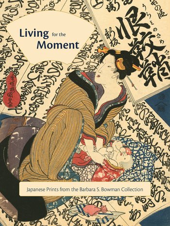 Spanning the late 18th and early 19th centuries, the exquisite examples of Japanese prints included in this book offer insights into the history of an art form and vision that is distinctively Japanese and was highly inspirational to later European painters. Polychrome prints, or ukiyo-e, first appeared in Japan in the late 18th century. Delicately hued and intricate, they depicted landscapes, scenes, and figures that epitomized the country’s idea of ‘the floating world’: a place whose denizens lived for the moment and appreciated the pleasures of the natural world. This volume surveys the prominent Barbara S. Bowman collection of prints notable for a number of reasons: an excellently preserved print of Lucky Dream for the New Year: Mount Fuji, Falcon, and Eggplants by Suzuki Harunobu; a number of surimono, or privately published prints that were created with unusually luxurious materials; and numerous works by Hiroshige and Hokusai, who are considered the masters of the art form. Each of the over one hundred prints in this book is reproduced in large color plates that highlight their subtle beauty and charm and are accompanied by extensive analysis of the pieces’ remarkable qualities. This comprehensive overview of the collection by LACMA curator Hollis Goodall addresses the significance and history of the Bowman collection and the many ways it enhances the museum’s extensive holdings of Japanese art.
Hollis Goodall is curator of Japanese art at the Los Angeles County Museum of Art.


leave a comment