Exhibition | In Plain Sight: Discovering the Furniture of Nathaniel Gould
Press release (15 September 2014) from PEM:
In Plain Sight: Discovering the Furniture of Nathaniel Gould
Peabody Essex Museum, Salem, MA, 15 November 2014 — 29 March 2015
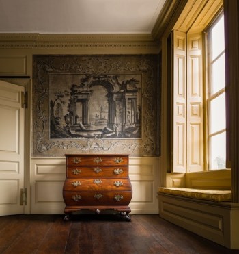
Chest of Drawers, 1758–66, attributed to Nathaniel Gould. Marblehead Historical Society and Museum. Photographed in the Jeremiah Lee Mansion (ca. 1766–68), 170 Washington Street, Marblehead. © 2014 Peabody Essex Museum. Photo by Dennis Helmar Photography.
At the dawn of the American Revolution in a city bustling with trade, politics and commerce, a craftsman of unusual ability was working tirelessly to create fine furniture for his wealthy patrons. Nathaniel Gould (1734–1781) established one of the region’s most sought-after workshops, producing thousands of technically sophisticated and aesthetically refined works for clients at home and for export. With an astute business sense, Gould thrived in one of the most tumultuous political and economic eras in American history. Despite all of this, until recently, Gould’s life and legacy was largely unknown. Masterworks sat in anonymity in the halls of major museum collections, unsigned by their maker and identified only vaguely by their geographic origin. In 2006, everything changed.
In the vaults of the Massachusetts Historical Society, among the records of Gould’s estate lawyer, researchers discovered documents that cast fresh light on—and forever enhance our understanding of—American furniture history. Three of Gould’s bound ledgers kept between 1758 and 1783 document in detail the production of almost 3,000 pieces of furniture in his Salem workshop. Painstaking analysis has revealed the identity, preferences, and transactions of more than 500 of Gould’s patrons as well as the names of his journeymen and probable apprentices. This veritable data dump of information has led museums, antique collectors, and the general public to examine their collections with fresh eyes and piqued interest. Works whose significance was obfuscated by the passage of time and lack of provenance are now being reconsidered and reappraised.
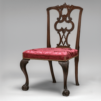
Attributed to the shop of Nathaniel Gould, Side Chair, 1770. Mahogany, maple, birch, and pine, 39 x 21 x 21 inches (NY: The Metropolitan Museum of Art: Gift of Mrs. Paul Moore, 39.88.2)
In Plain Sight: Discovering the Furniture of Nathaniel Gould—on view at PEM from November 15, 2014, through March 1, 2015—is the first exhibition to definitively unpack this discovery and describe the signature characteristics of Gould’s work. In Plain Sight also invites exploration into the life, times and social mores of early America through the lens of one of the country’s earliest and most successful woodworkers. Stately desks, bombé chests, and scalloped-top tea tables made of the finest imported mahogany are presented alongside paintings, archival materials, decorative arts, and an interactive workbench and desk provide insight into the makers and consumers of 18th-century American design and culture. The exhibition is accompanied by an exquisite publication of photographs and detailed essays from PEM curators and principal researchers Kemble Widmer, Joyce King, and Betsy Widmer.
“Possessing extraordinary woodworking skills and a refined sense of design, Gould created works that rank among the finest produced in 18th-century New England,” says Dean Lahikainen, PEM’s Carolyn and Peter Lynch Curator of American Decorative Art. “This jewel-like exhibition celebrates the best of Gould’s furniture in a format that invites contextual exploration and rewards close looking.”
Gould’s work is distinguished by its careful attention to graining, distinctive carved ball-and-claw feet, extended knee returns, and superbly carved pinwheels and scallop seashells. Clients could choose from a range of design forms, including desks and chests of drawers, tables, chairs, beds, and miscellaneous pieces, such as cradles, coffins, and fire screens. Gould built his career on his ability to translate London’s latest designs—sometimes gleaned from British pattern books, including Thomas Chippendale’s The Gentleman and Cabinet-Makers Director—into a more conservative style that pleased the tastes of the region’s wealthy elite.
The Gould ledgers reveal a high percentage of domestic furniture produced to fill wedding orders, mostly from members of the merchant class. Within a highly competitive social environment, newlywed couples aspired (as they do today) to own status symbols that communicated the family’s wealth and social position.
At the time, Salem was the hub of coastal trade and, as the ever-wise businessman, Gould saw opportunity. His ledgers reveal 616 pieces of furniture that were sold in the Caribbean and of this inventory, 62 percent were desks, half of which were made of cedar—an aromatic wood prized for its ability to deter insects in the semitropical regions. Gould’s participation in the export business also allowed him to become Salem’s principal importer of cedar and mahogany logs and allowed him to reserve the best pieces for his own magnificent workshop.
◊ ◊ ◊ ◊ ◊
From Giles:
Kemble Widmer and Joyce King with essays by Dean Lahikainen, Glenn Adamson, Daniel Finamore, and Elisabeth Garrett Widmer, In Plain Sight: Discovering the Furniture of Nathaniel Gould (London: Giles, 2014), 284 pages, ISBN: 978-1907804335, £45 / $70.
 In Plain Sight: Discovering the Furniture of Nathaniel Gould is the stunning result of happy accident and indefatigable, dedicated research. In the field of early American furniture made in Massachusetts, Nathaniel Gould has loomed as something of a mystery—believed to have been prolific, handsomely skilled, and exceptionally enterprising, yet considered elusive because of a scarcity of known works, lack of documentation, and difficulties of attribution. Accident—the unexpected discovery of Gould’s day books and account book in the collection of the Massachusetts Historical Society—and analysis—painstaking and inductive—have produced an invaluable, multifaceted case study.
This book establishes Gould unquestionably as Salem’s leading cabinetmaker before and during the period of the American Revolution. He made substantial and often expensive furniture, including case pieces of bombé form embellished with carving. The number of works that can be attributed to Gould remains small, but the foundation for increasingly assured connoisseurship lies within these pages and Gould’s archival records. The scale of his workshop, his impressively large, diverse clientele, and his successes in Salem’s furniture export trade attest to his achievements as an entrepreneur.
This book illuminates not only a particular individual, but the Salem/Boston/New England spheres in which Gould operated during a tumultuous time in American history. The scrupulously recorded notations in his ledgers are precious clues to emerging concepts of style and taste, cultural mores, business practices, socio-economic circumstances, and familial histories with local, regional, and national relevance. In Plain Sight presents a choice array of forms confidently assigned to Gould’s shop and makes accessible the ledgers themselves, meticulously analyzed and interpreted to facilitate present and ongoing scholarship regarding Nathaniel Gould, Salem, early New England furniture, and colonial America.
Kemble Widmer has applied his training and career as an industrial engineer to his examination of early furniture in Boston and Essex County, Massachusetts. Over twenty-five years, by rigorously documenting and comparing like forms, he has determined places of origin and even individual craftsmen. His research on Nathaniel Gould has disclosed an unparalleled amount of information about cabinetmaking, customers, and colonial life. Joyce King, an eleventh generation inhabitant of Salem, Massachusetts, is an expert in genealogical research. She has collaborated closely with her co-author on numerous issues of provenance that have enabled attributions of furniture to Nathaniel Gould. Glenn Adamson, formerly Head of Research, Victoria and Albert Museum, London, is The Nanette L. Laitman Director of the Museum of Arts and Design, New York. He is the founding co-editor of The Journal of Modern Craft and the author of Inventing Modern Craft. Daniel Finamore is The Russell W. Knight Curator of Maritime Art and History at the Peabody Essex Museum, Salem, Massachusetts. Dean Lahikainen is The Carolyn and Peter Lynch Curator of American Decorative Art at the Peabody Essex Museum, Salem, Massachusetts. His publications include Samuel McIntire: Carving an American Style and In the American Spirit: Folk Art from the Collections of the Peabody Essex Museum. Elisabeth Garrett Widmer, formerly director of Sotheby’s American Arts course and a Senior Vice President at Christie’s, New York, and director of Classes in Connoisseurship, is an authority on American eighteenth- and nineteenth-century decorative arts and social history. Her publications include At Home: The American Family, 1750–1870.
Exhibition | Birth of Design, Furniture Masterpieces, 1650–1789
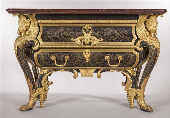
André-Charles Boulle, Louis XIV’s commode; made of resinous wood, ebony veneer, tortoiseshell and bronze inlay, gilt bronze, griotte marble; Paris, 1708, H. 88 x 131 x 65 cm (Versailles, National Museum of the Palaces of Versailles and Trianon; Inv. VMB 14279.1)
◊ ◊ ◊ ◊ ◊
From the Château de Versailles:
Eighteenth Century, Birth of Design, Furniture Masterpieces, 1650–1789
18e, aux sources du design, chefs-d’œuvre du mobilier 1650 à 1790
Château de Versailles, 28 October 2014 — 22 February 2015
From 28 October 2014 to 22 February 2015, the Palace of Versailles is hosting the exhibition 18th Century, Birth of Design, Furniture Masterpieces from 1650 to 1790 in the Africa and Crimea Rooms. The exhibition offers a glimpse of the ingenuity of a bygone era viewed from a present-day perspective and showcases the innovative and avant-garde nature of the shapes, techniques, decorations, and materials used in 18th-century furniture. The exhibition includes around 100 major works from collections at the Palace of Versailles, the Louvre Museum, the Musée des Arts Décoratifs, the Palace of Fontainbleau, and the Getty Museum, alongside works from private collections which will be on show to the public for the first time. Cabinets, desks, writing tables, commodes, and console tables, but also sofas, armchairs, folding chairs, and seating chairs will testify to the revolution that the 18th century brought about in the history of furniture, a reflection of the evolving tastes of a society enamoured by modernity and wanting to live in comfort and luxury.
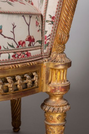
Jacques Gondoin and François II Foliot, Chair from the Pavillon du Rocher at the Petit Trianon; carved, gilded beech; 1781, 89 x 56 x 56 cm (Versailles, National Museum of the Palaces of Versailles and Trianon, Inv. V 5358)
Concept of Design
In 1712, Shaftesbury introduced the term and concept of design to art theory. It contains the dual meaning of ‘plan’ and ‘intention’ and unifies the processes of conceiving and shaping a work. For the first time, furniture was planned with forethought, created with specific intention and shaped for both functionality and comfort. 18th-century furniture was produced according to design sources, both in its overall conception and its quest for harmony between form and function.
The Transformation of Furniture
The quest for the ideal shape and form hit its peak in the 18th century, when the shape of furniture began to change. Inventiveness and creativity abounded and new outlines began to take shape, from console tables to commodes to secretary and armoire desks. Rigid outlines began to soften, then morphed into rounded curves, subsequently giving way to curved legs—sometimes four, six or even eight of them. Furniture became multi-purpose and featured mechanisms that allowed it to transform into something else.
Boldness of Materials and Colours
The same quest characterised the use of materials: furniture was covered with exotic woods, lacquers, varnishes, tortoiseshell, mother-of-pearl, bronze, brass, lead, porcelain, straw, steel and stone marquetry. Cloth, bulrush and copper began to be used in chairs. Long before the garish colours afforded by plastic in the 20th and 21st centuries, the 18th century saw the birth of furniture in red, daffodil yellow, turquoise blue, apple green, partially gilded or silvered, etc. At the same time, other colour palettes were limited to the black and gold of lacquer and bronze, and patterns were reduced to natural ones made out of quality materials such as mahogany.
◊ ◊ ◊ ◊ ◊
The catalogue is available in both French and English:
18th Century, Birth of Design, Furniture Masterpieces, 1650–1790 (Dijon: Éditions Faton, 2014), 280 pages, ISBN 978-2878441949 (English) / 978-2878441901 (French), 42€.
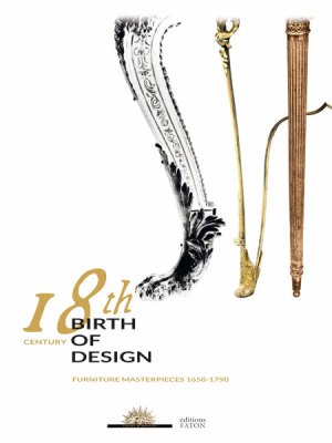 The sole purpose of this book, published to tie in with the magnificent exhibition at the Palace of Versailles, is to lay bare the incredible inventiveness of the century of Enlightenment, a century in which, for the first time, furniture became an art. Architects, artists and dealers as well as ordinary craftsmen set about organising furniture and elaborating it as never before.
The eighteenth century was to turn three everyday acts—sitting, sitting at table, storing things—into an art. Furniture changed its skin and shape. For the first time, it explored new materials, sought out new forms. It broke free of architecture, but went on playing with some of its styles. It became movable and occasional, and the notion of comfort came into being. Furniture found its identity in everyday actions to which it was closely linked. The connection between the individual and furniture became obvious. From its disposition to its ingenuity, and through the matchless quality of its incomparable workmanship, furniture in the eighteenth century came to be an integral part of daily life and fashion, quick to respond to changing moods and styles. Having thus secured both a new status and recognition, it became for ever a distinct element in the intellectual process of creation.
Daniel Alcoufe, conservateur général honoraire
Gérard Mabille, conservateur général honoraire
Yves Carlier, conservateur en chef au Musée national des châteaux de Versailles et de Trianon
Patrik Hourcade, photographe et designer
Patrick Lemasson, conservateur en chef au Musée du Petit Palais
Exhibition | Caspar Wolf and the Aesthetic Conquest of Nature

Caspar Wolf, Panorama of the Grindelwald Valley with the Wetterhorn, Mettenberg, and Eiger, ca. 1774 (Aarau: Aargauer Kunsthaus, photo by Jörg Müller)
◊ ◊ ◊ ◊ ◊
From the Kunstumuseum Basel:
Caspar Wolf and the Aesthetic Conquest of Nature
Kunstmuseum Basel, 19 October 2014 — 1 February 2015
Curated by Bodo Brinkmann and Katharina Georgi
The Alps as magnificent spectacle of nature—a surprisingly recent opinion. It was only during the course of the 18th century that people began regarding jagged mountain ranges as ‘sublime’ and aesthetically pleasing. The Swiss landscape painter Caspar Wolf (1735–1783) was one of the first to conquer this largely undeveloped Alpine landscape on his extensive treks and made it available as subject matter for artistic treatment. In his galvanizing compositions, massive boulders, thundering mountain torrents, and bizarre glacier formations impede the viewer’s path. The human being, standing in awe, is reduced to a tiny figure before expansive panoramas. Wolf stands well apart from the idyllic Baroque landscapes with his radical formations and as one of the most significant precursors to European romanticism. But the same time, his work breathed the spirit of enlightenment. The exhibition includes 126 works by Caspar Wolf and his contemporaries as well as a selection of recent photographs taken at these respective locations in the Alps. In conjunction with this exhibition, the Kupferstichkabinett at the Kunstmuseum Basel will present highlights from its wealth of drawings and prints by Caspar Wolf.
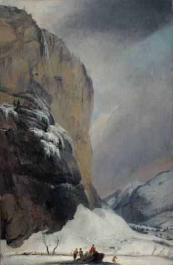
Caspar Wolf, The Staubbachfall in Winter, ca. 1775
(Bern: Kunstmuseum)
A fluke of history can be credited for Caspar Wolf ascent from impoverished childhood in Muri as carpenter’s son and moderately successful painter to artist of standing in European art history: the most important pioneer of Alpine painting and one of the most significant precursors to European Romanticism.
The fluke in question is Caspar Wolf’s encounter with the influential Bernese publisher Abraham Wagner (1734–1782). Wagner, one year his senior, had an ambitious project: to issue an encyclopedic publication of the Swiss Alpine landscape complete with illustrations of the highest artistic standard; and more to the point, these illustrations would be worked immediately from nature. The landscape that Wagner had in mind as motif was the rarely travelled and difficult to reach high Alpine region. The idea was to offer viewers a new conception of the Alpine landscape in images of previously unparalleled precision and magnificence. To author the written sections of this publication, Wagner engaged the Bernese priest and eminent natural philosopher Jacob Samuel Wyttenbach. Wolf was to accompany the two men on their extensive treks through the Alpine mountains. His task was to document and depict in paintings these unique encounters with nature.
What resulted was a comprehensive picture cycle of the Swiss Alps. Working in his studio from the nature studies completed on location, Wolf created some 200 paintings of imposing quality that bring together spontaneous observations and highly artistic formulations. Wolf invents astute painterly formulations to depict mountain ranges and glaciers, waterfalls and caves, bridges and raging torrents, lakes and high plateaus, sometimes rendering these in expansive panorama views, sometimes in close, claustrophobic compositions. His paintings include many prominent natural monuments, some no longer existent due to the environmental destruction of recent centuries: hence, the famous ‘séracs’ (pinnacles of glacier ice) of the Lower Grindelwald Glacier, evident in two exceptionally powerful paintings by Wolf, have long since melted, for instance.
Wolf’s paintings can neither be grouped with the vedute, a type painting popular at the time, nor can they be described as explicitly documentary images. Instead, they speak to a more fundamental subject matter: they consider the relationship between the mountain as rational concept and the mountain as sensual perception.
But what was the origin for the remarkable aesthetic assurance with which the artist entered the virginal territory of Alpine painting? Wolf’s intense engagement with French painting while in Paris in 1770/71 proved to be of central importance. This is vividly demonstrated in the exhibition with works by François Boucher, Claude-Joseph Vernet, Philippe-Jacques de Loutherbourg the Younger, and Hubert Robert. Surprisingly, Wolf profits greatly from his engagement with contemporary marine paintings and their depictions of dramatic storms at sea and shipwrecks.
The exhibition includes 126 works by Caspar Wolf and his contemporaries as well as a selection of recent photographs taken at these respective locations in the Alps. In conjunction with this exhibition, the Kupferstichkabinett at the Kunstmuseum Basel will present highlights from its wealth of drawings and prints by Caspar Wolf.
◊ ◊ ◊ ◊ ◊
The catalogue is available in German and English:
Caspar Wolf und die ästhetische Eroberung der Natur (Ostfildern: Hatje Cantz Verlag, 2014), 224 pages, ISBN: 978-3775738323 (German) / ISBN: 978-3775738330 (English), €58.
 The notion of the Alps as a magnificent natural spectacle is surprisingly recent. It was not until the eighteenth century that its craggy mountain ridges began to be seen as ‘sublime’ and beautiful. The Swiss landscape painter Caspar Wolf (1735–1783) was one of the first to discover the then largely unexplored world of the Alps as a subject of art through his extended forays into the mountains. Trained in southern Germany and Paris, Wolf was commissioned to produce a comprehensive series on the Swiss Alps, which he completed between 1773 and 1779. Working in his studio, the artist created some 180 imposing paintings from nature studies done outdoors. The publication demonstrates how he conveyed what he had seen according to his aesthetic criteria. In his dramatic compositions, paths are blocked by immense boulders, roaring streams of water, and glaciers, or the
view opens up to reveal giant panoramas, which are
observed by tiny, awestruck human figures.
Exhibition | Witches and Wicked Bodies
I noted this exhibition last year when it went on display in Scotland, but I didn’t realize it would also be on view in London. The description on The British Museum’s website provides additional information. I saw the exhibition Friday evening, and I think it’s fabulous (a nice complement to the British Library’s exhibition Terror and Wonder: The Gothic Imagination, even as they do very different things). There are stunning eighteenth-century images, and the period anchors the show more than the descriptions might suggest (including gorgeous prints after Salvator Rosa). –CH
From The British Museum:
Witches and Wicked Bodies
Scottish National Gallery of Modern Art, Edinburgh, 27 July — 3 November 2013
The British Museum, London, 25 September 2014 — 11 January 2015

Saul and the Witch of Endor, after Salvator Rosa.
Click on the image for details.
This exhibition will examine the portrayal of witches and witchcraft in art from the Renaissance to the end of the 19th century. It will feature prints and drawings by artists including Dürer, Goya, Delacroix, Burne-Jones and Dante Gabriel Rossetti, alongside classical Greek vessels and Renaissance maiolica.
Efforts to understand and interpret seemingly malevolent deeds—as well apportion blame for them and elicit confessions through hideous acts of torture—have had a place in society since classical antiquity and Biblical times. Men, women and children have all been accused of sorcery. The magus, or wise practitioner of ‘natural magic’ or occult ‘sciences’, has traditionally been male, but the majority of those accused and punished for witchcraft, especially since the Reformation, have been women. They are shown as monstrous hags with devil-worshipping followers. They represent an inversion of a well-ordered society and the natural world.
The focus of the exhibition is on prints and drawings from the British Museum’s collection, alongside a few loans from the V&A, the Ashmolean, Tate Britain and the British Library. Witches fly on broomsticks or backwards on dragons or beasts, as in Albrecht Dürer’s Witch Riding backwards on a Goat of 1501, or Hans Baldung’s Witches’ Sabbath from 1510. They are often depicted within cave-like kitchens surrounded by demons, performing evil spells, or raising the dead within magic circles, as in the powerful work of Salvator Rosa, Jacques de Gheyn and Jan van der Velde.
Francisco de Goya turned the subject of witches into an art form all of its own, whereby grotesque women conducting hideous activities on animals and children were represented in strikingly beautiful aquatint etchings. Goya used them as a way of satirising divisive social, political and religious issues of his day. Witches were also shown as bewitching seductresses intent on ensnaring their male victims, seen in the wonderful etching by Giovanni Battista Castiglione of Circe, who turned Odysseus’s companions into beasts.
During the Romantic period, Henry Fuseli’s Weird Sisters from Macbeth influenced generations of theatre-goers, and illustrations of Goethe’s Faust were popularised by Eugène Delacroix. By the end of the 19th century, hideous old hags with distended breasts and snakes for hair were mostly replaced by sexualised and mysteriously exotic sirens of feminine evil, seen in the exhibition in the work of Edward Burne-Jones, Dante Gabriel Rossetti and Odilon Redon.
The exhibition includes several classical Greek vessels and examples of Renaissance maiolica to emphasise the importance of the subject in the decorative arts.
Exhibition | Terror and Wonder: The Gothic Imagination
◊ ◊ ◊ ◊ ◊
This year marks the 250th anniversary of the publication of Horace Walpole’s ’s The Castle of Otranto, and the British Library celebrates with an exhibition exploring the the relationship between the Gothic and the British imagination up to the present. The wall colors are from Farrow & Ball, with Lulworth Blue (No. 89) providing the backdrops for most of the Walpole material at the beginning of the exhibition, along with Great White (No. 2006), before things go really dark with Pitch Black (No. 256) and Rectory Red (No. 217). Of course, there’s Rectory Red in this show.
From the BL:
Terror and Wonder: The Gothic Imagination
British Library, London, 3 October 2014 — 20 January 2015
Curated by Tim Pye

John Giles Eccardt, Portrait of Horace Walpole, 1754 (London: National Portrait Gallery)
Two hundred rare objects trace 250 years of the Gothic tradition, exploring our enduring fascination with the mysterious, the terrifying and the macabre. From Mary Shelley and Bram Stoker to Stanley Kubrick and Alexander McQueen, via posters, books, film and even a vampire-slaying kit, experience the dark shadow the Gothic imagination has cast across film, art, music, fashion, architecture and our daily lives.
Beginning with Horace Walpole’s The Castle of Otranto, Gothic literature challenged the moral certainties of the 18th century. By exploring the dark romance of the medieval past with its castles and abbeys, its wild landscapes and fascination with the supernatural, Gothic writers placed imagination firmly at the heart of their work—and our culture. Iconic works, such as handwritten drafts of Mary Shelley’s Frankenstein, Bram Stoker’s Dracula, the modern horrors of Clive Barker’s Hellraiser, and the popular Twilight series, highlight how contemporary fears have been addressed by generation after generation.
Dozens of press images can be found here»
◊ ◊ ◊ ◊ ◊
◊ ◊ ◊ ◊ ◊
Dale Townsend, ed., Terror and Wonder: The Gothic Imagination (London: The British Library, 2014), 224 pages, softcover, ISBN: 978-0712357913, £25 / hardcover, ISBN: 978-0712357555, £35.
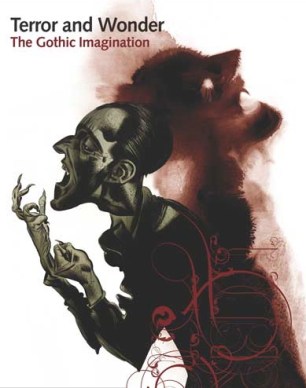 The Gothic imagination, that dark predilection for horrors and terrors, spectres and sprites, occupies a prominent place in contemporary Western culture. First given fictional expression in Horace Walpole’s The Castle of Otranto of 1764, the Gothic mode has continued to haunt literature, fine art, music, film and fashion ever since its heyday in Britain in the 1790s. Terror and Wonder, which accompanies a major exhibition at the British Library, is a collection of essays that trace the numerous meanings and manifestations of the Gothic across time, tracking its prominent shifts and mutations from its eighteenth-century origins, through the Victorian period, and into the present day. Edited and introduced by Dale Townshend, and consisting of original contributions by Nick Groom, Angela Wright, Alexandra Warwick, Andrew Smith, Lucie Armitt and Catherine Spooner, Terror and Wonder provides a compelling and comprehensive overview of the Gothic imagination over the past 250 years
Dale Townshend is Senior Lecturer in Gothic and Romantic Literature at the University of Stirling, Scotland. His most recent publications include The Gothic World (with Glennis Byron; Routledge, 2014) and Ann Radcliffe, Romanticism and the Gothic (with Angela Wright; Cambridge University Press, 2014).
C O N T E N T S
Dale Townshend, Introduction
Nick Groom, Gothic Antiquity: From the Sack of Rome to The Castle of Otranto
Angela Wright, Gothic, 1764–1820
Alexandra Warwick, Gothic, 1820–1880
Andrew Smith, Gothic and the Victorian Fin de siècle, 1880–1900
Lucie Armitt, Twentieth-Century Gothic
Catherine Spooner, Twenty-First-Century Gothic
Martin Parr, Photographing Goths: Martin Parr at the Whitby Goth Weekend
◊ ◊ ◊ ◊ ◊
From the exhibition press release (2 October 2014). . .
Terror and Wonder: The Gothic Imagination opens at the British Library exploring Gothic culture’s roots in British literature and celebrating 250 years since the publication of the first Gothic novel.
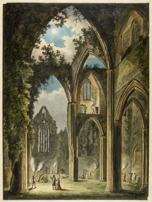
Tintern Abbey, watercolour, 1812 (London: British Library)
Alongside the manuscripts of classic novels such as Frankenstein, Dracula, and Jane Eyre, the exhibition brings the dark and macabre to life with artefacts, old and new. Highlights of the exhibition include a vampire slaying kit and 18th- and 19th-century Gothic fashions, as well as one of Alexander McQueen’s iconic catwalk creations. Also on display is a model of the Wallace and Gromit Were-Rabbit, showing how Gothic literature has inspired varied and colourful aspects of popular culture in exciting ways over centuries.
Celebrating how British writers have pioneered the genre, Terror and Wonder takes the first Gothic novel, The Castle of Otranto by Horace Walpole, and exhibits treasures from the Library’s collections to carry the story forwards to the present day. Eminent authors over the last 250 years, including William Blake, Ann Radcliffe, Mary Shelley, Charles Dickens, the Brontës, Edgar Allan Poe, Bram Stoker, MR James, Mervyn Peake, Angela Carter and Neil Gaiman, underpin the exhibition’s exploration of how Gothic fiction has evolved and influenced film, fashion, music, art and the Goth subculture.

An early illustration of a ‘wicker man’ from Nathaniel Spencer’s The Complete English Traveller (1771)
Lead curator of the exhibition, Tim Pye, says: “Gothic is one the most popular and influential modes of literature and I’m delighted that Terror and Wonder is celebrating its rich 250 year history. The exhibition features an amazingly wide range of material, from stunningly beautiful medieval artefacts to vinyl records from the early Goth music scene, so there is truly something for everyone.”
From Nosferatu to the most recent zombie thrillers, the exhibition uses movie clips, film posters, costume designs and props to show how Gothic themes and literature have been adapted for stage and screen, propelling characters like Dracula, Jekyll and Hyde and Frankenstein’s monster to mainstream fame. Exciting exhibits on loan to the Library include Clive Barker’s original film script and sketches for Hellraiser, as well as Stanley Kubrick’s annotated typescript of The Shining.
Showing how Gothic fiction has inspired great art, the exhibition features fine paintings and prints, such as Henry Fuseli’s Hamlet, Prince of Denmark and Nathaniel Grogan’s Lady Blanche Crosses the Ravine, a scene taken directly from the Queen of Terror Ann Radcliffe’s The Mysteries of Udolpho. These classic images precede dramatic contemporary artworks, such as Jake and Dinos Chapman’s series Exquisite Corpse, showing how the dark and gruesome still inspire today’s artists.
Celebrating the British Goth scene, we are delighted to reveal a brand new series of photographs of the Whitby Goth Weekend by the award-winning photographer Martin Parr. Commissioned specially for this exhibition, the photographs take a candid look at the biannual event, which takes place in the town famously featured in Dracula, capturing its diversity and energy.
Earlier this year the Library announced that we are putting our literary treasures online for the world to see with a new website, Discovering Literature. Many of the Gothic literary greats featuring in the exhibition, including the Brontës, Charles Dickens and Wilkie Collins, can be explored amongst the Romantic and Victorian literature now available online.
The Library has partnered with BBC Two and BBC Four to celebrate all things Gothic this autumn with a new season of programmes exploring the literature, architecture, music and artworks that have taken such a prominent place in British culture.
A host of famous literary faces will look back on Frankenstein’s creation in A Dark and Stormy Night: When Horror Was Born, while in The Art of Gothic: Britain’s Midnight Hour Andrew Graham-Dixon looks back at how Victorian Britain turned to the past for inspiration to create some of Britain’s most famous artworks and buildings. In God’s own Architects: The First Gothic Age, Dr Janina Ramirez looks at Perpendicular Gothic, Britain’s first cultural style and Dan Cruickshank looks back at Gothic architecture’s most influential family in A Gothic Dynasty: A Victorian Tale of Triumph and Tragedy. BBC Four delves into the archives uncovering classic performances from Siouxsie and the Banshees, Bauhaus, The Cure, Sisters of Mercy, The Mission and more in Goth at the BBC.
For the second year running the Library, GameCity and Crytek are running an exciting video game competition, Off the Map, this time with a Gothic edge. Following last year’s winners, who recreated London before the Great Fire, this year entrants will use ruined abbeys, the town of Whitby or Edgar Allan Poe as inspiration for a brand new interactive game.
A wide range of literary, film and music events will accompany the exhibition, with speakers including writers Susan Hill, Sarah Waters, Audrey Niffenegger and Kate Mosse, actor Reece Shearsmith, comedian Stewart Lee and musician Brian May.
Exhibition | The Sparkling Soul of Terracotta
Press release (distributed by Cawdell Douglas), via Art Daily (the particularly handsome 124-page catalogue is available for free download as PDF file here).
The Sparkling Soul of Terracotta: 16th to 19th Centuries
Caiati & Gallo Gallery, Milan, 9 October – 8 November 2014
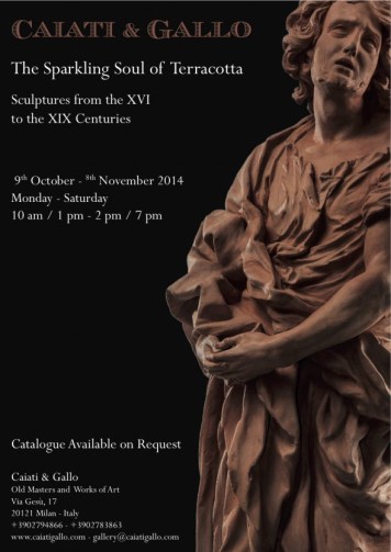 Caiati & Gallo Gallery is paying tribute to terracotta with an important exhibition entitled The Sparkling Soul of Terracotta: Exploring the Vibrant Intensity of Sculpture from the 16th to 19th Centuries. The exhibition centres around fifteen works of art which represent the peak of their particular era. These important works have been tracked down through extensive research and collaboration by a team of leading scholars. Each piece has been selected for its unique contribution to the history of art.
One of the most touching examples is the late-baroque Lombard group of Jupiter and Semele by the Milanese sculptor Carlo Francesco Mellone. It represents Jupiter meeting his lover Semele, who has a small cherub at her side. A second cherub who has since lost both arms completes the scene. The figures rest on a rectangular base, possibly alluding to the bed in which their adultery was committed. Mellone’s figures are light and full of movement. Semele’s facial features are typical of the sculptor’s work: the delicate oval shape, small mouth and large eyelids exemplify a style repeated in numerous
other works.
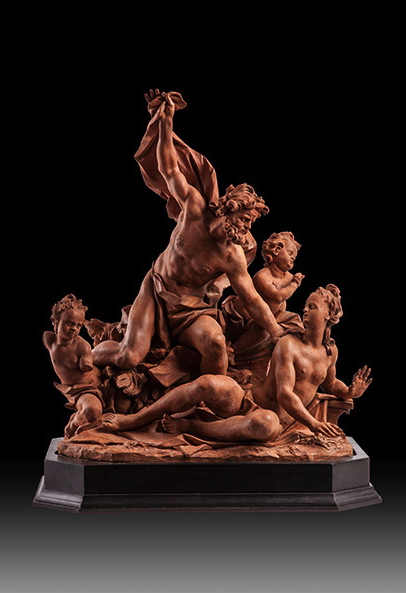
Carlo Francesco Mellone (1670–before 1756), Jupiter and Semele, terracotta, 12 x 16 x 8 inches.
René Frémin (1672–1744), Allegory of America. This statue is of a girl crowned by a full head of feathers in a long dress, her legs covered in a short irregularly-shaped tunic. The delicacy of her affected gestures, her flowing drapes and the square base bring to mind the gardens of the Royal Palace at La Granja of Sant’ Ildefonso, the summer residence of the King of Spain. This enables us to place the statue within the works of Frémin since he was responsible for the decoration of the palace from 1721 onwards. He was Louis XIV’s favourite sculptor and entered the French Academy in 1696.
Ignazio (1724–1793) and Filippo Collino (1737–1800), Pair of statues. Defence of Glory and Strength by the two brothers who were among the most important sculptors in Piedmont in the second half of the eighteenth century. Defence of Glory. This light, standing female figure is particularly refined. Her beautiful features are highlighted by her full head of hair gathered behind her neck. Great emphasis is given to her lithe body that is accentuated by a dress which mischievously clings to her body. A soft cloak with folds and pleats hangs down to her feet. The presence of a sword and a laurel branch with berries held between the woman’s fingers suggests the figure is an allegorical personification of the Defence of Glory. Strength. The figure in this work holds a baton in her hands with an oval shield bearing a relief of a lion attacking a wild boar. The woman’s features are drawn from the classical model of female beauty. Created as part of a pair with the Defence of Glory, the work is both refined and cultivated in terms of style, bearing considerable similarity to the French Rococo, late-baroque Roman and Tuscan classicism and the eclectic styles of mid eighteenth-century Venetian sculpture.
Jean Del Cour (1627–1707), Saint John. The most important Flemish sculptor of his time, Del Cour sculpted in marble, bronze, and wood. He was influenced by French and Flemish styles as well as by Bernini who he had met and visited in Rome during one of his long stays in the Eternal City. Del Cour’s Bernini-esque interpretations were both brilliant and original thanks to his ability to present the modernity of his epoch and thus translate passion, love, sensuality, and mysticism into dynamism, strength, and elegance.
Antonio Begarelli (Modena 1499–1565) Saint with Book (Saint Justine?). Little is known of the life of Begarelli before 1522, when, as a young man (in those days, under twenty-five was considered very young), he burst onto Modena’s artistic scene. Without receiving any commission, he undertook a large statue in terracotta, the Madonna di Piazza that he offered for free to the city. Today, it is kept at Modena’s Museo Civico. The statue was hugely popular and eventually earned him the position of Modena’s official artist.
Antonio Calegari (Brescia 1699–1777) Madonna with Child. Having trained with his father, Sante, Calegari drew from the seafaring traditions of Venice and exploited the dynamism, chiaroscuro, and vivacity that characterised his better works. In later years, his work enjoyed brilliant Rococo influences in perfect harmony with the latest styles in Venice and, above all, the work of Giambattista Tiepolo. It is to this last phase, from the mid-1750s to the early-1760s, that this work belongs.
Guido Reni, (Bologna 1575–1642) from a model of the Bust of Seneca. This dynamic terracotta sculpture of the ancient philosopher has been perfectly conserved, so that the exceptional modelling of the clay is still in evidence. It can be compared to at least seven versions in terracotta, bronze, plaster, and stone, all of which are replicas of Reni’s Seneca. According to Carlo Cesare Malvasia, the original was a terracotta relief head. In his thorough biography of Reni, contained in his celebrated work Felsina Pittrice (1678), Malvasia exalts Reni as the quintessential artist of seventeenth-century Bologna. Of the sculpted copies now known of the powerful head, only the two terracotta versions and this unseen work, could truly claim attribution to the master.
Lorenzo Sarti ( ?) (documented in Emilia and Veneto from 1722 to 1747) The Trinity with the Guardian Angel and Saints Filippo Benizzi, Francesco da Paola, Filippo Neri and Carlo Borromeo and The Blessed Virgin between Saint Caterina d’Alessandria and Christ carrying the Cross, with Saints Augustine, Domenic and Thomas Aquinas. Having undergone recent restoration, these two important terracotta high reliefs demonstrate all the depth and detail of their original modelling. Though the provenance and collection histories are unknown, examination suggests that they are from a school which originated within the walls of Bologna. This school was formed under the aegis of Giuseppe Maria Mazza and was then led by his pupil Angelo Gabriello Pi . Sarti was one of his best pupils. The two rectangular reliefs which should be regarded as pendants, are of very similar dimensions and format. The compositions both have a pyramidal form, with the holy groups placed at the apex. The lower part is an ordered and symmetrical arrangement of saints who appear in hierachical order.
Exhibition | Adriaan de Lelie and the Family Portrait
From the Museum Van Loon (with thanks to Hélène Bremer for noting it). . .
Adriaan de Lelie and the Eighteenth-Century Family Portrait
Museum Van Loon, Amsterdam, 17 October 2014 — 19 January 2015

Adriaan De Lelie, Jan van Loon and His Family, 1786
(Amsterdam: Museum van Loon)
From 17 October 2014 Museum Van Loon will show works by Adriaan de Lelie (1755–1820). It is the first time that so much of De Lelie’s œuvre will be on view to the public. Most of the paintings are from private collections. Next to paintings by De Lelie, family portraits by famous contemporaries like Tischbein, Regters, Laquy and Quinkhard are on display. The thirty paintings on show give a perfect reflection of family bliss and the lavish interiors of the 18th century.
Although little has been published about De Lelie, he is without doubt one of the most important portrait painters of his time. He was born in Tilburg, and after having studied in Antwerp and Düsseldorf, he settled in Amsterdam where he quickly integrated in the upper classes. With his keen eye for detail, refined palette, and smooth hand he was a successful portraitist. Governors, bankers, notaries, officers, professors, and wealthy merchants had themselves painted by him. Thus De Lelie literally gave face to Amsterdam at the turn of the century.
As a family home, Museum Van Loon is the place for showing family portraits. With this exhibition it intends to disclose its own 18th-century collection of paintings and to offer the public the unique opportunity to view the oeuvre of De Lelie and his contemporaries in the house of one of his large commissioners. For visitors the historic perspective is strengthened by the connection between the paintings, furniture, tapestry and carpets in the rooms as one will see one’s immediate surroundings in the museum reflected in the 18th-century interiors in the paintings.
◊ ◊ ◊ ◊ ◊
From W Books:
Josephina de Fouw, Adriaan de Lelie (1755–1820) en het achttiende-eeuwse familieportret (Zwolle: W Books, 2014), 64 pages, ISBN: 978-9462580398, €15.
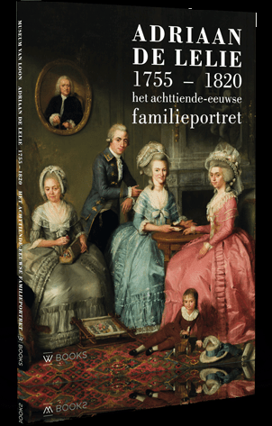 Adriaan de Lelie behoort zonder meer tot de belangrijkste portretschilders van zijn tijd. Zijn wieg stond in Tilburg en na een studietijd in Antwerpen en Düsseldorf vestigde hij zich definitief in Amsterdam. Daar wist hij al snel door te dringen in de kringen van de gegoede burgerij. Met zijn oog voor detail en verfijnde palet was hij een veelgevraagd portrettist. Notabelen, bankiers, notarissen, officieren, hoogleraren en vermogende koopmannen: allen lieten zich door de schilder vereeuwigen. De Lelie heeft zo letterlijk een gezicht gegeven aan het Amsterdam van rond de eeuwwisseling.
In deze eerste publicatie gewijd aan De Lelie wordt een beeld geschetst van deze portretten en wordt ingegaan op de karakteristieken van zijn familieportretten. Ook wordt zijn werk vergeleken met voorgangers en tijdgenoten, zoals Tibout Regters, Tischbein en Laquy.
Exhibition | Treasures from the Collection Rudolf-August Oetker
From the Museum Huelsmann
Wie es uns gefällt: Kostbarkeiten aus der Sammlung Rudolf-August Oetker
Museum Huelsmann, Ravensberger Park, Bielefeld, 14 September 2014 — 28 January 2015
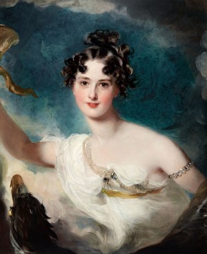
Thomas Lawrence, Princess Clementine de Metternich, ca. 1818–20.
Die umfangreiche Kunstsammlung des Bielefelder Unternehmers, Sammlers und Mäzens Rudolf-August Oetker (1916–2007) gehört in der Sammlungsgeschichte Deutschlands zu den wenigen privaten Beispielen des 20. Jahrhunderts.
Ausgewählte Kostbarkeiten der Malerei des Barock, Rokoko und Klassizismus sowie des europäischen Kunsthandwerks, darunter selten gezeigte Porzellane, auserlesenes Silber und fürstliche Schatzkunst repräsentieren den individuellen, aber auch universellen Charakter des Sammlers und stehen im Kontext des 18. Jahrhunderts, dem Jahrhundert, das das Aufkommen des individuellen Geschmacks betont.
Installation photos from the firm DesignPosition are available here»
The exhibition flyer is available as a PDf file here»
◊ ◊ ◊ ◊ ◊
From Hirmer Verlag:
Monika Bachtler, ed., Wie es uns gefällt: Kostbarkeiten aus der Sammlung Rudolf-August Oetker (Munich: Hirmer Verlag, 2014), 144 pages, ISBN: 978-3777422930, 35€.
 Die umfangreiche Sammlung des Bielefelder Unternehmers Rudolf-August Oetker ist eines der wenigen Beispiele der Geschichte privaten Sammelns in Deutschland während des 20. Jahrhunderts, das gleichermaßen universelle wie individuelle Maßstäbe setzte. Anhand der daraus ausgewählten Kostbarkeiten der Malerei des Barock und Rokoko und des europäischen Kunsthandwerks entsteht ein kulturgeschichtlich plastisches Bild dieser Zeit, aber auch eine Vorstellung vom repräsentierenden Charakter einer persönlich geprägten Ankaufstrategie. Das Katalogbuch spiegelt die Opulenz dieser Sammlerwelt in Bildern und Texten wider.
Exhibition | Canaletto, Bernardo Bellotto Paints Europe
Last fall, I noted this exhibition Canaletto, Bernardo Bellotto Paints Europe / Bernardo Bellotto Malt Europa, which opens this week at Munich’s Alte Pinakothek, Munich (17 October 2014 — 19 January 2015), but that was admittedly ages ago (thanks to Hélène Bremer for the useful reminder). And here’s the information for the catalogue. –CH
The German edition catalogue will soon by published by Hirmer; the English edition, distributed by The University of Chicago Press, will be available in January:
Andreas Schumacher, Canaletto, Bernardo Bellotto Paints Europe (Munich: Hirmer Publishers, 2015), 360 pages, ISBN: 978-3777422473, $75.
 In 1761, Bernardo Bellotto painted his famous panorama of Munich, signing the painting ‘Canaletto’—as he signed many of his paintings—in tribute to his uncle and teacher Giovanni Antonio Canal. In addition to the famous panorama, Bellotto completed over the course of several months two stunning palace views for the Duke of Bavaria, Maximilian III Joseph.
Placing Bellotto’s Munich paintings within the artist’s broader body of work, this well-illustrated book highlights the Italian painter and printmaker’s capacity to create paintings of European cities that are both remarkably realistic and compositionally idealistic. Depicting Dresden, Vienna, Turin, and Warsaw, the paintings demonstrate an elaborate attention to architectural and natural detail and a sophisticated understanding of the specific quality of light in each place. By juxtaposing the paintings with Bellotto’s preparatory sketches, the book also sheds light on his complicated process, which is thought to have included the use of the popular optical aid of that time, the camera obscura. Rounding out the book is a contemporary artistic reevaluation of the paintings through the medium of photography.
Bringing together many well-known works by the Venetian vedute with a trove of paintings rarely seen, including a series of highly idealized architectural depictions, the book illustrates his critical contribution to this important European tradition.
Andreas Schumacher is a director at the Alte Pinakothek, Munich, where he is responsible for the museum’s Collection of Italian Painting to the End of the Eighteenth Century. He is also an associate lecturer at the Institute for Art History at the University of Bonn, Germany.
◊ ◊ ◊ ◊ ◊
Exhibition | Sade: Marquis of Shadows, Prince of the Enlightenment
To the d’Orsay’s exhibition on the Marquis de Sade we can add this one now on view at the Institut des Lettres et Manuscrits:
Sade: Marquis of Shadows, Prince of the Enlightenment
The Spectrum of Libertinism from the 16th to the 20th Century
Institut des Lettres et Manuscrits, Paris, 26 September 2014 — 18 January 2015
Curated by Pascal Fulacher and Jean-Pierre Guéno
Yes, I am a libertine, I admit it freely. I have dreamed of doing everything that it is possible to dream of in that line. But I have certainly not done all the things I have dreamt of and never shall. Libertine I may be, but I am not a criminal, I am not a murderer. –Donatien Alphonse François de Sade
Sade and the Spectrum of Libertinism
Donatien Alphonse François de Sade was doubly a man of letters: a great novelist, a great letter writer, but above all a victim of the very special letters that were the lettres de cachet, often commissioned from monarchs or their ministers by the families of those who wanted to have troublesome offspring removed from the public sphere. Even more than the Marquis of Shadows, even more than his escapades and fantasies of debauchery, it was the Prince of the Enlightenment who never ceased to embarrass both his family, who continually persecuted him, his social caste, and the leading figures of his time, to the point where this troublemaker became a kind of literary man in an iron mask who spent more than half his adult life in prison before dying there. Apart from the fact that he was sentenced to life imprisonment in 1768, and twice to death in 1772 and in 1794, De Sade spent nearly twenty-eight years in prison between 1763 and 1814, between the age of 23 and his death at age 74, and this under three different regimes: the Monarchy, the Republic and the Empire. From the tower at Vincennes to Charenton insane asylum, despite the material means he had to improve his everyday life, he lived mostly in “execrable slums,” in a dozen jails including those of Saumur castle, Pierre-Encise citadel in Lyon, For-l’Eveque prison in Paris, Miolans fort in Savoy, the Bastille fortress, Sainte-Pélagie prison and Bicêtre prison in Paris, not forgetting the gaols of the Revolution. During the seventy-four years and six months of his life as in the two centuries that separate us from his death, it may seem paradoxical that we have demonised the Marquis de Sade to such an extent, and that we have for so long mixed the man with his work, to the point of confusing the man and the novelist with the criminal characters in his fiction.
 Certainly he was a libertine who indulged in licentious and dissolute sexual practices, but the man who lent his name to today’s definition of the word Sadism, “the tendency to derive pleasure from physical or emotional pain intentionally inflicted on others” would have been just one more profligate among the aristocrats of his time, had he not been primarily the eye of a kind of consciousness that managed to convey not just the pain of living, but the “pain of the century” (“mal du siècle”) as defined by Musset in the 19th century: through his escapades and provocations, then through his political writings, as through his philosophical writings, letters and novels, but also by example, or by the counterexample of his life, did Sade ever cease to express the evil that devours men, mostly from the Renaissance to modern times, that is to say, during the second half of the second millennium?
For the last four centuries, are those who call themselves libertines actually Epicureans, delinquents or hyper-aware individuals? Bon vivants, criminals or cursed existentialists? From the Marquis de Sade to Dominique Aury (aka Pauline Réage), author of Histoire d’O (The Story of O), to Théophile de Viau, Crébillon, Choderlos de Laclos and his Liaisons Dangereuses (Dangerous Liaisons), Mirabeau, Casanova, the Chevalier d’Eon, Musset, Maupassant, Baudelaire, Rimbaud, Verlaine, Pierre Louÿs and Joë Bousquet, the great figures of literature, poetry and thought have never ceased to celebrate the cannibalistic wedding of vice and virtue. Vice that feeds on virtue when it transgresses and deflowers it. Virtue that feeds on vice when it denounces and demonises it.
At the boundaries of fantasy, revolution, transgression, emancipation and moral suicide, between the realities of purgatory, the fantasised or dreaded delights of hell and the mythical nostalgia for paradise lost, between cynicism, pragmatism and hope, between Epicureanism and cruelty, between enlightenment and barbarism, between the obsession with God and its denial, do the case studies that adorn the spectrum of libertinism not illustrate the entire tragedy of the human condition, and do they not resemble in this respect all the major intellectual earthquakes of the 19th and 20th centuries, from romanticism to existentialism through surrealism?
The Exhibition
 Long before becoming a moral emancipation movement, libertinism was a terribly subversive spiritual liberation movement, since it questioned the existence of God, the legitimacy of kings’ rule by divine right, and all the dogmas of religion, morals and absolute power. From the outset, the exhibition reveals “The spectrum of libertinism,” leading the visitor from “libertinism of the spirit to libertinism of morals” through a set of subversive texts including the Decameron by Boccaccio, Pensées (Thoughts) by Pascal, Dom Juan by Molière, Contes et nouvelles (Tales and Novels) by La Fontaine, Les Lettres persanes (Persian Letters) by Montesquieu and La Nouvelle Héloïse (The New Heloise) by J.-J. Rousseau. Libertinage in the time of De Sade is also discussed in the letters and works of Crébillon, Casanova, the Chevalier d’Eon, Restif de la Bretonne, Choderlos de Laclos, Mirabeau and more.
Then, pride of place is given to the Marquis de Sade and his masterpiece, Les 120 journées de Sodome ou l’École du libertinage (The 120 Days of Sodom, of the School of Libertinism): the handwritten scroll on which this still-scandalous novel was written is on display here for the first time ever in France. Several letters by De Sade, to his wife, his mother-in-law, his lawyer, an actress, etc. are also displayed around the scroll, and give a better understanding of this enigmatic and highly controversial figure.
The last two parts of the exhibition shed light on the rehabilitation of the Marquis de Sade and his work, as well as the development of libertinism in the 19th and 20th centuries, from romanticism to surrealism through existentialism. The exhibition Sade: Marquis de l’ombre, prince des Lumières, L’éventail des libertinages du XVIe au XXe siècle also features over 120 exceptional pieces, letters and autograph manuscripts, first editions and rare, valuable illustrated books, drawings, photographs, etc.
◊ ◊ ◊ ◊ ◊
From Flammarion:
Gonzague Saint Bris and Marie-Claire Doumerg-Grellier, Sade: Marquis de L’Ombre, Prince des Lumières, L’Eventail des Libertinages (Paris: Flammarion, 2014), 176 pages, ISBN: 978-2081353817, 29€.
Consacré à l’histoire du libertinage, cet album en lien avec l’exposition du même titre, rassemble et présente lettres, manuscrits, livres rares et précieux, portraits et dessins érotiques consacrés aux «Cent vingt journées de Sodome» du marquis de Sade.







leave a comment