Exhibition | Etruscan Enchantment
From Holkham Hall:
Etruscan Enchantment: From the Secrets of Holkham Hall to the Wonders of the British Museum
Seduzione Etrusca: Dai Segreti di Holkham Hall alle Meraviglie del British Museum
Museo dell’Accademia Etrusca e della Città di Cortona, Palazzo Casali, Cortona, 22 March — 31 July 2014

◊ ◊ ◊ ◊ ◊
2014 will see Holkham Hall’s largest international collaboration since the eighteenth century. From March to July, the MAEC (Museo dell’Accademia Etrusca e della Città di Cortona) in Cortona, Tuscany, will host an exhibition of sculpture, paintings, prints, drawings and manuscripts drawn from the Uffizi museums in Florence, the Vatican Museums, the British Museum in London, and Holkham Hall.
 The exhibition, which will run from 22nd March to 31st July, centres on a moment of crucial importance in the history of archaeology and of Tuscany itself, that is the publication of Thomas Dempster’s De Etruria regali (On Royal Tuscany) in Florence in 1723 and 1726. The publication was entirely funded by the young Thomas Coke, the builder of Holkham Hall, and led to the foundation in 1727 of one of most important learned societies in Italy, the Accademia Etrusca. Since its beginnings, the Accademia has been housed in the medieval Palazzo Casali in Cortona, now the home of the MAEC itself.
Thomas Dempster (1579–1635) was an impoverished Scottish nobleman who taught at universities throughout Europe, and ended his career as Professor of Humanities in Bologna. Between 1616 and 1619, he compiled the De Etruria Regali, a monumental history of the Etruscan (broadly, Tuscan) people, the very first attempt to demonstrate the existence of a highly developed civilisation in Italy before the Romans. The work remained unpublished in Dempster’s lifetime, and survived in only one copy, in his own handwriting. This unique manuscript copy was purchased for Thomas Coke by his Grand Tour tutor-governor, Thomas Hobart, in July 1719, from the Florentine scholar Anton Maria Salvini, at a price of eleven guineas. It is still in the library at Holkham Hall, as MS 501.
Thomas Coke returned the manuscript to Florence and paid for the publication of work at a cost of over 2,000 Florentine scudi. Under the supervision of the antiquarian Senator Filippo Buonarotti, whom Coke and Hobart had visited several times while they were in Italy, a substantial programme of illustration was added to the printed edition. For the first time, a work of ancient history was based on the evidence of surviving artefacts and objects rather than on written sources, laying the foundations for modern archaeology. The printed volumes were dedicated to the Grand Dukes of Tuscany, whose dynasty was traced in the text back to the Etruscans themselves! The frontispiece to volume 2 is a portrait of Grand Duke Gian Gastone de’ Medici. He was the last of the line, and on his death in 1737, the family who had dominated Tuscany for centuries died out.
The importance of Coke’s role was only fully understood in 2007 with the discovery at Holkham by Dr Suzanne Reynolds of the accounts for the production process, documenting payments to the artists, engravers, and editors who worked on the project. These documents will be on display in the exhibition, along with the autograph manuscript of the text. Also on display will be the original drawings and copper plates for the illustrations which were discovered in the attics at Holkham by the 5th Earl of Leicester in 1964. The drawings were in the original leather wallet in which they had been sent back to England from Italy after publication.
Some three hundred years after Thomas Coke first arrived in Italy in November 1713, Holkham is also lending paintings, drawings and manuscripts that attest to his passion for Italian history and art. Highlights include Procaccini’s Tarquinius and Lucretia, paintings and drawings by Claude and Vanvitelli, and some of the most beautifully illuminated medieval manuscripts of ancient history from the Holkham Library.
-Dr Suzanne Reynolds (Curator of Manuscripts and Printed Books, Holkham Hall) September 2013
Exhibition | Andreas Schlüter and Baroque Berlin
To mark the 300th anniversary of Andreas Schlüter’s death, the Bode-Museum mounts this exhibition:
Schloss Bau Meister: Andreas Schlüter and Baroque Berlin
Bode-Museum, Berlin, 4 April — 13 July 2014
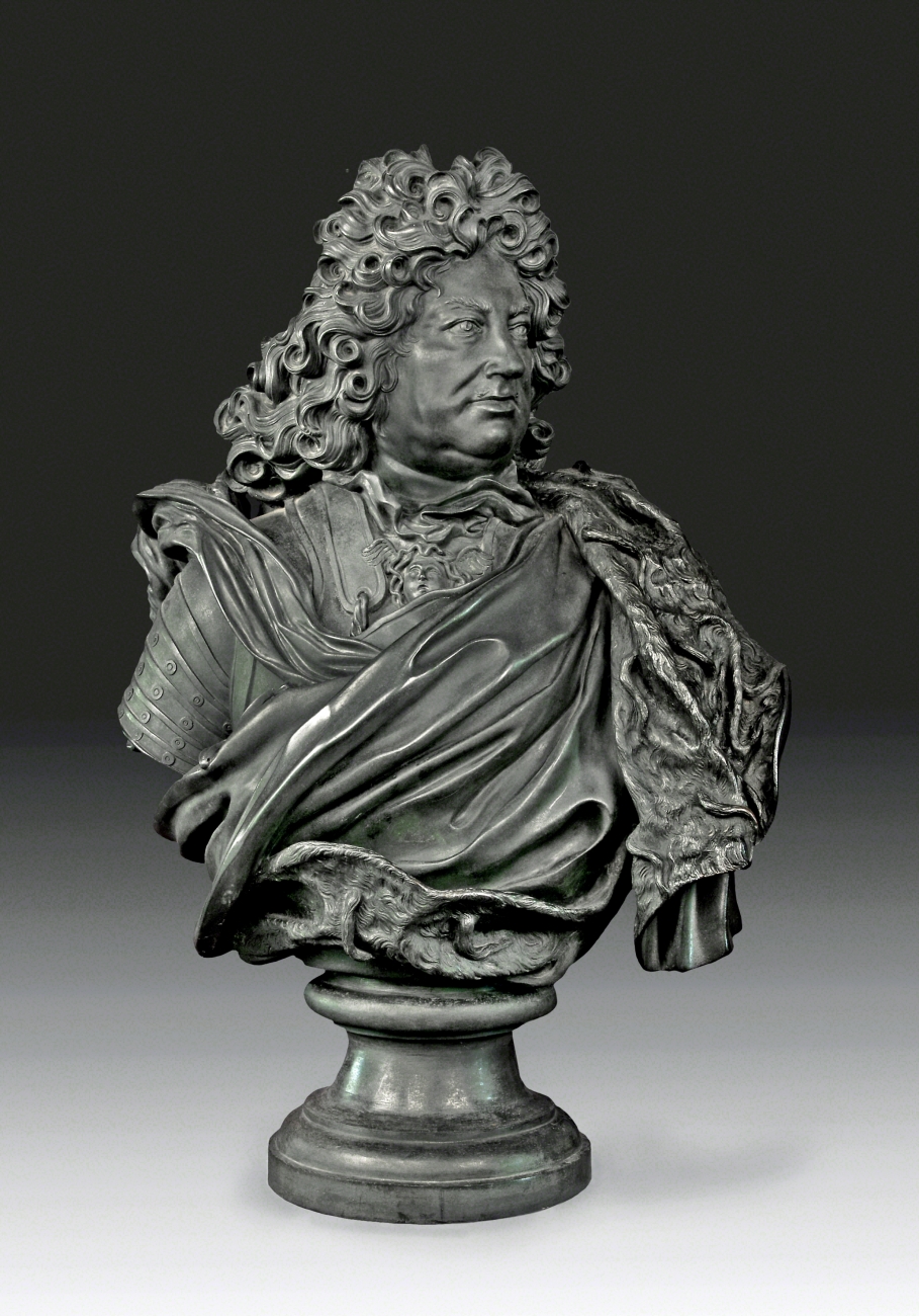
Bust of Landgrave Frederick II of Hesse Homburg, Berlin, 1701, bronze © Bad Homburg v. d. Höhe, Palace, Photo: Renate Deckers-Matzko
Andreas Schlüter (1659/60–1714) was a Baroque artist par excellence. Celebrated by his contemporaries as the ‘Michelangelo of the North’, Schlüter was not only a sculptor, but also an architect, town planner, and designer of magnificent interiors which were created to give lustre, for the first time, to the ambitious and emerging royal capital of Berlin. To commemorate the 300th anniversary of his death, the Bode-Museum is now holding the first ever major exhibition to be devoted to this important Berlin artist.
During the reign of Elector Friedrich III (from 1701 Friedrich I, ‘King in Prussia’), Schlüter was appointed official court sculptor and was entrusted with a variety of artistic roles in the Prussian capital, during a time when Prussia was emerging as a nascent new power.
This retrospective takes in all aspects of his multifaceted work and, enriched by numerous outstanding loans, recreates the opulent world that this creator of Baroque Berlin fashioned and inhabited. The exhibition in the Bode-Museum runs from 4 April until 13 July 2014 and is spread over a total of 16 galleries and side rooms. On display are not only Schlüter’s own works, but also those of the greatest role models of his time, including sculptures by such distinguished artists as Gian Lorenzo Bernini, Francesco Mochi, Francois Girardon, and Antoine Coysevox.
More information is available at the exhibition website.
◊ ◊ ◊ ◊ ◊
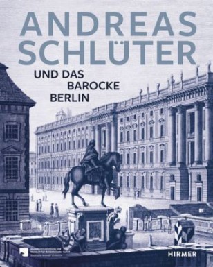
Published by Hirmer, the catalogue is available from Artbooks.com:
Hans-Ulrich Kessler, ed., Andreas Schlüter: Schöpfer des Barocken Berlin (Munich: Hirmer Verlag, 2014), 540 pages, ISBN: 978-3777421995, 50€ / $95.
 Andreas Schlüter (1659/60–1714), der bedeutendste Architekt und Bildhauer der Barockzeit nördlich der Alpen, verwandelte um 1700 Berlin in eine moderne, barocke Residenzstadt. Anlässlich seines 300. Todestages erzählt das opulente Katalogbuch die spannende Geschichte von Schlüters künstlerischem Werdegang und bietet einen fundierten Überblick über sein Œuvre.
Zunächst am Hof des polnischen Königs tätig, wurde Schlüter 1694 von Kurfürst Friedrich III. von Brandenburg, ab 1701 König Friedrich I. von Preußen, nach Berlin berufen. Fortan war er als Hofkünstler maßgeblich an der Umsetzung der Repräsentationsstrategien seines königlichen Auftraggebers beteiligt, wobei er sich an so glanzvollen Kunstzentren wie Rom und Paris orientierte. In 25 Beiträgen stellen namhafte Kenner Schlüters Werk umfassend vor, beginnend mit den Jahren in Danzig und Polen über seine Berliner Blütezeit mit Hauptwerken wie dem Reiterstandbild des Großen Kurfürsten,
dem Zeughaus und dem Berliner Schloss bis hin zu seinem
Spätwerk, der Berliner Villa Kameke.
Exhibition | Architectural Drawings of the Eighteenth Century
From the Museo di Roma:
Architectural Drawings of the Eighteenth Century / Disegni di architettura del Settecento
Museo di Roma, 20 December 2013 — 30 June 2014
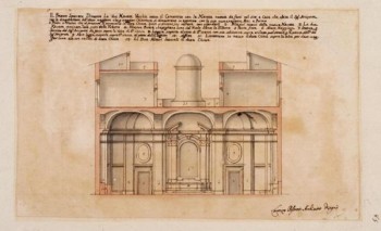
Lorenzo Possenti, Progetti per la nuova chiesa di Sant’Andrea a Gallicano, ca. 1731–33
The drawings exhibited in the “Hall of graphics” were selected from the collection of the Museum of Rome and come mainly from the collection of Antonio Muñoz. They testify the various architectural structures in Rome during the eighteenth century, which have greatly contributed to the creation of the image of the city.
In addition to the projects for monumental works commissioned by the popes, such as the Trevi Fountain, the facade of St. John Lateran, St. Paul Outside the Walls, there are those for minor works, such as small shrines, oratories, fountains and especially houses. A new type of building was conceived in this period: the apartment building, which helps to dramatically change the appearance of the city by marking its “gentrification.”
The designs, both by major architects (Ferdinando Fuga, Nicola Salvi) and other less well-known ones (Andrea Francesco Nicoletti, Girolamo Toma), are always very imaginative and extremely elegant from the point of view of graphics, especially those presenting the project to the potential buyer, the only means available to an artist to promote their work. Sketches, study sheets, design or academic drawings, and publications also allow to follow and better understand some important debates of the period relating to the “modern style” of the Roman Barocchetto opposed to the more austere “old style” or the difference between reproduction and imitation.
Exhibition | In the Library: Deforming and Adorning
Of the 29 volumes on display (dating from 1471 to 1973), 8 are from the eighteenth century, including Reynolds’s copy of Walpole’s Anecdotes of Painting and Christoph Gottlieb von Murr’s copy of Philipp von Stosch’s gem collection, Description des Pierres gravés du feu Baron de Stosch.
From the National Gallery of Art in Washington:
In the Library: Deforming and Adorning with Annotations and Marginalia
National Gallery of Art, Washington, D.C., 3 March — 27 June 2014
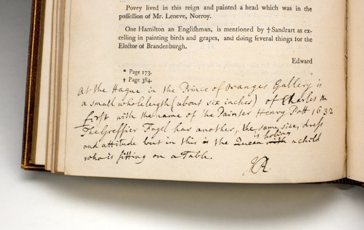
Horace Walpole, Anecdotes of Painting in England (Strawberry Hill, 1762–1771). National Gallery of Art Library, Gift of Joseph E. Widener. The remarks throughout this four-volume set reveal that this copy of an important 18th-century work on British paintings once belonged to Sir Joshua Reynolds (1723–1792). His commentary illuminates his relationship with the author and his role as the head of the Royal Academy of Arts.
◊ ◊ ◊ ◊ ◊
This exhibition highlights a selection of rare books that are unique not because of their content or imprint, but because of the one-of-a-kind markings and additions that readers of the past made to the printed text. From their hand-written marginal commentary and sketches to custom bindings with extra pages and illustrations to editorial notes, each of these books has been transformed from a standard mass-printed volume into a uniquely personal object. They illuminate us with insights into the texts themselves, as well as the readers who read, enjoyed, and annotated them—and the relationships between the two.
The printing press was introduced in the West by Johannes Gutenberg in the 15th century. Prior to this, manuscripts were often copied by hand—a laborious process that was both expensive and prone to errors. In contrast, the printed page permitted the creation and distribution of exact copies of a book to a wide audience. This revolutionary technology changed the spread of knowledge forever.
Yet even a mass-printed volume has the potential to survive as a unique artifact: perhaps all other copies of a particular edition are destroyed; perhaps an individual copy gains notoriety through its provenance, having belonged to a figure of historical importance; or perhaps the book is bound in a peculiar way. In the hand-press period, variance in collation is common for a variety of reasons. Alterations to the text might be made during the print run; moreover, bookbinding was performed separately from the actual publishing process, which allowed for the possibility of pages being lost, added, trimmed, or bound in a different order.
In spite of all these variations, the specific focus of this exhibition is alterations made to the text by readers. The books on view all began as copies identical to hundreds or thousands of others, but each has been transformed by the addition of new information. Many include annotations ranging from navigational aids to detailed critiques of the text.
In the manuscript era, extra-large margins were sometimes provided for scholars to provide commentary, known as glosses. Many early printed books incorporated these earlier glosses along with the main text, and modern readers continued the tradition of adding their own thoughts in the margins. Benjamin Franklin was known to have penned entire debates with authors in the blank spaces of his books; other readers adorned the text with sketches and illustrations. Some readers had their books rebound and included extra material such as prints, notes, and correspondence. In several cases, the author has made editorial notes and revisions for the next edition of his book.
Exhibition | Neapolitan Drawings
As noted at ArtDaily (25 March 2014) . . .
Dessins Napolitain / Neapolitan Drawings
Marty de Cambiaire, Paris, 25 March — 10 April 2014

Filippo Falciatore (actif à Naples 1718–1768),
Térée pourchassant Procné et Philomèle
◊ ◊ ◊ ◊ ◊
Marty de Cambiaire’s seventh show takes place in their offices, located on 16 place Vendôme, from 25 March to 4 April 2014. It focuses on a group of forty Neapolitan and Sicilian drawings dating from the 16th to the 18th century. A bilingual exhibition catalogue has been published, similar to their previous catalogues (which can be downloaded from their website). Given the scarcity of the literature on the subject, this publication provides fresh scholarship on a field still relatively unknown to the public as well as connoisseurs. There are very few Neapolitan drawings in public collections. They are equally rare far on the market. Therefore several years were required to build up a coherent group intended to illustrate 350 years of graphic production in Naples and Sicily. The ultimate goal of this venture, quite unprecedented in the old master drawing market, is to make a significant scientific contribution to the field.
Neapolitan drawing has long been a neglected research area. A few sporadic shows—some of which quite recent—have confirmed art historians’ strong interest in an area which remains largely unexplored. There is thus ample room for fascinating discoveries. The Neapolitan school (which includes the Sicilian school) is largely underrepresented in museums. Nor is it clearly identified as a distinct school, especially in comparison with other Italian schools such as the Florentine, Bolognese, Roman or Venetian ones. The Neapolitan school gives us the opportunity to examine draughtsmanship in its various aspects as an active practice, apprehended as a working method and not just as an intellectual concept destined to confer a social status to artists. Consequently their intention is to showcase the specificities of the Neapolitan school, through a group of 40 drawings dating between 1550 and 1800.
The prime concern in gathering them has been to focus on quality, condition and scholarly interest. It turned out to be a challenging venture given the traditional scarcity of Neapolitan drawings on the market. The gallery has decided to bring together artists such as Giordano and Solimena, already well-researched and known from the public, with other artists whose names are not so familiar but who were essential in the genesis of this school. It seemed equally important to illustrate the diversity of: the techniques used; the subjects illustrated; and the purpose of these drawings, which could be preparatory studies either for religious altarpieces or for decorative compositions, for book frontispieces or decorative pieces, or even intended as works of art per se.
The show explores successive periods in the Neapolitan and Sicilian graphic production. The earliest sheet presented is by a rare and precious artist, Leonardo Castellano (circa 1544–1588). This is complemented by two other 16th-century drawings by Francesco Curia (1538–1610), while Belisario Corenzio (circa 1558–1646) takes us into the 17th century. There big names such as Luca Giordano, Matia Preti and Salvator Rosa feature, alongside with lesser-known artists who deserve a reappraisal, including Cesare and Francesco Fracanzano, Battistello Carraciolo. and Aniello Falcone. Francesco Solimena and his pupils, Francesco De Mura, Francesco Celebrano, Giacopo Cestaro, Lorenzo de Caro and Campora are represented with several sheets which demonstrate how profoundly the master renewed the field of decorative painting. Solimena also revived the creative process itself, passing down to his pupils a method on which they firmly grounded their approach and developed their own talent. The final drawing in the collection’s chronology is a large sheet by Giuseppe Camarrano, a neoclassical artist rarely seen on the market. It illustrates the evolution of Neapolitan art towards a more European neo-classical taste.
One of the key criteria in the selection process was the condition of each drawing. However it is important to bear in mind that Neapolitan artists viewed their drawings not only as a mental projection but also as a hands-on device: assembled and pasted together, some sheets were thus pricked for transfer, while others bear the marks of working life in the studio. This show presents a varied and representative overview of the Neapolitan school. New attributions will be put forward, which will shed new light on certain artists. The gallery is thus hoping to provide a panorama of a rich, distinct graphic field.
Exhibition | From Poussin to Monet
This 2015 exhibition will showcase French paintings from the National Gallery of Ireland:
Von Poussin bis Monet. Die Farben Frankreichs
Bucerius Kunst Forum, Hamburg, 10 October 2015 — 17 January 2016
Die gesellschaftlichen und künstlerischen Umbrüche des 18. Jahrhunderts leiteten die Moderne ein. War Frankreichs Gesellschaft und Kunst im 17. Jahrhundert noch durch den königlichen Hof und die königliche Kunstakademie streng zentralistisch reglementiert, so gewann die bürgerliche Öffentlichkeit im Zeitalter der Aufklärung neue Bedeutung und Macht. Die Veränderungen der französischen Gesellschaft vor und nach der Revolution wurden auch zum Motor der Revolutionierung der künstlerischen Mittel. Die Ausstellung Von Poussin bis Monet. Die Farben Frankreichs widmet sich der künstlerischen Befreiung der französischen Malerei von den Zwängen und Regeln des Akademismus hin zur Freilichtmalerei des Impressionismus. Die Ausstellung präsentiert die Sammlung französischer Malerei der National Gallery of Ireland in Dublin. Sie wird durch eine Auswahl von Gemälden aus der Sammlung Rau (UNICEF) in Remagen ergänzt.
Die Ausstellung entsteht in Kooperation mit dem Arp Museum Bahnhof Rolandseck.
Exhibition | Hogarth, Reynolds, Turner: The Dawn of Modernity
From the museum:
Hogarth, Reynolds, Turner: Pittura inglese verso la modernità
The Dawn of Modernity: Painting in Britain in the 18th Century
Fondazione Roma Museo, Palazzo Sciarra, Rome, 15 April — 20 June 2014
Curated by Carolina Brook and Valter Curzi
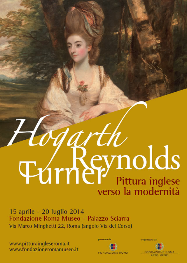 The exhibition offers the public a comprehensive overview of the social and artistic development that took place during the XVIII century in step with the hegemony gained by Great Britain at the historical, political, and economic level. For this purpose a corpus of over one hundred works belonging to prestigious institutions such as the British Museum, the Tate Gallery, the Victoria & Albert Museum, the Royal Academy, the National Portrait Gallery, the Museum of London, and the Uffizi Gallery has been formed and is accompanied by a nucleus of works from the important American collection belonging to the Yale Center for British Art.
During the eighteenth century England became an authentic international power, leader of the Industrial Revolution and of the domination of the sea routes, and thus raised the issue of establishing its own artistic school for the first time. The economic development lead by Great Britain created a new middle-class which included professionals, industrialists, merchants, scientists and philosophers who, having found that visible arts considerably affirmed their new social status, became patrons of those masters who over the century contributed to the definition of a domestic school.
The exhibition is divided into seven sections featuring a selection of works by the most significant English painters, for the purpose of documenting the portrait and landscape genres that found more fortune during this century, creating a figurative language capable of interpreting modernity which, in the nineteenth century, became a reference throughout Europe. Visitors may admire artists such as Hogarth, Reynolds, Gainsborough, Wright of Derby, Stubbs, Füssli, Constable, and Turner. Their works offer a significant cross-section of the peculiarity and originality of English art, an exhibition of which has not been held in Rome since 1966.
Update (added 19 April 2014) — The exhibition press release, which details the seven sections, is available as a PDF file here».
The catalogue is available from Skira:
Carolina Brook and Valter Curzi, Hogarth, Reynolds, Turner: Pittura inglese verso la modernità (Rome: Skira, 2014), 304 pages, ISBN: 8857222707, €40.
Exhibition | Grand Collecting: Richard Wilson and the Ford Collection
One more to add to the list of exhibitions of work by Richard Wilson, on this the 300th anniversary of his birth. The exhibition as described at ArtFund:
Grand Collecting: Richard Wilson and Masterworks from the Ford Collection
Gainsborough’s House, Sudbury, Suffolk, 11 January — 31 May 2014

Richard Wilson, Syon House from Richmond Gardens, Evening, 1761 (?)
(Gainsborough’s House)
◊ ◊ ◊ ◊ ◊
The Ford Collection originated in the 18th century thanks to Benjamin Booth, who amassed the largest set of works by Royal Academician Richard Wilson, held at the time. Booth’s grandson Richard Ford, an author, traveller and connoisseur, continued collecting into the 19th century, and in later years Richard’s great grandson Sir Brinsley Ford strengthened the existing areas of work as well as introducing his own interests.
At the centre of the collection are works by Richard Wilson, one of the leading figures in British landscape painting, whose influence was felt across Europe. Along with artists including Thomas Gainsborough he created the country’s ‘landscape tradition’, with John Hoppner proclaiming: ‘We recollect no painter, who, with so much originality of manner, united such truth and grandeur of expression’.
The works in this exhibition, predominantly collected by Booth, show the breadth of his expression from early drawings in Rome to paintings in the 1770s. Other featured artists include renowned English painter, John Frederick Lewis.
2014 marks 300 years since the birth of Richard Wilson and the beginning of the Georgian age. In celebration, Gainsborough’s House is displaying the 1714 Sudbury Map, hand drawn map on vellum using iron gall ink and various shades of watercolour. It was created by Cornelius Brewer, whose signature can be seen with the inscription and it contains the earliest image of Gainsborough’s House.
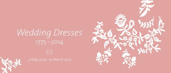
Exhibition | Wedding Dresses, 1775–2014
Press release for the upcoming exhibition at the V&A (also see the exhibition blog). . .
Wedding Dresses, 1775–2014
Victoria & Albert Museum, London, 3 May 2014 — 15 March 2015
Curated by Edwina Ehrman
◊ ◊ ◊ ◊ ◊
The V&A’s spring 2014 exhibition will trace the development of the fashionable white wedding dress and its interpretation by leading couturiers and designers, offering a panorama of fashion over the last two centuries. Wedding Dresses 1775–2014 will feature over 80 of the most romantic, glamorous and extravagant wedding outfits from the V&A’s collection. It will include important new acquisitions as well as loans such as the embroidered silk coat design by Anna Valentine and worn by The Duchess of Cornwall for the blessing after her marriage to HRH The Prince of Wales (2005), the purple Vivienne Westwood dress chosen by Dita Von Teese (2005), and the Dior outfits worn by Gwen Stefani and Gavin Rossdale on their wedding day (2002).
Displayed chronologically over two floors, the exhibition will focus on bridal wear. Most of the outfits were worn in Britain, by brides of many faiths. Alongside the dresses will be accessories including jewellery, shoes, garters, veils, wreaths, hats and corsetry as well as fashion sketches and personal photographs. Garments worn by bridegrooms and attendants will also be on display. The exhibition will investigate the histories of the garments, revealing fascinating and personal details about the lives of the wearers, giving an intimate insight into their occupations, circumstances and fashion choices.

Silk brocade gown, hat, and shoes, 1780. Olive Matthews Collection, Chertsey Museum. Photo by John Chase.
The opening section of the exhibition will feature some of the earliest examples of wedding fashion including a silk satin court dress (1775) and a ‘polonaise’ style brocade gown with straw bergère hat (1780) lent by the Chertsey Museum. The preference for white in the 19th century will be demonstrated by a white muslin wedding dress decorated with flowers, leaves and berries (1807) recently acquired by the V&A, and a wedding outfit embellished with pearl beads design by Charles Frederick Worth (1880). As the 19th century drew to a close historical costume influenced fashion. A fine example will be a copy of a Paris model designed by Paquin Lalanne et Cie made by Stern Brothers of New York (1890) for an American bride.
Designs from the 1920s and 1930s will illustrate the glamour of bridal wear which was now influenced by evening fashions, dresses were slim-hipped and made from richly beaded textured fabrics and slinky bias-cut satin. During the Second World War when clothing restrictions were introduced, brides needed to make imaginative and practical fashion choices. They used non-rationed fabrics such as upholstery materials, net curtaining and parachute silk, or married in a smart day dress or service uniform. On display will be a buttercup patterned dress made in light-weight upholstery fabric by London dressmaker Ella Dolling (1941).
Wedding Dresses 1775–2014 will also explore the growth of the wedding industry and the effect of increasing media focus on wedding fashions. Improvements in photography in the early 20th century encouraged photojournalism and society weddings were reported in detail in the national press and gossip columns. Two of the most spectacular wedding dresses on show will be the Norman Hartnell dress made for Margaret Whigham (later Duchess of Argyll) for her marriage to Charles Sweeny (1933), and the Charles James ivory silk satin dress worn by Barbara ‘Baba’ Beaton for her marriage to Alec Hambro (1934). These dramatic dresses will be seen alongside archive film and news clippings of the occasions as examples of society ‘celebrity’ weddings.
The mezzanine level will feature wedding garments from 1960 to 2014, taking the exhibition right up to date with Spring/Summer 2014 designs by Jenny Packham and Temperley Bridal. Emphasising the glamour and spectacle of weddings today, key designers will include Vivienne Westwood, John Galliano, Christian Lacroix, Lanvin, Vera Wang, Jasper Conran, Bruce Oldfield, Osman, Hardy Amies, Bellville Sassoon, Mr.Fish, John Bates and Jean Muir, with millinery by Philip Treacy and Stephen Jones. This section will explore the changing social and cultural attitudes to the wedding ceremony and marriage in the late 20th century and will feature examples of innovative and unconventional wedding outfits including dresses designed by Gareth Pugh and Pam Hogg for the weddings of Katie Shillingford (2011) and Mary Charteris (2012).
A version of the exhibition previously toured to Bendigo Art Gallery, Victoria, Australia (2011), Museum of New Zealand Te Papa Tongarewa (2011–12), National Museum of Singapore (2012), and Western Australian Museum, Perth, Australia (2012–13).
◊ ◊ ◊ ◊ ◊
From the V&A:
Edwina Ehrman, The Wedding Dress: 300 Years of Bridal Fashions, 2nd edition (London: V&A Publishing, 2014), 208 pages, ISBN 978-1851778133, £30 / $50.
 This sumptuous book draws on wedding garments in the V&A’s collection, photographs, letters, memoirs, newspaper accounts and genealogical research to explore the history of the wedding dress and the traditions that have developed around it since 1700. It focuses on the white wedding dress, which became fashionable in the early nineteenth century and is now chosen by women across the world. The book considers the way couturiers and designers have challenged and refreshed the traditional white dress and the influence of the wedding industry, whose antecedents lie in the commercialization of the wedding in Victorian Britain. The Wedding Dress is not only about costume, but also about the cultivation of the image of the bride. This book is a glorious tribute to an exquisite, stylish, glamorous gown, the romance of its evolution and the splendour of its design.
Edwina Ehrman is a curator of Textiles and Fashion at the V&A and of the exhibition The Wedding Dress: 300 Years of Bridal Fashions. She is co-author of The London Look: Fashion from Street to Catwalk and a contributor
to The Englishness of English Dress.
Exhibition | The Coast and the Sea
Press release (4 October 2013) from D. Giles:
Linda S. Ferber, The Coast and the Sea: Marine and Maritime Art in America (London: D. Giles Limited, 2013), 104 pages, ISBN 978-1907804311, $30 / £20.
The Society of the Four Arts, Palm Beach, Florida, 25 January — 9 March 2014
The Baker Museum of Art, Naples, Florida, 19 April — 6 July 2014
Portland Museum of Art, Portland, Maine, January — May 2015
The Mattatuck Museum, Waterbury, Connecticut, 6 June — 13 September 2015
The New York State Museum, Albany, New York, 24 October 2015 — 22 February 2016

A Southeast Prospect of the City of New York, ca. 1756–61. Oil on canvas. 38 x 72 1/2 in. (96.5 x 184.2 cm). Collection of the New-York Historical Society.
◊ ◊ ◊ ◊ ◊
The Coast and the Sea: Marine and Maritime Art in America will be published by D Giles Limited, in association with the New-York Historical Society, in December 2013. It is an appealing and colourful volume which presents over 50 of the best marine paintings and artifacts from the New-York Historical Society’s impressive maritime art collection.
 The works range in date from 1750 to 1940, and are by eminent marine artists like Thomas Birch, John Frederick Kensett, and Charlton T. Chapman. Highlights include large format canvasses of famous sea battles, ships at work, portraits of heroic sea captains, dashing naval officers like James Gordon Bennett Jr. and pioneering merchants, such as the aptly named Preserved Fish of New York, prominent in shipping in the early 19th century. There are also maritime themed objects such as an engraved whale’s tooth from the late 19th century, and a silver presentation urn commemorating acts of bravery from the War of 1812. An essay by curator Linda S. Ferber places the works within their wider historical and cultural narrative.
The works are then arranged thematically rather than by artist or period; there is for example a chapter on the Anglo-Dutch tradition in American marine art: the War of 1812 with its great sea battles and heroes and romantic and idealized visions of the sea. A section on the merchant marine and maritime trade features paintings of major trading posts in and around the Pearl River Delta, including Hong Kong; some of these paintings were by a group of Chinese artists working in the European style specifically for the export market. There are views of the Hudson River and the great Port of New York, as well as Gilded Age nostalgia for the great age of sail, with its clipper ships and majestic wind-jammers.
Linda S. Ferber is Senior Art Historian, the New-York Historical Society.
◊ ◊ ◊ ◊ ◊
Note (added 1 August 2014) — The original version of this posting included only the first two exhibition venues.


leave a comment