Exhibition | Magna Carta: Cornerstone of Liberty
On the eve of the 800th anniversary of Magna Carta. . . From the MFA press release (7 March 2014). . .
Magna Carta: Cornerstone of Liberty
Museum of Fine Arts, Boston, 2 July — 1 September 2014
Sterling and Francine Clark Art Institute, Williamstown, Massachusetts, 6 September — 2 November 2014
Library of Congress, Washington, D.C., 6 November 2014 — 19 January 2015
British Library, London, 13 March — 1 September 2015
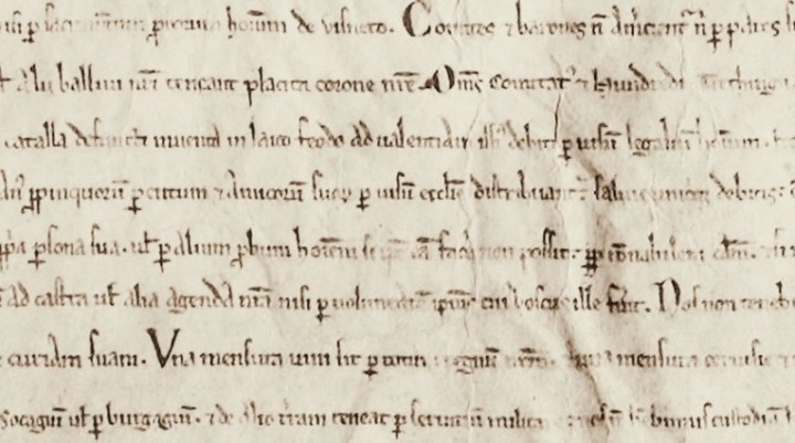
One of only four surviving copies of the original Magna Carta—a document written in 1215 that subsequently served as a symbol for liberty around the world—travels to the Museum of Fine Arts, Boston (MFA), this summer for a special exhibition of approximately 20 works in the Museum’s Art of the Americas Wing. An inspiration for the US Constitution and Bill of Rights, the exemplar owned by the UK’s Lincoln Cathedral and typically housed in Lincoln Castle will be on view in the exhibition, Magna Carta: Cornerstone of Liberty, from July 2–September 1, 2014. In partnership with the Massachusetts Historical Society (MHS) and the Massachusetts House of Representatives, Magna Carta will join historical loans as well as portraits and works of art from the Museum’s collection. The MFA’s Sons of Liberty Bowl (1768) by Paul Revere—which is engraved with the words “Magna/Charta” and “Bill of/Rights”—will be among the works that help tell the story of patriots and revolutionaries who fought for freedom in the face of tyranny across the centuries. Founding Fathers, presidents and abolitionists, inspired by the liberties enshrined in Magna Carta, will be represented in the exhibition through portraits, marble busts and historical documents that celebrate their commitment to civil rights and equal representation under the law.
“Our state’s rich history and preeminent cultural institutions provide a wonderful showcase for Magna Carta,” House Speaker Robert A. DeLeo said. “Massachusetts’ tourism industry is booming and the House of Representatives is proud to provide substantial support for the arts, travel and tourism. Last month we extended this commitment by allocating sizeable funding to bring Magna Carta to Massachusetts. Thank you to the Museum of Fine Arts and my colleagues in the Legislature for their work in securing this momentous historic treasure.”
State Representative Cory Atkins (D-Concord), House Chair of the Joint Committee on Tourism, Arts, and Cultural Development, and Alice Richmond, Deputy Chair of the Magna Carta 800th Anniversary 2015 Committee, worked with the MFA and Lincoln Cathedral to secure the loan of Magna Carta. After being shown in the MFA’s Edward and Nancy Roberts Family Gallery, Magna Carta travels to the Sterling and Francine Clark Art Institute in Williamstown, Massachusetts, and the Library of Congress in Washington, DC, before returning to London for an exhibition celebrating the charter’s 800th anniversary. All four of the original surviving 1215 Magna Carta manuscripts will be brought together for the first time in history at a three-day event at the British Library February 2–4, 2015.
“Massachusetts is a fitting place to learn about the founding of this great nation and the development of civil rights and liberties both here and abroad. I am incredibly proud to bring Magna Carta to Boston, where it inspired so many Sons of Liberty and Founding Fathers to action, and am grateful to the Lincoln Cathedral for this extraordinary loan,” said Malcolm Rogers, Ann and Graham Gund Director at the MFA. “This foundational document will hold a place of honor among American masterpieces and colonial treasures that bring some of the Commonwealth’s most famous patriots to life.”
For centuries, Magna Carta—Latin for “Great Charter”—has had symbolic influence on politicians, judges and revolutionaries who were inspired by its protections against tyranny and arbitrary rule. Written in Latin, the document laid the foundation for modern concepts of justice, due process, trial by jury and civil rights, and was reissued multiple times in the Middle Ages. In the 17th century, its influence was revived during the English Civil War. The concepts enshrined in the document also had a profound influence on the American Colonies, where it influenced the Declaration of Independence and later the US Constitution—particularly the Bill of Rights.
Massachusetts Historical Society President Dennis Fiori added, “This exhibition will be a terrific experience for anyone with an interest in the people and events that shaped our country. In partnering with the MFA, the MHS is pleased to loan a number of documents and artifacts that define our nation’s history. It will be quite something to see the nearly 800-year-old Magna Carta together with important US documents—such as handwritten drafts of the Declaration of Independence and an annotated copy of the Constitution—that were inspired by it. I am sure the Founding Fathers would be pleased.”
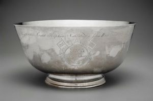
Paul Revere, Sons of Liberty Bowl, 1768 (Boston: MFA).
The exhibition at the MFA will focus on Massachusetts’ and America’s ongoing relationship with Magna Carta—highlighting early presidents, Founding Fathers and patriots whose ideals and philosophies have shaped our nation. Iconic works of art, loans and manuscript material from the MHS and other lenders will tell the story of these remarkable men and women, and the revolutionary acts inspired by Magna Carta. The MFA’s silver Sons of Liberty Bowl, a highlight of the Museum’s renowned collection of art and objects from Revolutionary Boston, honors 92 members of the Massachusetts House of Representatives who refused to rescind a letter protesting the Townshend Acts (1767), which taxed tea, paper, glass and other commodities. This act of civil disobedience by the ‘Glorious Ninety-Two’ was a major step leading to the American Revolution, and demonstrates the legacy and influence of Magna Carta more than 500 years after it was first issued.
“Since the 17th century, Magna Carta has served as a potent symbol for all Americans seeking protection against ‘the insolent menaces of villains in power,’ as the inscription on the Liberty Bowl states,” said Gerald W. R. Ward, New Hampshire State Representative (D-Portsmouth) and the MFA’s Senior Consulting Curator and Katharine Lane Weems Senior Curator of American Decorative Arts and Sculpture Emeritus. “This exhibition offers the rare opportunity, in this digital age, to see the nearly 800-year-old ‘real thing’ that is the ancient underpinning for so many freedoms and rights that we cherish today.”
A number of items from the Museum’s collection will be paired with loans from the MHS. Two manuscript copies of the Declaration of Independence, originally penned by John Adams and Thomas Jefferson, will be accompanied by the MFA’s marble busts of the two Founding Fathers. The MFA’s painting of lawyer Theodore Sedgwick (about 1808) by Gilbert Stuart complements a miniature portrait from the MHS of Elizabeth Freeman (“Mumbet”) (1811), a woman who was enslaved in Massachusetts and was represented by Sedgwick when she successfully sued for her freedom—a case which abolished slavery in the Commonwealth. Other loans from the MHS include a portrait of former Massachusetts Governor and US Vice President Elbridge Gerry and his annotated copy of the US Constitution, as well as two Paul Revere Sword in Hand Notes (currency)—one of which depicts the words “Magna Carta.” (more…)
New Book | Architecture, Art, and Identity in Venice
From Ashgate:
Nebahat Avcioglu and Emma Jones, eds., Architecture, Art, and Identity in Venice and its Territories, 1450–1750 (Aldershot: Ashgate, 2013), 326 pages, ISBN: 978-1472410825, £70.
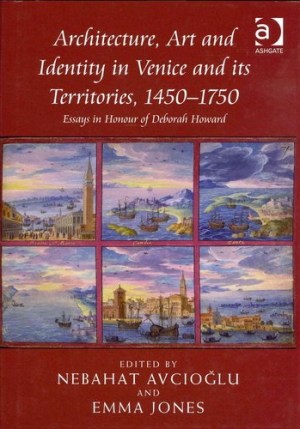 Cities are shaped as much by a repertoire of buildings, works and objects, as by cultural institutions, ideas and interactions between forms and practices entangled in identity formations. This is particularly true when seen through a city as forceful and splendid as Venice. The essays in this volume investigate these connections between art and identity, through discussions of patronage, space and the dissemination of architectural models and knowledge in Venice, its territories and beyond. They celebrate Professor Deborah Howard’s leading role in fostering a historically grounded and interdisciplinary approach to the art and architecture of Venice.
Based on an examination and re-interpretation of a wide range of archival material and primary sources, the contributing authors approach the notion of identity in its many guises: as self-representation, as strong sub-currents of spatial strategies, as visual and semantic discourses, and as political and imperial aspirations. Employing interdisciplinary modes of interpretation, these studies offer ground-breaking analyses of canonical sites and works of art, diverse groups of patrons, as well as the life and oeuvre of leading architects such as Jacopo Sansovino and Andrea Palladio. In so doing, they link together citizens and nobles, past and present, the real and the symbolic, space and sound, religion and power, the city and its parts, Venice and the Stato da Mar, the Serenissima and the Sublime Port.
Nebahat Avcioglu is Associate Professor of Art History at Hunter College, CUNY. Emma Jones is a PhD Candidate in the Department of History of Art at the University of Cambridge.
◊ ◊ ◊ ◊ ◊
C O N T E N T S
Introduction, Nebahat Avcioglu and Emma Jones
Section 1: Identity, Space and the City
1. ‘Soli deo honor et gloria’? Cittadino lay procurator patronage and the art of identity formation in Renaissance Venice, Allison Sherman
2. The Sisters Sagredo: Passion and patronage in eighteenth-century Venice, Esther Gabel
Section 2: Drawing, Mapping and Translating Venice
3. The early history of Jacopo Sansovino’s scheme for Piazza San Marco: A proposal, Paul Davies
4. Venice 1557: Sabbadino’s city plan, Elena Svalduz
5. Translatio Longhena Salute: Drawings and patrons in pilgrimage between Venice, Rome, and Gostyn, Andrew Hopkins
Section 3: Palladio’s Creations and Creating Palladio
6. The twin sacristy arrangement of Palladio’s Venice: origins and adaptations, Lydia Hamlett
7. Palladio’s patrons and music: Connections between cultural interests and architecture: The Villa Pisani at Bagnolo, Laura Moretti
8. How Palladio became famous: Paolo Gualdo and the Republic of Letters, Tracy E. Cooper
Section 4: The Production of Sacred Space
9. The seventeenth-century project for the church of San Nicolò del Lido in Venice: Liturgical problems and new architectural models in the counter-Reformation, Massimo Bisson
10. Innovation or afterthought? Dating the San Giobbe retrochoir, Joanne Allen
11. Venice’s cathedral of San Pietro di Castello, 1451–1630, Gianmario Guidarelli
Section 5: Time and Place in the Stato da Mar
12. The topography of antiquity in descriptions of Venetian Crete, Johanna D. Heinrichs
13. Jacopo Foscarini, Francesco Barozzi and the oracles of Leo the Wise, Blake de Maria
14. Becoming a man of empire: The construction of patrician identity in a republic of equals, Patricia Fortini Brown
Call for Papers | The Church of San Pietro di Castello
While this is primarily a Renaissance and seventeenth-century project, the organ of San Pietro di Castello is the mid-eighteenth-century work of Pietro Nachini. Surely ‘San Pietro in the Eighteenth Century’ would make a fine epilogue to the proceedings . . .
The Church of San Pietro di Castello and the Birth of the Patriarchate of Venice
Venice, 10–12 December 2015
Proposals due by 15 June 2014
The research project Chiese di Venezia. Nuove prospettive di ricerca (Churches of Venice. New Research Perspectives), promoted by the Studium Generale Marcianum and representing one of the activities of the ISSR San Lorenzo Giustiniani, consists in a long-term program of multidisciplinary conferences, each focused on a particular church of Venice. The project aims at promoting the combination of the different disciplines in order to understand the complex phenomena and dynamics of which Venetian churches, in their articulate reality and manifold meanings, have been catalyst elements for centuries. Besides facing in an innovative way the study of the churches of Venice, ‘releasing’ the potentialities of each discipline through their mutual comparison, the project takes up the challenge of reaching a wider public than just the specialist one, whose contributions, constituting a central aspect, are collected in a special series of volumes edited by Marcianum Press.
After the study of the churches of San Bartolomeo (2011), of the Scalzi (2012), of San Lazzaro dei Mendicanti (2013) and of San Zaccaria (scheduled for 2014), the conference of 10–12 December 2015 will be dedicated to the study of the church of San Pietro di Castello. In the context of the urban development of Venice, the Olivolo Island, set at the extreme peripheral area of the town, was appointed to be the see of the Bishop’s complex (including the cathedral, the bishop’s palace and the residences of the canons) since the 9th century. Since 1451, when the island was chosen to be the seat of the Patriarch of Venice, a series of urban and architectural renewals led to a complete restoration of the complex by Mauro Codussi, Andrea Palladio, Francesco Smeraldi, Gerolamo Grappiglia and Baldassarre Longhena.
The conference will concentrate on the transformation from the Episcopate of Castello to the Patriarchate of Venice, in the framework of Renaissance Venice, and will focus the attention on the early patriarchs, particularly on Lorenzo Giustiniani. The figure of the proto-patriarch of Venice, who played a fundamental role in the history of the local Church, will be studied not only in the context of the changing fortunes of the Venetian Church of the 15th century but also in the wider context of the changing fortunes of the whole town during 16th and 17th centuries, when the process of canonization and the following worship of the Saint represented the key to discover the relationship between Church and state. The conference intends to reconsider, from a multidisciplinary point of view, the role of the Patriarchate in the history of the town, starting from the church of San Pietro di Castello in its architectural consistency, passing on to the following decoration campaigns and getting to the 17th century rebuilding.
In particular, the following topics will be analysed:
• The area of the parish: social and pastoral aspects
• The curia: the patriarchal palace and the residences of the canons. Historical-architectural aspects, fortunes of the chancellery and life of the familia patriarchalis
• The Giustinianean Reform in the context of the Italian Church of 15th century
• Worship and music in San Pietro di Castello
• The church’s interior decoration between the 15th and 16th century
• The façade: sacred liturgy and urban ritual
• The worship of Saint Lorenzo Giustiniani: religious and civil rituals. The worship of the Saint in the area of the Republic: prayers, churches, place names and festivals dedicated to San Lorenzo Giustiniani outside Venice
• The iconography of Saint Lorenzo Giustiniani
• Seventeenth-century church: the chancel (architecture, painting, sculpture), the Vendramin Chapel and Luca Giordano. The interior decoration of the church.
Proposals, accompanied by a brief abstract (200 words, max 1200 characters) and by a one-page cv, will have to be submitted sending an e-mail to chiesedivenezia@marcianum.it by 15th June 2014. Successful applicants will be notified by 31st July 2014.
Exhibition | Goya and the Altamira Family
Press release (10 April 2014) from The Met:
Goya and the Altamira Family
The Metropolitan Museum of Art, New York, 22 April — 3 August 2014
Curated by y Xavier F. Salomon
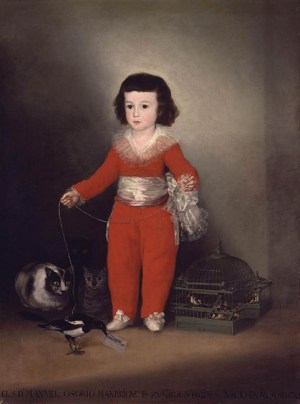
Goya, Manuel Osorio Manrique de Zuñiga, 1787–88
50 x 40 inches (NY: The Metropolitan Museum of Art)
By special arrangement with the Banco de España, from April 22 through August 3, The Metropolitan Museum of Art will reunite for the first time four portraits painted by Francisco de Goya (1746–1828) that were commissioned by the Count of Altamira, who was a director of the bank. Goya and the Altamira Family will consist of
• Banco de España’s Portrait of the Count of Altamira
• the Metropolitan’s beloved Manuel Osorio Manrique de Zuñiga, the so-called ‘Red Boy’
• the beautiful portrait of Manuel’s mother and sister, Condesa de Altamira and Her Daughter, María Agustina, from the Metropolitan Museum’s Robert Lehman Collection
• and a portrait of Manuel Osorio’s brother Vicente Joaquin de Toledo, from a private collection.
All four portraits were painted between 1786 and 1788 when Goya was beginning to experiment with aristocratic portraiture. A fifth portrait depicting Count Altamira’s middle son, Juan María Osorio, was painted around the same time by Agustín Esteve, one of Goya’s pupils, and will be lent by the Cleveland Museum of Art.
The Banco de San Carlos (the present-day Banco de España) commissioned Goya to create a series of portraits of the directors of the bank in Madrid, including the full-length depiction of Vicente Joaquín Osorio Moscoso y Guzmán, Count of Altamira. It was the success of this portrait that led to the subsequent commission to Goya for three portraits of members of the count’s family.
The exhibition is organized by Xavier F. Salomon, Peter Jay Sharp Chief Curator, The Frick Collection, New York. The exhibition is made possible by the Placido Arango Fund. It was organized by The Metropolitan Museum of Art with the assistance of the Consulate of Spain in New York.
◊ ◊ ◊ ◊ ◊
From the museum’s shop:
Xavier F. Salomon, Goya and the Altamira Family, Metropolitan Museum of Art Bulletin (Spring 2014), 48 pages, $15.
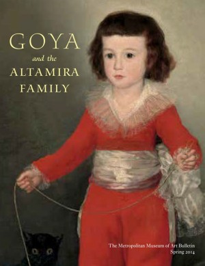 Ever since its arrival at the Metropolitan as part of the outstanding collection of Old Master paintings bequeathed by New York financier and philanthropist Jules Bache, Goya’s portrait of Don Manuel Osorio, the three- or four-year-old son of the conde de Altamira, has ranked as one of the museum’s most popular paintings. In celebration of the reinstallation of the Metropolitan’s European Paintings galleries, inaugurated last May, the condesa de Altamira and her son have been temporarily reunited in a gallery devoted to Goya and his contemporaries in Spain. But from the outset this move was planned as just the first stage of a more eventful family reunion that would also include Don Manuel’s older brother, Vicente Osorio, and their father, Vicente Joaquín Osorio de Moscoso y Guzmán, conde de Altamira: all four pictures outstanding works by Goya.
The publication is made possible through the generosity of the Lila Acheson Wallace Fund for The Metropolitan Museum of Art, established by the cofounder of Reader’s Digest.
New Book | Spanish Drawings in the Princeton University Art Museum
This critical catalogue of Princeton’s Spanish drawings was reviewed by Zahira Véliz Bomford for The Burlington Magazine 156 (April 2014): 244–45. From Yale UP:
Lisa A. Banner with contributions by Jonathan Brown, Robert S. Lubar, and Pierre Rosenberg, Spanish Drawings in the Princeton University Art Museum (New Haven: Yale University Press, 2013), 192 pages, ISBN: 978-0300149319, $40.
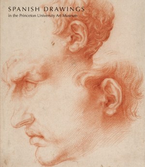 The Princeton University Art Museum’s collection of Spanish drawings includes masterworks by artists such as Jusepe de Ribera (1591–1652), Bartolomé Esteban Murillo (1617–1682), Francisco Goya (1746–1828), Pablo Picasso (1881–1973), and Salvador Dalí (1904–1989). Although many of the drawings in the collection relate to celebrated paintings, commissions, and other works by these artists, they remain largely unknown. Most have not been published previously and many are attributed here for the first time.
In Spanish Drawings in the Princeton University Art Museum, preeminent scholars enrich the growing corpus of work on Spanish drawings with original research. Each of the 95 drawings is reproduced in color, often accompanied by comparative illustrations. Watermarks have been documented with beta radiography and are included in an appendix. Provenances and
artist biographies round out this detailed record of one of the
most important collections of its kind.
Lisa A. Banner has written extensively on Spanish baroque art and has contributed to exhibition catalogues, symposia, and conferences throughout the world, most recently co-curating The Spanish Manner at The Frick Collection (2010–11).
Call for Articles | The Uses of Genius
From Le Blog de L’ApAhAu:
Penser le génie à travers ses usages / The Uses of Genius
Special Issue of L’Esprit Créateur (Johns Hopkins University Press), Fall 2015
Proposals due by 30 June 2014
Le génie est, depuis la première modernité, l’une des notions par lesquelles se construit la valeur des œuvres d’art et des innovations scientifiques, de même que celle de leurs agents (artistes, poètes, scientifiques, philosophes, inventeurs, grandes figures de toutes sortes). À ce titre, le génie permet d’ancrer le sentiment d’appartenance des communautés autour d’une instance de valorisation qui leur est universellement reconnue, sur laquelle peuvent être fondées les hiérarchies culturelles, les mécanismes d’admiration et d’émulation, les stratégies de recyclage du passé, la constitution projective de la postérité, etc. Bref, malgré son extrême singularité, le génie permet de fonder du commun. Ainsi, cette figure peut être envisagée non pas comme un naturel inné dont on pourrait s’employer à comprendre la cause (transcendantale ou physiologique), mais plutôt comme une construction historique et culturelle correspondant à différents usages.
C’est précisément ces usages du génie que nous proposons d’interroger, dans le cadre d’un numéro collectif de la revue L’Esprit créateur (Johns Hopkins University Press) dont la publication est prévue pour l’automne 2015.
Plus particulièrement, les propositions attendues s’intéresseront au statut problématique que possède la notion de génie au sein des discours dans lesquels elle se trouve impliquée, du Moyen Âge aux vingtième et vingt-et-unième siècles français. Il s’agira non seulement de souligner la variété des constructions dont le génie a fait l’objet dans son histoire, mais aussi d’insister sur les utilisations particulières de cette notion en fonction des contextes de son élaboration (disciplines, pratiques de valorisation, querelles et débats ; enjeux politiques, économiques, sociologiques, linguistiques, littéraires, philosophiques, esthétiques, etc.). Loin de relever de l’évidence, le génie demande au contraire à être sans cesse redéfini selon les circonstances dans lesquelles il est convoqué. Nous ne chercherons donc pas à saisir l’essence du génie, mais plutôt à interroger les modalités même de cette utilisation. Pour ce faire, nous proposons d’aborder le génie dans la longue durée, de façon à mettre en évidence la pluralité des champs dans lesquels la notion est investie. Nous inscrivons cette longue durée dans le contexte français (ce qui n’exclut pas de considérer les phénomènes de transferts culturels), non seulement parce que l’histoire française du génie a été négligée jusqu’à présent par la critique, mais aussi pour nous permettre de mesurer les conséquences de cette spécificité dans l’élaboration des discours.
Plusieurs angles d’approche peuvent être envisagés (mais la liste n’est pas exhaustive) :
• Quelles sont les modalités du rapport entre la singularité du génie et la communauté à laquelle il appartient selon une époque/région/circonstance donnée ?
• Comment (dispositif publicitaire, acteurs, public, médias, etc.) et à quelles fins ont été construites dans leur temps les grandes figures du génie ?
• Comment se constitue le rapport du génie à la norme et à ses éventuelles transgressions, aux usages et aux innovations, à la règle et au dérèglement sous toutes ses formes ?
• Y a-t-il une éthique propre au génie ?
• Comment les différentes formes d’art représentent-elles le génie ?
• Quel(s) génie(s) aujourd’hui et pourquoi?
Les propositions d’articles d’une page maximum, accompagnées d’une brève bio-bibliographie pourront nous être adressées par mél aux adresses suivantes : ann.jefferson@new.ox.ac.uk & jean-alexandre.perras@mod-langs.ox.ac.uk avant le 30 juin 2014. La date limite pour la remise des articles est le 31 décembre 2014.
Responsables du numéro
Ann Jefferson, Professor of French, New College, Oxford
Jean-Alexandre Perras, Postdoctoral fellow, Lady Margaret Hall, Oxford
Call for Panel Proposals | ASECS 2015, Los Angeles
At Auction | Rare Books at Ketterer Kunst in Hamburg

Cornelis Haak’s, Vues des palais, bâtiments célèbres, places mascarades,
et autres beautés singulières de la ville de Venise (Leiden, 1762)
More information is available here»
◊ ◊ ◊ ◊ ◊
As noted at ArtDaily (3 May 2014). . .
It was nothing less but a revolution in the history of nautical cartography—the sea atlas by Lucas Janszoon Waghenaer. The extremely scarce work in first French edition with a Spanish title sheet will be sold in the auction of Rare Books at Ketterer Kunst in Hamburg on 19 and 20 May with an estimate of €85.000. Lucas Janszoon Waghenaer’s Spieghel der Zeevaert offers a variety of information, such as an innovative illustration of the coastal line in combination with coast profiles. Additionally, his maps are particularly captivating for their accuracy and their rich artful adornment with ornaments, ships and sea monsters.
Besides ships and regattas, Cornelis Haak’s rare series of views of Venice from 1762 also show splendid palaces, manors, churches and bridges in the city of lagoons, as well as its masked balls, acrobats and religious processions. The series of vedutas in the style of Canaletto and Marieschi is especially impressive for the two large city maps of Venice published by Pieter van der Aa. The estimate is at €35.000.
Next to the first print of the first Latin edition of Abraham Ortelius’ Theatrum Orbis Terrarum, its style and content paved the path for later atlases, Johann Heinrich Zedler’s 64-volume encyclopedia will enter the race with an estimate of €30.000. The monumental lexicon, also called Der Zedler after its publisher, may well hold the claim of being the occident’s greatest reference work in print in those days, together with the Spanish Espasa.
While the French natural scientist Jean Baptiste Audebert entirely dedicated his main work in two volumes Oiseaux dorés ou à reflets métalliques from 1802 to the splendid illustration of humming birds (estimate: €15.000), Frederic Moore and Charles Swinhoe committed themselves to the world of exotic butterflies. The extremely rare book in ten volumes, released over a period of 23 years, comprises all Indian butterflies known of in 1913. The work in an excellent coloring will be called up with an estimate of €25.000.
The full press release is available here»

Map of Venice by Pieter van der Aa from Cornelis Haak’s, Vues des palais, bâtiments célèbres, places mascarades, et autres beautés singulières de la ville de Venise (Leiden, 1762). Click on the image to enlarge. More information is available here»
Call for Papers | Diocletian’s Palace for Adam, Clérisseau, and Cassas
As posted at H-ArtHist:
Diocletian’s Palace in the Works of Adam, Clérisseau, and Cassas
Institute of Art History – Center Cvito Fiskovic, Split, Croatia, 27–29 November 2014
Proposals due by 30 June 2014
The Grand Tour, as an educational rite of passage, reached its peak in the 18th century, widening its travelling radius outside of Rome and Italy onto further parts of the Roman Empire, among which Dalmatia held a prominent position. The international interdisciplinary conference on architecture, urban planning, and architectural decoration aims to explore the role of Diocletian’s Palace in the work of Robert Adam, Charles-Louis Clérisseau, and Louis-François Cassas, as well as the influence of Diocletian’s palace on the development of European neoclassicism.
We welcome proposals for 20-minute papers. Each proposal should consist of a 250-word abstract and short biographical statement. Proposals are due by 30/06/2014 (with notification of acceptance by 15/07/2014). Direct proposals and questions as a PDF attachment to asverko@ipu.hr.
Important information
• There is no conference fee.
• Accommodation for the participants can be arranged at organizer’s expense.
• The organizers are not able to pay for the travel expense of the participants.
• Conference languages: English and French.
• The length of spoken contribution should not exceed 20 minutes. Contributions will be divided into sections according to their topics. Each section will be followed by discussion.
• Papers will be published in the conference proceedings. Please send final written version (both in English or French) by 31/01/2015.
Scientific Committee
Joško Belamaric (Institute of Art History – Centre Cvito Fiskovic Split)
Milan Pelc (Institute of Art History Zagreb)
Pierre Pinon (ENSA de Paris-Belleville, École de Chaillot, Institut
national d’Histoire de l’Art Paris)
John A. Pinto (Princeton University)
Ana Sverko (Institute of Art History – Centre Cvito Fiskovic Split)
Organizing Committee
Joško Belamaric (Institute of Art History – Centre Cvito Fiskovic Split)
Milan Pelc (Institute of Art History Zagreb)
Ana Sverko (Institute of Art History – Centre Cvito Fiskovic Split)
New Book | The Colours of Rome
From The Old School Press:
John Sutcliffe, The Colours of Rome: An Examination of the Use of Colour on the Façades of Today’s Rome, with Historical and Other Notes, and a Selection of Colours Copied on Site (Bath: The Old School Press, 2013), 32 pages, ISBN: 978-1899933334 (standard edition), £185 / $350.
 John’s vision for this book was a survey of the city’s colourscape, a palette of colours so different from that of, say, Venice, Tuscany, or Palermo, and a palette that is today in a period of great change. His new essay traces the history of that palette and the influences that have led it to its state today.
To illustrate the essay John made several trips to Rome, returning finally with twenty sheets of colours copied directly from the buildings themselves. His carefully chosen selection is designed to demonstrate the diversity of the palette and also to draw together two very different strands of tradition that have created the appearance of the streets of Rome today. Each of the twenty colours is illustrated with a large painted patch applied directly onto its own sheet of Magnani wove using water-based paints. These sheets are loose in a wallet within the cased sleeve that holds the book, thus making it possible for the reader to explore the colours in different combinations just as they appear in Rome. A swatch card of chips of the twenty colours is also included in the wallet.

The wallet in the sleeve contains the paint-outs for the twenty colours that John Sutcliffe has chosen as representative of the colours of Rome. They are accompanied by a swatch card summarising the full set.
The text is printed in 14pt Dante on a large page of Magnani hand-made laid paper, with headings printed from wood-letter. The book is bound in full cloth and is protected by the sleeve inside which the wallet of paint patches is attached. In addition to the standard edition of ninety-nine copies there were twenty-five de luxe copies (ALL SOLD) that take the form of a solander box containing, as well as the standard edition book, bottled samples of nine of the most important pigments, mostly earths, in powdered form. The book is 323mm by 235mm (about 12.75 inches by 9.25 inches); the solander box is slightly larger and 92mm deep (3.75 inches). The price is £185 (euro235, US$350) for a standard copy (and was £350 (euro435, US$580) for a de luxe copy). Trade discount is one quarter. Postage and packing are charged as usual at cost.
If you know our books you will know we love colour, so this was a project that appealed from the outset. If Rome, architecture, and the way our cities change interest you, this book will appeal, and we hope that the production qualities will enhance your enjoyment. Uniquely, it is the only record of the most characteristic colours to be seen in Rome today, perhaps the only such survey of any city.
John Sutcliffe knows about colour. A former regional curator at the National Trust and now active as a decorative painter, his expertise in the topic, in particular in an architectural setting, was extensively used by Farrow & Ball, a company that will surely be known to many, at the time when they were first building up their reputation for traditional paints and hand-produced wallpapers. For many years John’s interest in colour has taken him to the Mediterranean, to Italy, and in particular to Rome. The buildings of Rome’s centro storico carry on their walls many layers of coloured limewash and distemper, layers that have both accumulated and decayed over time, thereby capturing the changing fashions in colour.
More information is available here»
◊ ◊ ◊ ◊ ◊
As described by Martin Gayford for The World of Interiors (May 2014), p. 50:
 [The book] is a work of decorative art in itself, elegantly printed and bound by a private press in a limited edition. . . . In the course of his investigations, Sutcliffe made a discovery. His initial assumption was that the shades he saw had been used since the days of ancient Rome. This turned out to be completely wrong. . . . Tastes in colour in the age of Michelangelo, Bernini, and the Grand Tour were all different, both from each other and from what can be seen today. In earlier centuries, Rome would have looked lighter and bluer. . . . The dramatically dark walls Sutcliffe loves date back only to the late 19th century and the Mussolini regime. In recent decades, these have begun to be replaced by a new fashion for ‘old colours’—that is, 17th- and 18th-century hues rediscovered by careful scraping of old paintwork. The colours of cities seem, like most things, to fluctuate through time.
David Watkin likewise praises the “beautifully produced book,” in his review for TLS, “Raw and Burnt,” (7 March 2014): 22.







leave a comment