New Book | Merian, Metamorphosis insectorum Surinamensium
From Lannoo, with more information available here:
Maria Sibylla Merian, Metamorphosis insectorum Surinamensium Verandering der Surinaamsche insecten / Transformation of the Surinamese Insects, edited by Marieke van Delft (Tielt: Lannoo Publishers, 2017), 200 pages, ISBN: 978 94014 33785, $145 / €99.
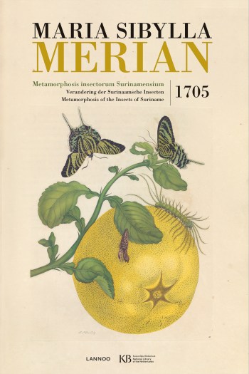 Maria Sibylla Merian (1647–1717) was a German naturalist and scientific illustrator. She is considered to be among the most significant contributors to the field of entomology because of her careful observations and documentation of the metamorphosis of the butterfly. In 1705, Merian published Metamorphosis Insectorum Surinamensium, for which she became famous. No more than 30 copies of this masterwork are left worldwide. In 2017, it will be 300 years since Maria Sibylla Merian’s death. To mark the occasion, a facsimile of Merian’s highly successful book will be released. Modern readers will at last be able to see with their own eyes how detailed and colourful Merian’s magnificent work was. The book includes a comprehensive introduction and background information by renowned historians and biologists.
Included is a foreword by Merian specialist Redmond O’Hanlon and a biographical introduction by art historian Ella Reitsman. Kay Etheridge, professor biology at Gettysburg College, discusses the meaning of Merian’s work for biology, and Bert van de Roemer talks about the historical context.
Marieke van Delft is Curator of Early Printed Collections at the Koninklijke Bibliotheek, National Library of the Netherlands, in The Hague. She studied history and book history at the universities of Amsterdam and Leiden and gained her doctorate in cultural studies at the KU Leuven. Van Delft has published on many aspects of the history of the printed book in the Netherlands. In collaboration with Uitgeverij Lannoo she has created real-size facsimile editions of major books from the collections of the Koninklijke Bibliotheek: Atlas De Wit (2012), Nozeman & Sepp, Nederlandsche vogelen (2014), and Merian’s Metamorphosis insectorum Surinamensium (2016).
New Book | The Botany of Empire in the Long Eighteenth Century
From Harvard UP:
Yota Batsaki, Sarah Burke Cahalan, and Anatole Tchikine, eds., The Botany of Empire in the Long Eighteenth Century, Dumbarton Oaks Symposia and Colloquia (Cambridge: Harvard University Press, 2017), 406 pages, ISBN: 978 08840 24163, $90 / £67 / €81.
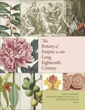 This book brings together an international body of scholars working on eighteenth-century botany within the context of imperial expansion. The eighteenth century saw widespread exploration, a tremendous increase in the traffic in botanical specimens, taxonomic breakthroughs, and horticultural experimentation. The contributors to this volume compare the impact of new developments and discoveries across several regions, broadening the geographical scope of their inquiries to encompass imperial powers that did not have overseas colonial possessions—such as the Russian, Ottoman, and Qing empires and the Tokugawa shogunate—as well as politically borderline regions such as South Africa, Yemen, and New Zealand. Essays examine the botanical ambitions of eighteenth-century empires; the figure of the botanical explorer; the links between imperial ambition and the impulse to survey, map, and collect botanical specimens in ‘new’ territories; and the relationships among botanical knowledge, self-representation, and material culture.
Yota Batsaki is Executive Director of Dumbarton Oaks.
Sarah Burke Cahalan is Director of the Marian Library, University of Dayton.
Anatole Tchikine is Assistant Director of Garden and Landscape Studies, Dumbarton Oaks.
New Book | Gardens of Court and Country: English Design, 1630–1730
From Yale UP:
David Jacques, Gardens of Court and Country: English Design, 1630–1730 (London: Paul Mellon Centre for Studies in British Art, 2017), 416 pages, ISBN: 978 0300 222012, £45 / $75.
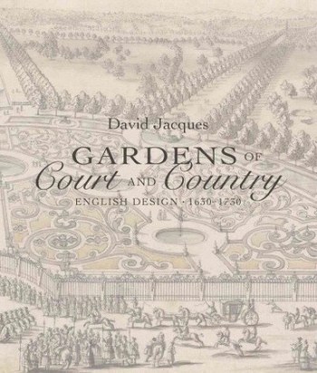 Gardens of Court and Country provides the first comprehensive overview of the development of the English formal garden from 1630 to 1730. Often overshadowed by the English landscape garden that became fashionable later in the 18th century, English formal gardens of the 17th century displayed important design innovations that reflected a broad rethinking of how gardens functioned within society. With insights into how the Protestant nobility planned and used their formal gardens, the domestication of the lawn, and the transformation of gardens into large rustic parks, David Jacques explores the ways forecourts, flower gardens, bowling greens, cascades, and more were created and reimagined over time. This handsome volume includes 300 illustrations—including plans, engravings, and paintings—that bring lost and forgotten gardens back to life.
David Jacques is an independent scholar and a consultant in historic landscapes, parks, and gardens.
Exhibition | Volcanoes

Sir William Hamilton’s volcano archive includes paintings he commissioned (Oxford: Bodleian).
◊ ◊ ◊ ◊ ◊
From the press release (16 January 2017) for the exhibition:
Volcanoes
Weston Library, Bodleian, Oxford, 10 February 2017 — 21 May 2017
Curated by David Pyle
A new exhibition at the Bodleian Libraries uses a spectacular selection of eye witness accounts, scientific observations, and artwork to chart how our understanding of volcanoes has evolved over the past two millennia. The exhibition examines some of the world’s most spectacular volcanoes including the 79 AD eruption of Vesuvius—one of the most catastrophic eruptions in European history—and the 19th-century eruptions of Krakatoa and Santorini, two of the first volcanic eruptions to be intensely studied by modern scientists.
Today, satellites monitor volcanic activity and anyone with internet access can watch volcanic eruptions live in real time. In the past, volcanic eruptions were described in letters, manuscript accounts, and early printed books and illustrated through sketches, woodcuts, and engravings. Many of these fascinating accounts are preserved in the Bodleian’s historic collections and will be on display in Volcanoes at the Weston Library.
The human encounters with volcanoes that are traced in the exhibition range from Pliny the Younger’s account of the dramatic eruption of Vesuvius in 79 CE to early Renaissance explorers who reported strange sightings of mountains that spewed fire and stones. Also explored is how scientific understanding of volcanoes and the Earth’s interior have developed over time, from classical mythology and early concepts of subterranean fires to the emergence of modern volcano science, or volcanology, in the 19th century. The exhibition brings together science and society, art, and history and will delight visitors of all ages.
 The exhibition is curated by David M. Pyle, Professor of Earth Sciences at the University of Oxford, whose research uses historical sources to improve our knowledge of past volcanic activity and to shed light on what might happen in the future at young or active volcanoes. It will feature treasures from the Bodleian Libraries, some of which have never been on public display before. In addition, the exhibition will feature items on loan from the Natural History Museum in London and from the University of Oxford’s Museum of Natural History, the Museum of the History of Science, and Magdalen College. Highlights of Volcanoes include:
• Fragments of ‘burnt’ papyrus scrolls from the ancient Roman town of Herculaneum, which were buried during the 79 AD eruption of Vesuvius
• The earliest known manuscript illustration of a volcano, found in the margin of a 14th-century account of the voyage of St Brendan, an Irish monk who travelled across the north Atlantic in the 6th century
• A stunning illustration of the Earth’s subterranean fires from Athanasius Kircher’s Mundus Subterraneus, an influential 17th-century work which proposed that volcanoes were created where the Earth’s internal fires escaped at the surface
• Spectacular 18th-century studies of Vesuvius by Scottish diplomat and early volcanologist William Hamilton who wrote one of the first descriptive monographs of an active volcano
• 18th- and 19th-century weather diaries and paintings that capture the distant effects and freak weather conditions caused by major volcanic eruptions in Iceland and Indonesia
• ‘Infographics’ from 19th-century natural historians Alexander von Humboldt and Charles Daubeny whose work has contributed greatly to our current understanding of volcanoes
• Lava and rock samples, maps, lecture notes, and scientific equipment from 19th-century volcanologists and explorers
The exhibition curator David Pyle said: “Humans have lived with volcanoes for millions of years yet scientists are still grappling with questions about how they work. This exhibition features historical representations and ideas about volcanoes that are captivating and dramatic but most importantly these works provide scientists today with valuable insights into how these enigmatic phenomena behave. Looking back at history can help us learn valuable lessons about how best to reduce the effects of future volcanic disasters.”
Richard Ovenden, Bodley’s Librarian said: “Volcanoes are one of the most extraordinary marvels of the natural world and have fascinated us for millennia. This exhibition draws on both the rich collections held at the Bodleian and cutting edge scientific research to demonstrate the power and fascination of volcanoes through time.”
David Pyle, Volcanoes (Oxford Bodleian Libraries, 2017), 224 pages, ISBN: ISBN: 978 18512 44591, £20.
New Book | Why Preservation Matters
Released in October from Yale UP:
Max Page, Why Preservation Matters (New Haven: Yale University Press, 2016), 224 pages, ISBN: 978 03002 18589, $25.
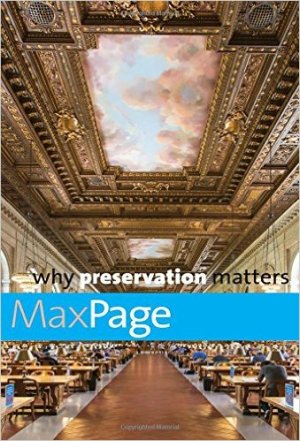 Commemorating the fiftieth anniversary of the National Historic Preservation Act, a critique of the preservation movement—and a bold vision for its future
Every day, millions of people enter old buildings, pass monuments, and gaze at landscapes unaware that these acts are possible only thanks to the preservation movement. As we approach the October 2016 anniversary of the United States National Historic Preservation Act, historian Max Page offers a thoughtful assessment of the movement’s past and charts a path toward a more progressive future.
Page argues that if preservation is to play a central role in building more-just communities, it must transform itself to stand against gentrification, work more closely with the environmental sustainability movement, and challenge societies to confront their pasts. Touching on the history of the preservation movement in the United States and ranging the world, Page searches for inspiration on how to rejuvenate historic preservation for the next fifty years. This illuminating work will be widely read by urban planners, historians, and anyone with a stake in the past.
Max Page is a professor of architecture and history at the University of Massachusetts Amherst, author of The City’s End: Two Centuries of Fantasies, Fears, and Premonitions of New York’s Destruction, and winner of the Spiro Kostof Award from the Society of Architectural Historians, a Guggenheim Fellowship and the Rome Prize. He lives in Amherst, MA.
New Book | English Delftware Apothecary Jars
Available from Oakeley Books:
Alan Humphries, Henry Oakeley, and Victor Hoffbrand, English Delftware Apothecary Jars and Their Contents: The Victor Hoffbrand Collection (London: Oakley Books, 2017), ISBN: 978 0952 146131 (hardcover), £20 / ISBN: 978 0952 146148 (softcover), £12.
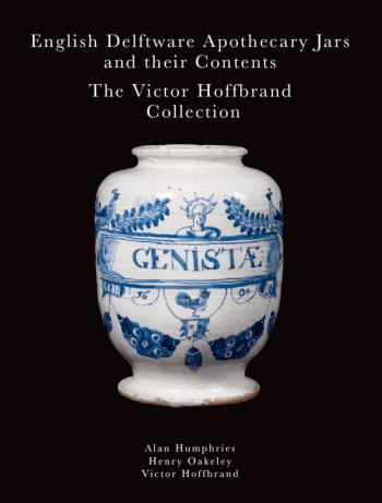 This collection of apothecary jars—used for storing medicines and their ingredients—comprises 183 items, dating from the 1640s to 1745. Collected by Professor Victor Hoffbrand, FRCP, it is the largest privately owned collection of English delftware apothecary jars in the United Kingdom. The fascination with English tin-glazed or delftware apothecary jars lies in their hand-painted designs and drug labels, in the composition and therapeutic uses of the drugs they contained, in the individual apothecaries who owned them, and in the potteries that manufactured them. The beauty of the jars’ designs may have helped to convince customers of the efficacy of their contents in treating and possibly curing diseases. For those interested in ceramics or the history of plant-based medicines, this sourcebook is complete with bibliographies, biographies, and glossaries of technical terms and materia medica.
Victor Hoffbrand is a professor of haematology. His collection of nearly 200 English delftware jars is now the second largest in the world and can be seen at the Royal College of Physicians in London.
Alan Humphries is a librarian at the Thackray Medical Museum in Leeds. He is responsible for the museum’s collections of over 10,000 books and 15,000 trade catalogues. To date he has located 2,419 English apothecary jars and has made their study his special interest.
Henry Oakeley is a garden fellow at the RCP. From contemporary pharmacopoeias, he has identified the 135 different medicines that the Hoffbrand apothecary jars contained and the plants (from Acorus to Zedoary), snakes, birds, and minerals that were used to manufacture those medicines.
◊ ◊ ◊ ◊ ◊
Book Launch: English Delftware Apothecary Jars
Royal College of Physicians, London, Thursday, 30 March 2017, 6:30–8:30
The evening begins with refreshments and a welcome by former RCP president Sir Richard Thompson. Short talks by Victor Hoffbrand, Alan Humphries, and Henry Oakeley will be followed by questions from the audience and a book signing. Copies of the book will be available to purchase (hardback £20, softback £12). Please RSVP to history@rcplondon.ac.uk by Friday, 24 March.
New Book | Jerónimo Antonio Gil
From UNM Press:
Kelly Donahue-Wallace, Jerónimo Antonio Gil and the Idea of the Spanish Enlightenment (Albuquerque: University of New Mexico Press, 2017), 392 pages, ISBN: 978 08263 57342, $65.
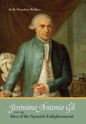 Examining the career of a largely unstudied eighteenth-century engraver, this book establishes Jerónimo Antonio Gil, a man immersed within the complicated culture and politics of the Spanish empire, as a major figure in the history of both Spanish and Mexican art. Donahue-Wallace examines Gil as an artist, tracing his education, entry into professional life, appointment to the Mexico City mint, and foundation of the Royal Academy of the Three Noble Arts of San Carlos. She analyzes the archival and visual materials he left behind; and, most importantly, she considers the ideas, philosophies, and principles of his era, those who espoused them, and how Gil responded to them. Although frustrated by resistance from the faculty and colleagues he brought to his academy, Gil would leave a lasting influence on the Mexican art scene as local artists continued to benefit from his legacy at the Mexican academy.
Kelly Donahue-Wallace is professor of art history at the University of North Texas. She is the author of Art and Architecture of Viceregal Latin America, 1521–1821 (UNM Press).
New Book | Enlightenment Travel and British Identities
From Anthem Press:
Mary-Ann Constantine and Nigel Leask, eds., Enlightenment Travel and British Identities: Thomas Pennant’s Tours of Scotland and Wales (London: Anthem Press, 2017), 250 pages, ISBN: 978 17830 86535, £70 / $115.
 Thomas Pennant of Downing, Flintshire (1726–1798), naturalist, antiquarian and self-styled ‘Curious Traveller’, published accounts of his pioneering travels in Scotland and Wales to wide acclaim between 1769 and 1784, directly inspiring Dr Johnson, James Boswell and hundreds of subsequent tourists. A keen observer and cataloguer of plants, birds, minerals and animals, Pennant corresponded with a trans-continental network of natural scientists (Linnaeus, Simon Pallas, Joseph Banks, Gilbert White) and was similarly well-connected with leading British antiquarians (William Borlase, Francis Grose, Richard Gough). Frequently cited as witness or authority across a wide range of disciplines, Pennant’s texts have seldom been themselves the focus of critical attention. There is as yet no biography of Pennant, nor any edition of his prolific correspondence with many of the leading minds of the European Enlightenment.
The ‘Tours’ were widely read and much imitated. As annotated copies reveal, readers were far from passive in their responses to the text, and ‘local knowledge’ would occasionally be summoned to challenge or correct them. But Pennant indisputably helped bring about a richer, more complex understanding of the multiple histories and cultures of Britain at a time when ‘Britishness’ was itself a fragile and developing concept. Because the ‘Tours’ drew on a vast network of informants (often incorporating material wholesale), they are, as texts, fascinatingly multi-voiced: many of the period’s political tensions run through them.
This volume of eleven essays seeks to address the comparative neglect of Pennant’s travel writing by bringing together researchers from literary criticism, art history, Celtic studies, archaeology and natural history. Attentive to the visual as well as textual aspects of his topographical enquiries, it demonstrates how much there is to be said about the cross-currents (some pulling in quite contrary directions) in Pennant’s work. In so doing they rehabilitate a neglected aspect of the Enlightenment in relation to questions of British identity, offering a new assessment of an important chapter in the development of domestic travel writing.
Mary-Ann Constantine is Senior Research Fellow at the University of Wales Centre for Advanced Welsh and Celtic Studies. She has written widely on the Romantic period in Wales and Brittany.
Nigel Leask is Regius Chair in English Language and Literature at the University of Glasgow. He divides his time between Glasgow, the West Highlands, and Mexico.
C O N T E N T S
List of Figures and Plates
Preface
Acknowledgements
List of Abbreviations
Introduction: Thomas Pennant, Curious Traveller — Mary-Ann Constantine and Nigel Leask
1 ‘A round jump from ornithology to antiquity’: The Development of Thomas Pennant’s Tours — R. Paul Evans
2 Thomas Pennant: Some Working Practices of an Archaeological Travel-Writer in Late Eighteenth-Century Britain — C. Stephen Briggs
3 Heart of Darkness: Thomas Pennant and Roman Britain — Mary-Ann Constantine
4 Constructing Identities in the Eighteenth Century: Thomas Pennant and the Early Medieval Sculpture of Scotland and England — Jane Hawkes
5 Shaping a Heroic Life: Thomas Pennant on Owen Glyndwr — Dafydd Johnston
6 ‘The First Antiquary of his Country’: Robert Riddell’s Extra-Illustrated and Annotated Volumes of Thomas Pennant’s Tours in Scotland — Ailsa Hutton and Nigel Leask
7 ‘A galaxy of the blended lights’: The Reception of Thomas Pennant — Elizabeth Edwards
8 ‘As if created by fusion of matter after some intense heat’: Pioneering Geological Observations in Thomas Pennant’s Tours of Scotland — Tom Furniss
9 Geological Landscape as Antiquarian Ruin: Banks, Pennant and the Isle of Staffa — Allison Ksiazkiewicz
10 Pennant, Hunter, Stubbs and the Pursuit of Nature — Helen McCormack
11 Pennant’s Legacy: The Popularization of Natural History through Botanical Touring and Observation in Nineteenth-Century Wales — Caroline R. Kerkham
Short Bibliography of Thomas Pennant’s Tours in Scotland and Wales
Index
New Book | Washington’s Monument
Constructed between 1848 and 1884—precisely when Mount Vernon was being preserved as a crucial part of America’s history—the obelisk at 555 feet high remains the tallest stone structure in the world. From Bloomsbury:
John Steele Gordon, Washington’s Monument and the Fascinating History of the Obelisk (New York: Bloomsbury, 2016), 224 pages, ISBN: 978 1620 406502, $27.
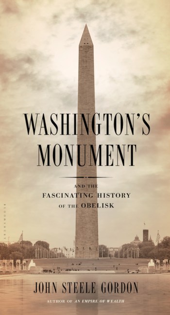 Conceived soon after the American Revolution ended, the great monument to George Washington was not finally completed until almost a century later; the great obelisk was finished in 1884, and remains the tallest stone structure in the world at 555 feet. The story behind its construction is a largely untold and intriguing piece of American history, which acclaimed historian John Steele Gordon relates with verve, connecting it to the colorful saga of the ancient obelisks of Egypt.
Nobody knows how many obelisks were crafted in ancient Egypt, or even exactly how they were created and erected since they are made out of hard granite and few known tools of the time were strong enough to work granite. Generally placed in pairs at the entrances to temples, they have in modern times been ingeniously transported around the world to Istanbul, Paris, London, New York, and many other locations. Their stories illuminate that of the Washington Monument, once again open to the public following earthquake damage, and offer a new appreciation for perhaps the most iconic memorial in the country.
John Steele Gordon is one of America’s leading historians, especially in the realm of business and financial history. He is the author of The Scarlet Woman of Wall Street, Hamilton’s Blessing, A Thread Across the Ocean, An Empire of Wealth, and The Great Game. He has written for Forbes, Worth, The New York Times, and The Washington Post, and his columns appear regularly in The Wall Street Journal. He lives in North Salem, New York.
New Book | Chinese Painting and Its Audiences
From Princeton UP:
Craig Clunas, Chinese Painting and Its Audiences (Princeton: Princeton University Press, 2017), 320 pages, ISBN: 978 0691 171937, $60 / £50.
 What is Chinese painting? When did it begin? And what are the different associations of this term in China and the West? In Chinese Painting and Its Audiences, which is based on the A. W. Mellon Lectures in the Fine Arts given at the National Gallery of Art, leading art historian Craig Clunas draws from a wealth of artistic masterpieces and lesser-known pictures, some of them discussed here in English for the first time, to show how Chinese painting has been understood by a range of audiences over five centuries, from the Ming Dynasty to today. Richly illustrated, Chinese Painting and Its Audiences demonstrates that viewers in China and beyond have irrevocably shaped this great artistic tradition.
Arguing that audiences within China were crucially important to the evolution of Chinese painting, Clunas considers how Chinese artists have imagined the reception of their own work. By examining paintings that depict people looking at paintings, he introduces readers to ideal types of viewers: the scholar, the gentleman, the merchant, the nation, and the people. In discussing the changing audiences for Chinese art, Clunas emphasizes that the diversity and quantity of images in Chinese culture make it impossible to generalize definitively about what constitutes Chinese painting. Exploring the complex relationships between works of art and those who look at them, Chinese Painting and Its Audiences sheds new light on how the concept of Chinese painting has been formed and reformed over hundreds of years.
Craig Clunas is Professor of the History of Art at the University of Oxford. His books include Screen of Kings: Royal Art and Power in Ming China; Empire of Great Brightness: Visual and Material Culture and Social Status in Early Modern China; and Art in China.
C O N T E N T S
Acknowledgments
Introduction
1 Beginning and Ending
2 The Gentleman
3 The Emperor
4 The Merchant
5 The Nation
6 The People
Conclusion
Notes
Bibliography
Index
Photography and Copyright Credits







leave a comment