Exhibition | Eighteenth-Century Fans from the Lázaro Collection

◊ ◊ ◊ ◊ ◊
Thanks to Pierre-Henri Biger for noting this exhibition now on view at the Fundación Lázaro Galdiano:
Abanicos del Siglo XVIII en la Colección Lázaro
Museo Lázaro Galdiano, Madrid, 10 October 2014 — 26 January 2015
Curated by Carmen Espinosa
La exposición Abanicos del siglo XVIII en la Colección Lázaro, comisariada por Carmen Espinosa, conservadora jefe del Museo Lázaro Galdiano, se compone de una cuidada selección de 24 piezas correspondientes a la edad de oro del abanico, elemento fundamental del adorno personal femenino, signo de distinción y de lujo. La gran variedad de abanicos que atesoró José Lázaro es muestra de su incansable búsqueda como coleccionista, de meses e incluso años, para encontrar piezas con las que obsequiar a su esposa, Paula Florido, desde que la conoció en 1901.
Los ejemplares expuestos en Abanicos del siglo XVIII en la Colección Lázaro constituyen un excelente repertorio que permite al visitante apreciar la evolución de este complemento femenino. Se muestran obras tempranas, del primer tercio del siglo XVIII, donde las referencias al barroco clasicista son evidentes; piezas en las que vemos cómo se va fraguando el gusto rococó que dio lugar al abanico galante, fiel reflejo de la vida refinada y placentera de los nobles y burgueses europeos del segundo tercio de la centuria; y otras de estructura sencilla, pero de calidad, que nos adentran en el estilo neoclásico y la moda Imperio.
Las pinturas de los países están realizadas sobre papel o vitela -piel de vaca o ternera, adobada y pulida-, materiales que permiten el plegado, y están inspiradas en asuntos mitológicos, históricos, galantes y pastorales. Los poemas homéricos de la Iliada y la Odisea, unidos a la Eneida de Virgilio y Las Metamorfosis de Ovidio, fueron una fuente inagotable para los pintores de abanicos junto a las gestas de Alejandro Magno cuya figura encarnó los ideales de valor, poder y nobleza. La pintura de los abanicos de estilo Luis XV, identificados con el rococó, refleja la creciente hegemonía de la mujer en la vida social, protagonista indiscutible reflejada en la diosa Venus, personificación del amor, la belleza y la fertilidad; en Juno, diosa del matrimonio y protectora de la mujer; o en Onfalia que hizo que Hércules olvidará su valentía abandonándose a los placeres del amor. De la historia religiosa, habitual en abanicos del primer tercio del siglo, se escogieron relatos del Antiguo Testamento, aquellos donde la mujer desempeñó un papel fundamental como Sansón y Dalila, Salomé, Betsabé o la reina de Saba. A partir de 1750, a la literatura se unen, como fuente de inspiración para los pintores, el teatro, la ópera y el ballet.
Las pinturas de Antoine Coypel, Charles Le Brun y sobre todo las de Jean Antoine Watteau y François Boucher, creadores de la fiesta galante y de la pintura pastoral, son otro gran referente para la decoración de los abanicos dieciochescos. Esta riqueza iconográfica se muestra en los abanicos de la Colección Lázaro y queda patente en esta exposición.
Variedad y calidad están presentes en los abanicos de esta muestra, citemos como ejemplo uno francés con la representación de la Alegoría de las Artes o el italiano con una escena de toilette, que figuran entre las más ostentosas de la colección. También podemos deleitarnos con los elegantes varillajes realizados en marfil o carey con trabajo de piqué -técnica italiana adoptada en Francia e Inglaterra que consiste en la incrustación de pequeños fragmentos de oro y plata-, tallados y calados en forma de rejilla o puntos -grillé / pointillé-, a los que se añaden pequeñas láminas de madreperla, plata dorada o corlada, nácar y, en ocasiones, piedras preciosas en el adorno de las palas y en el clavillo -pasador que sujeta las varillas, las fuentes y palas, del abanico-.
La colección de abanicos, compuesta por noventa piezas, es un caso especial entre todas las que conforman la Colección Lázaro. Sus obras, nos explica Carmen Espinosa, son algo más que objetos de colección, fueron testigos mudos de una relación personal, la de los coleccionistas José Lázaro y Paula Florido: desde que se conocieron, en 1901, y hasta la muerte de Paula en 1932, Lázaro regaló a su esposa abanicos en dos fechas muy señaladas: el 15 de enero, día de su cumpleaños, y el 29 de junio, en que celebraba su onomástica. Estos abanicos responden al gusto de Lázaro que se esforzó por encontrar las piezas con las que agasajar a su esposa aunque, evidentemente, existió cierta complicidad pues conocía su preferencia por la época de Luis XV y Luis XVI. Los abanicos del XVIII estaban considerados, a comienzos del siglo XX y aún hoy, como verdaderas joyas, muy buscadas y de gran valor.
◊ ◊ ◊ ◊ ◊
From La Tienda de Los Museos Online:
Este catálogo recoge la colección completa de abanicos (casi un centenar) en la que están incluidas las 24 piezas de la exposición.
Arte, Lujo y Sociabilidad: La Colección de Abanicos de Paula Florido (Año Edición, 2009), 134 pages, ISBN: 978-8496411906, 12€.
 Se trata de una muestra de abanicos de elite, con materiales en su mayoría nobles de textiles, metales, brillantes, países y varillaje bien hecho y torneado, en madera de peral o de carey, con ejemplares muy selectos que abarcan los siglos XVIII y XIX.
Entre los abanicos expuestos también se encontraban cocardas (tipo paipai redondeado y recogido) o pericones, de mayor tamaño, así como abanicos de baraja. En su mayoría abanicos franceses, italianos e ingleses, con escenas bíblicas, mitológicas, heroicas, galantes, de la Comedia del arte y muy pocos con motivos políticos como el del matrimonio de doña Isabel II. En el abanico elegante se buscaban brillos y destellos de luz para impactar en sociedad.
Un bello cuadro de Luis Paret y Alcazar La Tienda (1772), perteneciente al mismo museo, ilustra sobre el modo en que un caballero y una dama adquieren ejemplares de abanico o miniaturas en aquel colmado ilustrado.
Se añaden algunos grabados de Goya que también dan cuenta del uso del abanico en Los Caprichos, objeto de indumentaria de lujo en principio, que paulatinamente se fue popularizando. El abanico era una pieza utilizada por el hombre o la mujer indistintamente, aunque era la mujer la que ofrecía con él todo un código de señales de sociabilidad.
Exhibition | Goya: The Witches and Old Women Album
In the spirit of marking the 250th anniversary of Horace Walpole’s ’s The Castle of Otranto (published on Christmas Eve, 1764), I draw your attention to this upcoming exhibition, with best wishes for keeping the ghosts of Christmas at bay. –CH
Goya: The Witches and Old Women Album
The Courtauld Institute of Art, London, 26 February 2015 — 25 May 2014
Curated by Juliet Wilson-Bareau and Stephanie Buck
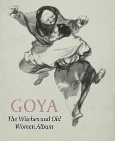 The Courtauld Gallery presents a groundbreaking exhibition which reunites for the first time all of the surviving drawings from one of Goya’s celebrated private albums. The albums were never intended to be seen beyond a small circle of friends, giving Goya the freedom to create images which range from the humorous, to the macabre and the bitingly satirical. With its themes of witchcraft, dreams and nightmares.
The ‘Witches and Old Women Album’ offers an important perspective on the development of Goya’s interest in old age, the fantastic and the diabolical. Above all, the drawings reveal his penetrating observation of human nature.
Additional information is available at The Guardian (10 December 2014).
◊ ◊ ◊ ◊ ◊
From Paul Holberton:
Juliet Wilson-Bareau with Stephanie Buck, Reva Wolf and Ed Payne, Goya: The Witches and Old Women Album (London: Paul Holberton Publishing, 2015), 200 pages, ISBN: 978-1907372766, £30.

Goya, Nightmare, ‘Witches and Old Women’ Album (D), page 20, ca. 1819–23. Brush, black ink, and wash on Netherlandish laid paper (New York: Metropolitan Museum of Art, Rogers Fund, 1919)
One of the masterpieces of The Courtauld Gallery’s collection of Spanish drawings is a sheet known as Cantar y bailar (Singing and dancing), page 3 from Goya’s Album D, also known as the ‘Witches and Old Women’ album. Bringing together all the extant album pages, currently numbered up to 23, this catalogue proposes a reconstruction of the album that would include the sheets from which Goya’s page numbers have been erased or trimmed away.
Goya began to create ‘journal albums’ of drawings relatively late in life, after the shattering illness that left him stone deaf before the age of fifty. It was a practice he would sustain until his death, creating eight albums (named with letters A to H) that originally included a total of some 550 drawings. Visually, technically and intellectually coherent, these albums are unified in their discrete techniques and types of support, and paginated (after the first). In these album pages Goya committed to paper his views, with or without written comments, on human nature and the world around him. Each album has its own distinctive subject matter, style and technique.
The later history of the eight albums, already expertly chronicled, remains under investigation. The disbound album sheets were remounted in large volumes by Goya’s son, then sold en bloc by his grandson. Following their final dispersal by Federico de Madrazo and Valentín Carderera in the 1860s and 1870s, many gaps remain in all the albums.
This exhibition and the research underpinning it on Album D are the pilot for an international project for the reconstruction of Goya’s graphic oeuvre. The publication will test the extent of Album D and explore the possible sequence and thematic coherence of the sheets. The individual Album D drawings will be reproduced as a proposed reconstructed sequence, each with detailed catalogue entry and technical information. In addition, the publication will define the context of the album by including a number of closely related works by Goya.
Exhibition | Martin van Meytens the Younger

Martin van Meytens, Joseph de France with his Family, 1748
(Stockholm, National Museum)
◊ ◊ ◊ ◊ ◊
Press release (via ArtDaily) for the exhibition:
Martin van Meytens the Younger
Winter Palace, Belvedere, Vienna, 18 October 2014 — 8 February 2015
In Martin van Meytens the Younger (1695–1770) the Belvedere is presenting a preeminent European master of the Baroque age. As the preferred portraitist at Maria Theresa’s imperial court, Meytens impressively captured influential personalities of his period’s intellectual, artistic, and political spheres. The Belvedere is the first museum to highlight this important figure of the Austrian art scene in a monographic exhibition, which is on view from 18 October 2014 to 8 February 2015 in the Baroque ambience of the Winter Palace. Of Dutch origins and born in Sweden, Martin van Meytens the Younger developed his specific style, for which he borrowed from diverse European models and which he later successfully passed on to numerous students, during several lengthy sojourns in France, England, and Italy. Originally trained as a painter of miniatures, Meytens perfected monumental painting over the years while always remaining true to portraiture, apart from a few forays into other figural genres. The focus of this exhibition is on his fascinating portraits and the art of his most important pupils, including that of Joseph Hickel.

Martin van Meytens, Portrait of a Man Wearing a Traditional Hungarian Costume, ca. 1740/1750 (Vienna: Belvedere)
“It is a great joy for me personally that the first monographic show on Martin van Meytens is taking place in Vienna—the city where the artist, following extensive stays in a number of other countries, spent more than half of his life and where he left behind impressive traces,” says the Belvedere’s director Agnes Husslein-Arco. Like no other artist, Martin van Meytens the Younger succeeded in documenting the protagonists of the legendary age of Maria Theresa in his portraits. “The precisely painted facial features, the detailed rendering of elaborate garments, and the unmistakable clues to the sitters’ social standing and profession still convey a lively impression of this period, which was probably not as glamorous as it appears in the paintings,” Agnes Husslein-Arco adds. Unlike the other genres, portraiture necessitated the artist’s direct confrontation with the ‘original’, i.e., the person of the sitter or patron. “Those who had their portraits painted by Meytens had to abandon themselves to his art and artifice,” curator Georg Lechner explains.
Martin van Meytens the Younger was born in Stockholm in 1695 the son of Martin Mijtens the Elder (1648–1736), who was also active as a portraitist. His parents, who originally came from Southern Holland, had emigrated to Sweden. Having first been trained by his father, the younger Meytens embarked on a study tour of several years as early as 1714, which led him to his parents’ native country, as well as to England, France, Italy, and, finally, to Vienna. “Emperor Charles VI enabled this very likeable and widely travelled artist to study in Italy for an extensive period of time when he was still very young, so that from 1731 on the Habsburg dynasty and, above all, the empire’s aristocracy had an accomplished and versatile portraitist at their disposal,” Georg Lechner points out.
Martin van Meytens cannot be assigned to any particular painting tradition, such as the Swedish, French, or Roman school. His personal style, which is characterised by precise drawing and partly intense colours, is much too distinctive for categorisation. Having been highly interested in alchemy and physics, he immersed himself in the development of his own materials, namely paints, besides his activities as an artist, receiving a patent from the imperial government for the production of mineral paints in 1743. Moreover, Martin Meytens the Younger is said to have had a written and spoken command of several languages, so that he can probably be most fittingly described as a European citizen who was proud of his Swedish origins.
The beginnings of Meytens, who today is known primarily for his life-sized portraits, lie in miniature painting, which was greatly appreciated at the time. Meytens, a student of his compatriot Charles Boit (1662–1727), soon acquired considerable fame in this genre and achieved a special brilliance in the enamel technique. Even the Russian tsar and the Swedish king tried to lure him to their courts, but Meytens decided for Vienna. He entered the service of the Habsburg family and became a successful portraitist of the court and the aristocracy. In 1732 he was officially appointed ‘imperial chamber painter’. The names of those whose likenesses, physiques, and social ranks he depicted in his paintings almost resemble a Who’s Who of the age of Maria Theresa. They include such statesmen as Johann Christoph von Bartenstein or Wenzel Anton von Kaunitz-Rietberg, as well as members of the Batthyány, Liechtenstein, Pálffy, and Schwarzenberg families. However, they only represent one aspect of his oeuvre. Besides more than a dozen of self-portraits, he also painted such artist colleagues as Johann Gottfried Auerbach, the costume designer and Maria Theresa’s drawing teacher Antonio Bertoli, and the librettist Pietro Metastasio. Held in high esteem particularly by Maria Theresa, Meytens was finally appointed director of the Vienna Academy and filled this position until his death in 1770.
The precision in the rendering of laces, fabrics, and other details is characteristic of the works by Martin van Meytens the Younger and his collaborators. Such paintings as Maria Theresa in a pink lace dress have thereby even gained documentary importance. This special focus on textiles and accessories sometimes also stands out in portraits that were produced outside the artist’s workshop or by his followers. Frequently, the actual portrait even appears to be a neglected element. The meticulous representation of motifs recalls Lucas Cranach the Elder, whose flourishing workshop was also known for its extraordinary precision and sharpness with regard to details, which occasionally even gives the impression of a certain degree of steeliness. Whereas Meytens was so successful during his lifetime just because of the great precision of his works, this very characteristic of his style would later meet with disapproval among critics.
 It can hardly be estimated how many paintings left Meytens’s studio over the decades. In any case, the demand for his paintings was so high that the artist was soon no longer able to cope with the workload by himself and therefore employed numerous pupils and collaborators. Among the most talented of them were Sophonias de Derichs (1712–1773), who also came from Sweden, and Joseph Hickel (1736–1807). They worked entirely in the master’s manner so that their share in the individual works has remained hidden for both patrons and art lovers of the past and present. Moreover, Meytens hardly ever signed his works. Scholars therefore also depend on archival materials and contemporary engravings after Meytens’s works for their attributions, as these documents and reproductions usually mention the names of both painter and sitter. The following generation of artists represents the transition from the type of official Baroque portraiture they had been taught by
Meytens to a distinctly drier style that was in keeping with the
age of Josephinism and the Enlightenment.
Georg Lechner, Rolf H. Johannsen, Anne-Sophie Banakas, Birgit A. Schmidt, Agnes Husslein-Arco, Martin van Meytens der Jüngere (Vienna: Belvedere, 2014), 160 pages, ISBN: 978-3902805546, €29.
Exhibition | American Encounters: The Simple Pleasures of Still Life

Jean-Siméon Chardin, Pipes and Drinking Pitcher, 1737
(Paris: Musée du Louvre)
◊ ◊ ◊ ◊ ◊
Press release (10 December 2014) from the High Museum:
American Encounters: The Simple Pleasures of Still Life
Musée du Louvre, Paris, 5 February — 27 April 2015
Crystal Bridges Museum of American Art, Bentonville, Arkansas, 16 May — 14 September 2015
High Museum of Art in Atlanta, 26 September 2015 — 31 January 2016
The Musée du Louvre, the High Museum of Art, Crystal Bridges Museum of American Art, and the Terra Foundation for American Art have announced the final installation in their four-year collaboration focusing on the history of American art. Opening at the Louvre, American Encounters: The Simple Pleasures of Still Life explores how late 18th- and early 19th-century American artists adapted European still-life tradition to American taste, character and experience. The culminating presentation of the American Encounters series—which has aimed to broaden appreciation for and dialogue about American art both within the U.S. and abroad—The Simple Pleasures of Still Life follows previous installations examining important genres in American art, including portraiture, landscape and genre paintings.
Though a centuries-old tradition in Europe, still-life painting was slow to take hold in the U.S., increasing in popularity over the course of the 19th century, an era of remarkable political, economic and social transformation. The subjects depicted in American still lifes evolved throughout these decades, drawing on and expanding the traditions of Dutch-style tabletops laden with fruits and vegetables and ornate French bouquet arrangements in the selection, arrangement and depiction of objects imbued with New World symbolism. As the country became more cosmopolitan, a result of its growing industrial and economic power, art patronage in the Gilded Age increasingly focused on the representation of wealth in pictures of exotic objects popular among the upper classes. The subjects of still-life painting during this period served as evocative emblems—whether of regional identity, moral values or eclectic collecting—and reflect the story of an evolving nation.
“This focused presentation could not be a more fitting conclusion to the American Encounters series,” said Stephanie Mayer Heydt, Margaret and Terry Stent Curator of American Art at the High Museum of Art. “Each individual painting, intimately scaled and packed with lush imagery rife with symbolic and historical meaning, invites close observation and tells the story of a young nation finding its voice. We’re thrilled to share this distinctly American experience and educate audiences about the history of American art both at home and abroad.”
Added Guillaume Faroult, curator, Department of Paintings, Musée du Louvre: “Our partnership over the past four years has allowed for unprecedented opportunities for scholarship, engagement and creative exchange. Collectively, we have been able to provide a much richer, holistic narrative of the development of American art than any of the institutions could have presented alone. This collaboration has had a significant impact on the understanding and appreciation for American art in Paris and beyond, and we look forward to continuing the dialogue fostered by this installation series.”
The ten masterpieces in the The Simple Pleasures of Still Life speak to the diversity of the still-life genre in the U.S. and range from works by artists De Scott Evans, Martin Johnson Heade, Joseph Biays Ord, William Sydney Mount and Raphaelle Peale to trompe l’oeil masterworks by John Haberle, William Michael Harnett and George Cope. Two paintings by John-Baptiste-Siméon Chardin and Abraham Mignon demonstrate the European examples frequently emulated by American artists first experimenting with still life in the early 1800s. The presentation at the High will be supplemented with four additional paintings drawn from the museum’s extensive holdings in American art, including works by William Mason Brown, Joseph Decker and John Frederick Peto.
Highlights
• Pipes and Drinking Pitcher (1737) by Chardin, the most popular French still-life painter of the 18th century, depicts an unusual subject for the artist that subtly conjures sensory pleasures. (Musée du Louvre)
• Corn and Cantaloupe (c. 1813) by Peale demonstrates how American artists adopted the European “tabletop composition” to feature distinctly American horticulture: the ear of corn and a Maryland-specific variety of cantaloupe grown on the plantation of the painting’s original owner. (Crystal Bridges Museum of American Art)
• Civil War-era Apples on a Tin Cup (1864) by Mount juxtaposes opposing symbols of the apple—the iconic American fruit and a common gift from children to Union soldiers during the Civil War—atop an empty, battled-worn army-issued cup to create a poignant contrast between sustenance and absence in a nation weary from war. (Terra Foundation for American Art)
• Still Life with Bust of Dante (1883) by Harnett is a trompe l’oeil painting illustrating the late 19th-century trend towards collecting eclectic and exotic objects made available through rapidly expanding international commerce. (High Museum of Art)
The partners have collaborated to produce a small catalogue for each installation in the series. The illustrated book for American Encounters: The Simple Pleasures of Still Life will feature an essay by Heydt that charts the rise of the still-life tradition in the 19th century and infusion of American symbolism into a traditionally European genre. The book will be published by the High Museum of Art, produced by Marquand Books, and distributed by the University of Washington Press. A lecture on the exhibition by Stephanie Heydt will be held at the Louvre auditorium on Wednesday, February 4 at 12:30pm. (more…)
Exhibition | Joshua Reynolds: Experiments in Paint
From the press release for the exhibition:
Joshua Reynolds: Experiments in Paint
The Wallace Collection, London, 12 March — 7 June 2015
Curated by Lucy Davis, Mark Hallett, and Alexandra Gent
A room hung with pictures is a room hung with thoughts. –Joshua Reynolds (1784)
The Wallace Collection’s spring exhibition will offer a fresh perspective on the work of a towering figure of British painting, Joshua Reynolds. Although widely regarded as one of the most important and influential painters of the period, Reynolds’s reputation as an ‘establishment’ artist masks his unquenchable thirst for innovation and his experimental approach to the practice and materials of painting. The exhibition explores Reynolds’s painting techniques, pictorial compositions and narratives through the display of 20 paintings, archival sources and x-ray images.

Joshua Reynolds, Mrs. Abington as Miss Prue in ‘Love for Love’ by William Congreve, 1771 (New Haven Yale Center for British Art)
Joshua Reynolds: Experiments in Paint will draw upon the significant works within the Wallace Collection and major loans from the UK, other European countries and the USA, all chosen to reveal Reynolds’s compositional and narrative experimentation and his unorthodox choice of materials, admixtures of paint and complex layering techniques. The exhibition reveals discoveries made during a four-year research project into the outstanding collection of twelve Reynolds paintings at the Wallace Collection.
With support from the Paul Mellon Centre for Studies in British Art, TEFAF, the Hertford House Trust, various private donors, and Trusts and drawing on the research expertise of the National Gallery in London and the Yale Center for British Art in New Haven, the exhibition spans most of Reynolds’s career and includes portraits, ‘fancy’ pictures and history painting.
On display will be celebrated portraits such as Nelly O’Brien (c.1762–64), Mrs Abington as Miss Prue (1771) and Reynolds’s own Self Portrait Shading the Eyes (1747–49) together with experimental studies and a canvas showing how Reynolds observed the effects of different combinations of colour and media. Collectively, alongside the hidden stories behind the paintings, archive resources and x-ray-images, the exhibition demonstrates the diversity of Reynolds’s artistic production, his highly original approach to image-making, composition and narrative, and prompts us to review opinions and perceptions of this truly experimental artist.
Joshua Reynolds: Experiments in Paint has been curated by Dr Lucy Davis, Curator of Old Master Pictures at the Wallace Collection, Professor Mark Hallett, Director of Studies in British Art at the Paul Mellon Centre and Alexandra Gent, also responsible for paintings conservation for the Reynolds Research Project. Director of the Wallace Collection, Dr Christoph Martin Vogtherr initiated the Reynolds Research Project. The Wallace Collection is a leading centre for the study of Joshua Reynolds and owns twelve important paintings by the artist dating from 1759 until the end of his career, covering several important aspects of his oeuvre: bust-length, half-length and full-length portraits of male and female sitters, ‘fancy’ pictures and a rare history painting.
◊ ◊ ◊ ◊ ◊
From Paul Holberton:
Lucy Davis and Mark Hallet, eds., Joshua Reynolds: Experiments in Paint (London: Paul Holberton Publishing, 2015), 192 pages, ISBN: 978-0900785757, £30 / $50.
 One of Britain’s most important and influential painters, Sir Joshua Reynolds (1723–1792) is justly celebrated for his dynamic portraiture, his poignant ‘fancy pictures’, his ambitious history paintings and his role as the first President of Britain’s Royal Academy.
This catalogue, published to accompany a major exhibition at the Wallace Collection, provides a fresh perspective on the artist, focusing on his innovative, often highly experimental approaches to the practice and materials of painting. Building on the many discoveries made during a four-year research project into the outstanding collection of the artist’s works at the Wallace Collection, Joshua Reynolds: Experiments in Paint investigates his radical manipulation of pigments, oils, glazes and varnishes. It traces his experiments with colour, tone and handling, reveals his continual temptation to rework and revise his pictures, and illuminates his highly creative responses to the new exhibition culture of his day. It also suggests the extent to which the artist’s work was founded upon a radical agenda of pictorial assemblage, in which he mixed anew the motifs, narratives and visual effects he drew from in the great art of the past. Finally, it demonstrates how Reynolds’s innovations as a painter were often the product of collaboration—in part, with his assistants and his students, but, more importantly, with his patrons and subjects, with whom he continually explored the possibilities of gesture, expression, performance and role-play.
The catalogue features an introduction, seven essays by leading scholars, curators and conservators, a chronology of the artist’s life and career, and detailed entries on a range of Reynolds’s pictures, at the centre of which are the Wallace Collection’s own collection of works by the artist.
Exhibition | The King of Groningen: Jan Albert Sichterman (1692–1764)

Johann Dietrich Findorff, after Jean-Baptiste Oudry, Clara the Rhinoceros, ca. 1752
(Schwerin: Staatliches Museum)
◊ ◊ ◊ ◊ ◊
Along with the exhibition highlighting treasures from the Dresden Picture Gallery acquired in the eighteenth century, the Groninger Museum is currently presenting an exhibition addressing the collection of the Dutch merchant Jan Albert Sichterman:
De Koning van Groningen: Jan Albert Sichterman (1692–1764)
Groninger Museum, Groningen, 20 September 2014 — 1 March 2015

Philip van Dijk, Portrait of Jan Albert Sichterman (Groninger Museum)
The art collection of the Groningen merchant Jan Albert Sichterman—one of the most striking figures of the eighteenth century—included Asian ceramics, beautiful porcelain, splendid portraits painted by Philip van Dijk, Cornelis Troost and others, inconceivably fine pappercutting by Koster, furniture, silver, chintz, and memories of Clara the rhinoceros. After Sichterman’s death in 1764, his art collection was auctioned off and the collection largely dispersed. Fortunately, many collection pieces remained within the family and, in the course of time, the Groninger Museum has also been able to acquire several items. With this exhibition, the Groninger Museum has seized the exceptional opportunity to gather together what has been diffused since 1764. For this occasion, the Museum’s own Sichterman collection has been supplemented by hitherto unshown objects from private collections, as well as a number of works on loan. Never before has so much Chine de Commande porcelain owned a single family been exhibited in our country.
Christiaan J.A. Jörg, Egge Knol, and Denise A. Campbell, Jan Albert Sichterman (1692–1764): Een imponerende Groninger liefhebber van kunst (Groningen: Groninger Museum, 2014), 184 pages, ISBN: 978-9071691737, €39.
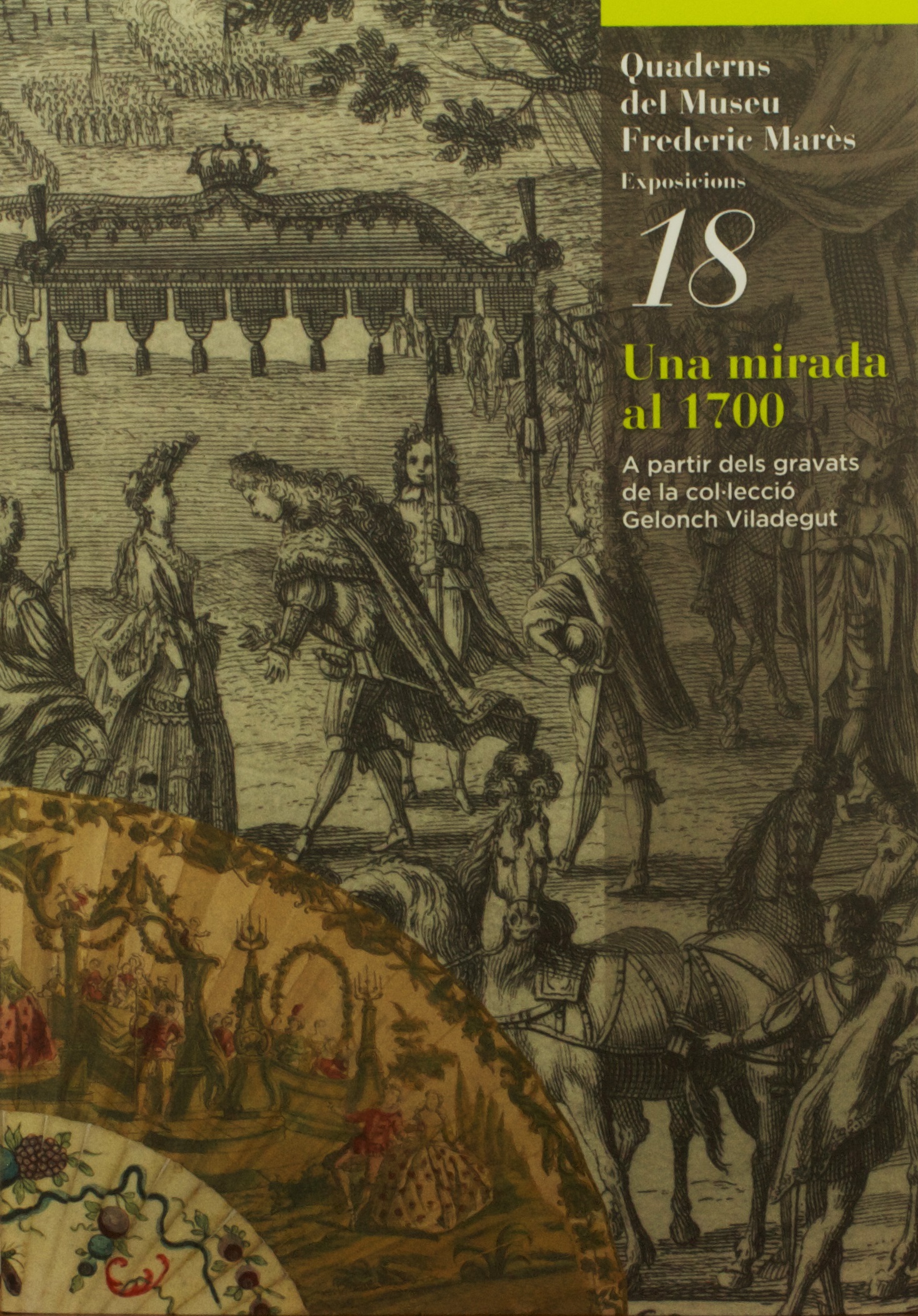
Exhibition | A Look at 1700: Prints from the Viladegut Collection

Jacques Rigaud and Martin Engelbrecht, Siege of Barcelona of 1714 (Comment l’on soutient et repousse les sorties), etching, Augsurg, ca.1750.
◊ ◊ ◊ ◊ ◊
From the Museu Frederic Marès:
Una Mirada al 1700: A partir dels gravats de la col·lecció Gelonch Viladegut
Una Mirada al 1700: A partir de los grabados de la colección Gelonch Viladegut
A Look at 1700: The Engravings of the Gelonch Viladegut Collection
Museu Frederic Marès, Barcelona, 16 June — 2 November 2014, extended until 11 January 2015
A partir del diàleg entre els gravats de la col·lecció Gelonch-Viladegut i les col·leccions del Museu Frederic Marès es vol oferir una galeria d’imatges sobre la Catalunya de començament del segle XVIII, concretament a la fi de la Guerra de Successió. L’exposició mostra com des del col·leccionisme també es pot aportar una visió del context sociocultural del país al voltant del 1714.
The press release (in Catalan) is available here»
◊ ◊ ◊ ◊ ◊
 The catalogue is available from Artbooks.com:
Xevi Camprubi et al, Una mirada al 1700: A partir dels gravats de la col·lecció Gelonch Viladegut (Barcelona: Ajuntament de Barcelona, Institut de Cultura de Barcelona, 2014), 154 pages, ISBN: 978-8498505597, $38.
Organised into five areas, the exhibition offers a view of Catalonia in the context of the War of the Spanish Succession based on the testimonies from collectors: first, the engravings from that period from the collection of Antoni Gelonch Viladegut, and secondly the collections of the Frederic Marès Museum, from which some works from its sculpture and 18th-century object collection in its extensive Collector’s Cabinet have been chosen. The five areas show images of power, territory, war, everyday life, and devoutness.
Exhibition | Tiepolo: I Colori del Disegno

Giandominico Tiepolo, The Three Angels Appearing to Abraham
(Venice: Accademia)
◊ ◊ ◊ ◊ ◊
Now on at the Capitoline Museum (with caveats concerning an English translation in this particular case) . . .
Tiepolo: The Colours of Drawings / I Colori del Disegno
The Capitoline Museum, Rome, 3 October 2014 — 18 January 2015
Curated by Giorgio Marini with Massimo Favilla and Ruggero Rugolo
For the first time in Rome, the work of one of the greatest painters and printmakers of the eighteenth-century Venice, Giambattista Tiepolo. In the history of European figurative art, the impressive quantity and variety of designs produced by Tiepolo stands out as a great monument of eighteenth-century graphic representation.
 The history of European figurative culture is remarkably marked by a huge amount and variety of drawings of the Tiepolos, which stand out as a magnificent monument of Eighteenth-century graphics. Indeed, drawing is the basic element of Giambattista Tiepolo’s genial art and is where he was the most prolific. Similarly, drawing characterized the exceptional and unique production of his family-owned original atelier, where he guided the graphical activity of his sons, Giandomenico and Lorenzo, in the last example of a very old Venitian tradition. Such an inexhaustible narrative vein, mainly intended as an independent exercise, is made of an extensive variety of registers that the artist used to adjust to the different functionalities of his production. Thus, the various typologies, techniques and themes give rise to a ‘colour of drawing’. This occasion is dedicated to this peculiar perspective on the many-sided world of Tiepolo and finds its reason in the lucky chance of gathering a selection of works coming from Italian collections, unfamiliar to the great public, with sheets that have been hardly ever exhibited before.
 The four sections of the exhibition feature drawings and a selection of etchings according to prominent thematic clusters, but still arranged according to the range of their techniques: from the project to the early sketches, from ‘memories’ to ‘amusements’ and to the replicas of Giandomenico and Lorenzo, as an emulation of their father’s works. A measured selection of paintings is also exhibited in order to introduce and somehow represent the painting outcomes of every graphical typology. Some are well known, others have re-emerged or have been recognized only by the most recent research activities—even in the preparation of this exhibition—but they all contribute to grasp the dynamics of Tiepolo’s language, whose exceptional imaginative fertility does not exclude a constant innovation in the iteration of models.
The catalogue is available from ArtBooks.com:
Giorgio Marini et al., Tiepolo: I Colori del Disegno
(Rome: Campisano Editore, 2014), 192 pages, ISBN:
978-8898229338, $78.
Exhibition | Painting Paradise: The Art of the Garden

Studio of Marco Ricci, A View of the Cascade, Bushy Park Water Gardens (detail),
ca. 1715 (Royal Collection Trust)
◊ ◊ ◊ ◊ ◊
Press release (9 October 2014) from the Royal Collection Trust:
Painting Paradise: The Art of the Garden
The Queen’s Gallery, Buckingham Palace, 20 March — 11 October 2015
The Queen’s Gallery, Palace of Holyroodhouse, Edinburgh, 5 August 2016 — 26 February 2017
Curated by Vanessa Remington
Whether a sacred sanctuary, a place for scientific study, a haven for the solitary thinker or a space for pure enjoyment and delight, gardens are where mankind and nature meet. A new exhibition at The Queen’s Gallery, Buckingham Palace will explore the many ways in which the garden has been celebrated in art through over 150 paintings, drawings, books, manuscripts and decorative arts from the Royal Collection, including some of the earliest and rarest surviving records of gardens and plants. From spectacular paintings of epic royal landscapes to jewel-like manuscripts and delicate botanical studies, Painting Paradise: The Art of the Garden reveals the changing character of the garden and its enduring appeal for artists from the 16th to the early 20th century, including Leonardo da Vinci, Rembrandt van Rijn and Carl Fabergé.
The idea of an earthly paradise—an enclosed space with orchards, flowing water, shade and shelter—can be traced back to Persia in the 6th century BC. The painted miniature Seven Couples in a Garden, c.1510, from the earliest illustrated Islamic manuscript in the Royal Collection, shows a beautiful Persian garden with an octagonal pool, plane and cypress trees, and elaborately tiled pavilions laid with floral carpets.
Before the 15th century, most European images of gardens appeared in illuminated religious manuscripts. The Book of Genesis, with its references to the Tree of Life, Tree of Knowledge and Four Rivers, provided a framework for artists to create images of Eden, as in Hartmann Schedel’s woodcut of 1493. In Adam and Eve in the Garden of Eden, 1615, Jan Brueghel the Elder relegates the main protagonists and the Tree of Knowledge to the middle distance in an abundant woodland landscape rich in flora and fauna. As court painter to the Habsburg Archdukes Albert and Isabella, Breughel was able to study botanical specimens in the palace garden in Brussels.
Until the 16th century, gardens in paintings and manuscripts remained largely those of the imagination. Henry VIII’s Great Garden at Whitehall Palace, seen in the background of the painting The Family of Henry VIII, c.1545, is the first real garden recorded in British art. By the Renaissance, gardens had become status symbols to be employed in royal propaganda. The wealth of a garden’s owner could be demonstrated through elaborate horticultural features such as obelisks, pergolas, knot designs and topiary. Although in the painting Pleasure Garden with a Maze by Lodewijk Toeput (Pozzoserrato), c.1579–84, the water labyrinth is the artist’s invention, it is inspired by contemporary descriptions of 16th-century Italian formal gardens.
By the 17th century, aristocratic gardens were created on a previously unimaginable scale. The intense rivalry between the French and English kings, Louis XIV and William III, produced two of the largest and most elaborate royal gardens ever made. The exhibition includes a panoramic view by Jean-Baptiste Martin of the French king’s gardens at Versailles, c.1700, and A View of Hampton Court, by Leonard Knyff, c.1702–14, the greatest surviving Baroque painting of an English garden.
With their amphitheatres, cascades and fountains, statuary, exotic birds and aviaries, Baroque gardens offered much to engage artists. The only surviving pair of sundials by the great 17th-century horologist, Thomas Tompion, are shown in the exhibition. The fashion for parterres (ornamental flower gardens) is reflected in An Exact Prospect of Hampton Court, an etching by Sutton Nicholls, c.1700, while A View of Bushy Park Water Gardens by the studio of Marco Ricci, c.1715, shows a large cascade, a rare feature in an English landscape.
By the 18th century, gardens took on a more natural, informal style, inspired in part by the poet John Milton’s romantic description of a wild and untamed Eden in Paradise Lost, 1667. An oil painting of Kew by the Swiss artist Johan Jacob Schalch, 1759, is from a series of views of the gardens designed for Frederick, Prince of Wales by William Kent and William Chambers. The distant pagoda is the only obvious sign of human intervention among the gently sloping hills, grazing sheep and lake.
In the 19th century the garden became a symbol of wholesome and virtuous family life, and a necessary ingredient of ordered domestic harmony. In a portrait of Queen Victoria and Prince Albert by Edwin Landseer, commissioned only two months after their marriage in 1840, the royal couple are set against a view of the East Terrace garden at Windsor Castle. William Leighton Leitch’s 1855 watercolour of the Swiss Cottage, created by Prince Albert for his children in the garden of Osborne House, reflects the informal and private existence enjoyed by the family on the Isle of Wight.
The 16th and early 17th centuries saw the birth of botanical illustration, florilegia (flower books) and still-life painting. Leonardo da Vinci was the first artist to produce true botanical studies, and the exhibition includes a number of exquisite examples by the artist. The only surviving painted flower book from 17th-century England is by the English gardener and botanical artist Alexander Marshal. Produced over a period of 30 years, it includes rare specimens, such as Auriculas (Primula x pubescens), grown only in the finest gardens of the time.
Flower designs on porcelain, silver, furniture and textiles, such as the vine-covered tapestry of a pergola by Jacob Wauters, c.1650, brought the garden inside the home. In the 19th century, the ‘language of flowers’ was translated into precious luxury items, such as the brooch presented by Prince Albert to Queen Victoria in celebration of their betrothal in 1839. In the form of orange blossom, symbolising chastity, it was the first of a suite of flower jewellery given to the Queen over several years. The skill of replicating the charm and beauty of flowers in three-dimensional objects reached new heights in the workshops of Carl Fabergé, the great Russian jeweller and goldsmith. Fabergé’s Bleeding Heart, c.1900, carved in nephrite, rhodonite and quartzite, has its flowers suspended from gold stems, so that they can move gently, as if blown by the wind.
◊ ◊ ◊ ◊ ◊
Published by the Royal Collection and distributed by The University of Chicago Press:
Vanessa Remington, Painting Paradise: The Art of the Garden (London: The Royal Collection Trust, 2015), 312 pages, ISBN: 9781909741089, $75.
 The garden is of perennial interest to artists. Yet, as cultural attitudes toward the garden and how we enjoy it have changed, so too have the ways in which it has been represented in art. From a space for solitary communion with nature to the backdrop for a budding romance, and from a place for scientific study to the source of the foods we eat, Painting Paradise looks at why the garden has remained such a seductive artistic subject.
For centuries, gardens have prompted reflection on the relationship between nature and man. They have also been considered representations of the divine, as in Flemish master Jan Brueghel’s famous Adam and Eve in the Garden of Paradise. Their ability to carry messages about their creator’s status will be clear to all who have had the pleasure of walking the grounds of meticulously manicured palaces or stately homes, but they are also evocative of prevailing cultural values and a desire to better understand, classify, and collect elements of the natural world. By the sixteenth century, artists were also attempting to bring the garden indoors as a source of design elements in the decorative arts, from seventeenth-century Flemish Pergola tapestries to handcrafted flowers from the Russian House of Fabergé.
Tracing these and other themes that attracted the attention of artists from the fifteenth to the early twentieth century, Painting Paradise explores how these ideas came to be expressed in ways characteristic to a particular place and time, including works in both the Eastern and Western traditions. The curator of an accompanying exhibition opening at Buckingham Palace, Vanessa Remington has weeded through the Royal Collection to cultivate a selection of paintings, drawings, manuscripts, tapestries, and jewelry of exceptional value and extraordinary beauty. With more than three hundred color illustrations—including many treasures that have been previously unpublished—the book will be of great interest to artists, art and design historians, and all who find inspiration in the beauty of the garden.
Vanessa Remington is Senior Curator of Paintings, Royal Collection Trust, and the author of several books highlighting its collection, including Victorian Miniatures in the Collection of Her Majesty The Queen.
Exhibition | Prints after Veronese
From the Remondini Museum in Bassano:
Veronese Inciso: Stampe da Veronese dal XVI al XIX Secolo
Museo della Stampa Remondini, Bassano del Grappa, 14 September 2014 — 19 January 2015
Curated by Giuliana Ericani
 Si inserisce nell’itinerario Scopri il Veneto di Paolo Veronese con altre 5 mostre e 32 siti intitolati al grande artista del Cinquecento Veneto la mostra che i Musei civici di Bassano del Grappa dedicheranno a settembre alla fortuna di Veronese nella stampa “di traduzione.” Sarà così segnalata con larga evidenza l’enorme fama dell’artista e le capacità tecniche degli incisori di rendere con i tratti segnati sulla lastra la felicità e l’esuberanza del colore del Caliari.
La scelta di 58 fogli consente di riconoscere quasi tutti i capolavori del grande artista, alcuni irrimediabilmente perduti, opere riprodotte tra acqueforti e xilografie, tra la fine del Cinquecento fino a tutto il Settecento, a partire dalle acqueforti contemporanee di Agostino Carracci. Un paio di secoli più tardi, in pieno Neoclassicismo, la produzione più corrente dei Remondini non esita a tradurre nei segni fortemente inchiostrati la magniloquenza del disegno più che la felicità del colore, documentando per il mercato un artista la cui fama, complici il barocco e Tiepolo, non aveva mai visto flessioni.
Nella seconda metà del Settecento Giuseppe Remondini raccoglie una consistente collezione di incisioni a paragone, modello e supporto tecnico della produzione calcografica e tipografica della più grande stamperia dell’epoca, prima in Europa—è l’Encyclopédie a ricordarlo—per numero di addetti e quantità della produzione. Tale fondo, donato nel 1847 alla città dall’ultimo erede, Giambattista, è il nucleo fondante per il più recente tra gli antichi musei bassanesi—premio ICOM 2010—prezioso giacimento di questa e delle altre mostre che il Museo della stampa Remondini va via via proponendo dal 2007.
Posto d’onore in mostra per i legni xilografici incisi, con tecnica da lui inventata, dall’inglese John Baptist Jackson, tutti ceduti a Giuseppe Remondini, che saranno esposti assieme ad una selezione dei fogli da lui eseguiti sulle opere di Veronese. Una chicca che, in mezzo a stampe multiple, da sola vale il viaggio a Bassano, per gli addetti ai lavori e per chi vuole capire come le immagini si propaghino grazie alla forza espressiva delle immagini stesse.
Giuliana Ericani, ed., Veronese Inciso: Stampe da Veronese dal XVI al XIX Secolo (Naples: Arti Grafiche Zaccaria, 2014), 90 pages, ISBN: 978-8885821446, €10.
Writing for The Burlington 156 (December 2014), Xavier Salomon judges the catalogue “an essential contribution to the subject and complements Paolo Ticozzi’s catalogue of 1977” (p. 843).


leave a comment