Historical Paint, Interview with Color Consultant Patrick Baty
As we seem to become increasingly detached from the materiality of paint (at least in many quarters), there’s a tendency to view the substance of eighteenth-century paint anachronistically, ignoring the tangibility and the finite possibilities of these historical mixtures. As a corrective, Enfilade contributor Courtney Barnes (author of her own ever-interesting blog, Style Court) offers the following insightful interview with leading color consultant Patrick Baty. As soon becomes clear, Baty is a vocal champion of the understated ‘common colors’ — creams and various stone colors — and, not surprisingly, he has previously raised questions over some of John Fowler’s most expressive restoration projects (one thinks of the famous yellow walls of the staircase at Sudbury Hall). The interview is full of fascinating links, and I think there’s plenty here to satisfy the full range of Enfilade readers. My warm thanks to both Patrick and Courtney for their participation. -CH.
◊ ◊ ◊ ◊ ◊
The Color Field: A Look at Paint Then and Now with Historian Patrick Baty
By Courtney Barnes
 Pouring over bolts of sumptuously embroidered fabric, shopping for colorful ribbons, planting a garden—these activities I recall seeing portrayed in various period films. But characters discussing house paint? This seems much less familiar. Mr. Blandings Builds His Dream House provides one notable movie example, with Mrs. Blandings (played by Myrna Loy) describing her desired hues in a famous paint-related scene. The emphasis of the 1948 comedy is, however, on shaping the present, not conjuring the past. And yet, we know that people living in the eighteenth and nineteenth centuries were themselves very interested in color.
In her book, The Creation of Color in Eighteenth-Century Europe, Sarah Lowengard emphasizes the wide-ranging appeal: “Throughout the eighteenth century, people from all social and economic backgrounds thought about color, experimented with color, and offered their own notions of how to explain it, how
to use it, and how to improve it.”
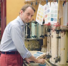 A stroll through any twenty-first-century home-and-garden center or a glance at the array of decorating tomes on the shelves of your local bookstore, suggests that the same holds true for us today. Few people grasp the subjective allure and associations of color as fully as Patrick Baty, a London-based historic paint consultant and owner of the shop Papers and Paints.
PB: Certainly when many customers start to describe colors to me it often takes a while to appreciate what they are actually looking for. Indeed, rather like the color that I am often asked for—French chateau shutter blue—perhaps the name is purely an idea that encompasses a certain combination of light, texture,
and an indeterminate range of hues that is in the eye of the beholder alone.
 In advising heritage organizations such as English Heritage or the National Trust, analyzing paint to solve an architectural puzzle, or working with a homeowner interested in determining the original colors of her old walls, Baty must piece together more concrete bits of evidence. Drawing upon his expertise as a historian along with a basic bag of forensic tools (above all, paint samples and microscopy) he works to uncover a building’s decorative evolution from past to present.
 Descended from artists and a respected paint specialist, Baty has color in his genes. Beginning his professional life as an officer in the British Army, he decided in the early 1980s to join his father, Robert Baty, at the family shop, ultimately taking the helm of Papers and Paints in 1990. Already, the several-decades-old small business in Chelsea had a well-established reputation for color matching. The son came on the scene just as paint mania gripped England—special decorative effects including various glazing techniques were becoming all the rage.
Immersed more deeply in this complex world of paint, Baty found his curiosity growing about a much earlier color explosion, paint in the eighteenth century – to the point, in fact, that he earned an academic degree focused on the ‘colormen’ of the past. Combining his historical knowledge with hands-on professional expertise, Baty was soon regularly to be found in the field, climbing and crouching in all sorts of historical locations as he gathered his vital samples of paint (along the way, he’s
also published a couple of dozen articles and contributed to five books).
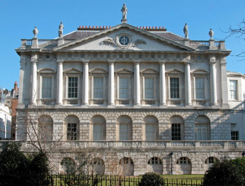
With Catherine Hassall, Baty completed the paint analysis of the Painted Room at Spencer House, finding that the walls were originally paler than the colors used in the 1980s refurbishment.
As of 2011, Baty’s broad consulting portfolio includes houses, palaces and other structures in the United Kingdom and United States. To name a handful: Kensington Palace, Queen Charlotte’s Cottage at Kew, London’s Tower Bridge, Blenheim Palace, Headfort House (Ireland), Calke Abbey, Spencer House, the Richard Bennehan House (at Stagville, near Durham, North Carolina), and the jewel-box-like Khadambi Asalache House in South London. In 2007, Papers and Paints received a Royal Warrant of Appointment to Her Majesty The Queen.
During Baty’s thirty-year career, there have been important shifts in the understanding of eighteenth- and early nineteenth-century color. In particular, evidence that highly saturated colors were in vogue has led to changes at famous historic sites. Due to a recently revealed, much-buzzed-about restoration at Monticello, it’s much more widely known, for instance, that Thomas Jefferson selected for his own dining room walls in 1815 a then-cutting-edge (and extremely costly) chrome-yellow. Monticello curator Susan Stein tells design journalist Mitchell Owens (writing for Elle Decor in July 2010) that Jefferson selected the eye-popping hue just six years after it was developed in France, and press materials note that the egg-yoke-like yellow would have cost Jefferson $5 per gallon, more than 33-times the price of white lead paint. Until 2010, modern school children touring Monticello saw a muted, post-Jefferson blue.

Paint sample showing the lowest (earliest) fifteen color schemes, from a house in Queen Anne's Gate, Westminster. It can be seen immediately that white or off-white (“pale stone colour” in eighteenth century painters’ terminology) was employed on nearly every occasion.
 Thinking about Jefferson’s luminous yellow, as well as George Washington’s intimate verdigris-green dining room at Mount Vernon, I asked Baty about the era’s lively, saturated hues. He was quick to point out that not everyone lived with such vivid walls. Clear, intense colors, underscores Sarah Lowengard, were in high demand but difficult and typically expensive to produce. At the same time, intentionally drab shades had fans among the fashionable set as well (interestingly, Jefferson lived with unpainted plaster walls before the costly yellow went up). Baty cautions us against imagining most walls as jewel-like, noting that in some instances
they tended to be more colorful than the ‘mock historic’ colors offered by some of the well-known paint companies (sadly, our view as to what is authentic has been much distorted by the rash of these ranges that have appeared over the last twenty years)… I would certainly say that a small collection of colors tended to be seen more than any other. These were known as the Common Colors and were cheap and applied in all sorts of houses throughout the century: Cream color, Lead color, Pearl color, Stone color, Wainscot / Oak color, White. It may surprise you to hear that the most commonly used type of color in the past was that described as Stone. This encompassed the warm, honey-colored sandstones to the greyer limestones. The use of color was much more limited than one might believe.
And where would one go to buy paint centuries ago?
 PB: In eighteenth-century London, ready-mixed paint would have been bought from a colorman, such as Alexander Emerton “at the Bell over against Arundel Street near St Clement’s Church in the Strand, London.” The original pricelist from the 1730s survives, and from this we learn that he was selling the Common Colors at 4d per Yard, but extraordinary colors, such as Olive Colors and Prussian blue, were offered at 8d per Yard. Greens, however, were sold at 12d per Yard. The everyday Common Colors continued unchanged through to the twentieth century. As new (successful) pigments were introduced they were adopted and the range of colors used widened.
Baty takes issue with today’s commercial ranges of paint, tweaked to suit current fashion or reinterpreted to appear aged and then inaccurately marketed as historical rather than labeled with what he views would be a more appropriate tagline such as “loosely inspired by.”
By contrast, his own company is known for two ranges with specific links to the past: Papers and Paints’ Historical line, originally released in 1988, consists of 112 colors based directly on those used in the applied arts (like porcelain and tapestry) while the Traditional range is made up primarily of colors matched to the earliest known set of paint sample cards prepared by a house painter for a client in 1807 (while doing academic research, Baty struck gold with the discovery of these cards in the archives of a Scottish house destroyed by fire.) Years ago, Baty and his wife spent their evenings hand-painting color cards for the first paint range; today at Papers and Paints, hand-painted sets are still available for purchase.
So, we have a better picture of what paint looked like centuries ago; how long was it expected to last?
PB: On the inside of a building there was no reason for a paint not to last for very many years. Indeed, I have worked in buildings where paint from the second half of the eighteenth century survives. On the exterior of a building it was understood that paint had a finite life. A well-known quote of 1774 illustrates this well:
The third year the gloss is gone…in the fourth if you rub the painting with your finger, it will come off like so much dust.
Modern exterior-grade paint may last ten years before needing renewal.
Whilst one can match eighteenth-century paint colors nowadays, legislation and developments in pigment technology mean that paints are compounded in a very different manner. Lead-based paint tends to retain the impression of the brush and doesn’t flow out in the way that a modern oil-based paint does. A water-based distemper can still be made up in the traditional manner, but the number of tradesmen who can do so is small.
Baty also says there is a widespread misconception that eighteenth- and early nineteenth-century paints were invariably environmentally friendly and ‘pure’ when, in fact, arsenic and lead were used in their production.
Is it possible to compare what it cost to paint a room in the eighteenth century with expenses now?
PB: This is a very complicated business as not only has the type of paint changed but inflation has played havoc with the price comparison of similar products. Working from a set of prices and the coverage rate of everyday oil paints in 1770 I was able to show that the cost of the paint for painting an average-sized room in 2002 was about the same – within a Pound or two. The cost for a room 12’x12’x8’ worked out at about £43-£45. It has since gone up another 20%, but that is largely as a result of recent EU legislation. The cost of carrying out the work was controlled in the eighteenth century by the Guild system in London and had remained remarkably stable for many years. It is less easy to obtain quotes for painting a room nowadays.
How closely was the industry tied to the fine art tradition of painting?
PB: The two branches of the industry were closely related as they were to other wielders of a brush. By the latter half of the seventeenth century, the London-based Painters-Stainers’ Company regarded themselves as consisting of four main groups: the Arms Painters, House Painters, Leather Gilders and Picture Makers. Many of the pigments were identical, although the more expensive and certainly the more fugitive ones saw less use by the housepainter.
Just as it can be a let down when, as civilians, we learn that spies don’t actually use certain high-tech tools shown in popular movies, Baty has sometimes encountered surprise when describing his methods:
PB: Although new techniques will no doubt help, the basics are fairly low-tech. I remember shocking an audience at Williamsburg some years ago when asked about medium analysis. They wanted to know what equipment I used. I said that context and optical examination generally told me what I needed to know. I can see whether a paint was an oil paint and, understanding how paints were made and used, in most cases this means linseed oil was the medium.
In a similar vein, I was asked by the conservation scientists at one museum what their findings meant. They could virtually tell me the Atomic Number of the components in a particular eighteenth-century paint layer but didn’t know what it was saying to them. I knew from a study of early source material that white lead with black and a little Prussian blue and red oxide usually indicated a Pearl Color. I also knew that this sort of color saw use in the kind of room being examined and, most importantly, what kind of color it was.
The key thing is to read as much as possible, whether technical works, histories or books on historic design and decoration. It is important to understand who these people were who chose the decoration, what they were trying to achieve and then to know how the paint would have been mixed and applied…One thing that strikes me when I meet other people working in the field is that most have stopped reading and learning. I have now been doing this for over 25 years, but still I am picking up new facts that help me gain a clearer understanding of what I see when I examine a room.
And for anyone wondering, Baty himself is quite fond of that paint selection scene in Mr. Blandings Builds His Dream House. I can only hope for the day when I see Georgians on the big screen weighing the costs of chrome yellow against the deeply satisfying array of common stone colors.







8 comments