Exhibition | Goya and the Altamira Family
Press release (10 April 2014) from The Met:
Goya and the Altamira Family
The Metropolitan Museum of Art, New York, 22 April — 3 August 2014
Curated by y Xavier F. Salomon
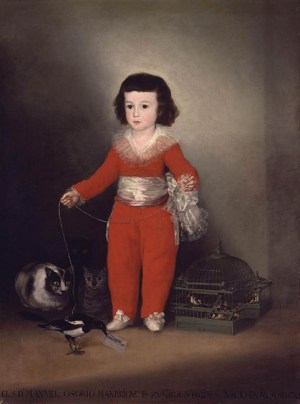
Goya, Manuel Osorio Manrique de Zuñiga, 1787–88
50 x 40 inches (NY: The Metropolitan Museum of Art)
By special arrangement with the Banco de España, from April 22 through August 3, The Metropolitan Museum of Art will reunite for the first time four portraits painted by Francisco de Goya (1746–1828) that were commissioned by the Count of Altamira, who was a director of the bank. Goya and the Altamira Family will consist of
• Banco de España’s Portrait of the Count of Altamira
• the Metropolitan’s beloved Manuel Osorio Manrique de Zuñiga, the so-called ‘Red Boy’
• the beautiful portrait of Manuel’s mother and sister, Condesa de Altamira and Her Daughter, María Agustina, from the Metropolitan Museum’s Robert Lehman Collection
• and a portrait of Manuel Osorio’s brother Vicente Joaquin de Toledo, from a private collection.
All four portraits were painted between 1786 and 1788 when Goya was beginning to experiment with aristocratic portraiture. A fifth portrait depicting Count Altamira’s middle son, Juan María Osorio, was painted around the same time by Agustín Esteve, one of Goya’s pupils, and will be lent by the Cleveland Museum of Art.
The Banco de San Carlos (the present-day Banco de España) commissioned Goya to create a series of portraits of the directors of the bank in Madrid, including the full-length depiction of Vicente Joaquín Osorio Moscoso y Guzmán, Count of Altamira. It was the success of this portrait that led to the subsequent commission to Goya for three portraits of members of the count’s family.
The exhibition is organized by Xavier F. Salomon, Peter Jay Sharp Chief Curator, The Frick Collection, New York. The exhibition is made possible by the Placido Arango Fund. It was organized by The Metropolitan Museum of Art with the assistance of the Consulate of Spain in New York.
◊ ◊ ◊ ◊ ◊
From the museum’s shop:
Xavier F. Salomon, Goya and the Altamira Family, Metropolitan Museum of Art Bulletin (Spring 2014), 48 pages, $15.
 Ever since its arrival at the Metropolitan as part of the outstanding collection of Old Master paintings bequeathed by New York financier and philanthropist Jules Bache, Goya’s portrait of Don Manuel Osorio, the three- or four-year-old son of the conde de Altamira, has ranked as one of the museum’s most popular paintings. In celebration of the reinstallation of the Metropolitan’s European Paintings galleries, inaugurated last May, the condesa de Altamira and her son have been temporarily reunited in a gallery devoted to Goya and his contemporaries in Spain. But from the outset this move was planned as just the first stage of a more eventful family reunion that would also include Don Manuel’s older brother, Vicente Osorio, and their father, Vicente Joaquín Osorio de Moscoso y Guzmán, conde de Altamira: all four pictures outstanding works by Goya.
The publication is made possible through the generosity of the Lila Acheson Wallace Fund for The Metropolitan Museum of Art, established by the cofounder of Reader’s Digest.
New Book | Spanish Drawings in the Princeton University Art Museum
This critical catalogue of Princeton’s Spanish drawings was reviewed by Zahira Véliz Bomford for The Burlington Magazine 156 (April 2014): 244–45. From Yale UP:
Lisa A. Banner with contributions by Jonathan Brown, Robert S. Lubar, and Pierre Rosenberg, Spanish Drawings in the Princeton University Art Museum (New Haven: Yale University Press, 2013), 192 pages, ISBN: 978-0300149319, $40.
 The Princeton University Art Museum’s collection of Spanish drawings includes masterworks by artists such as Jusepe de Ribera (1591–1652), Bartolomé Esteban Murillo (1617–1682), Francisco Goya (1746–1828), Pablo Picasso (1881–1973), and Salvador Dalí (1904–1989). Although many of the drawings in the collection relate to celebrated paintings, commissions, and other works by these artists, they remain largely unknown. Most have not been published previously and many are attributed here for the first time.
In Spanish Drawings in the Princeton University Art Museum, preeminent scholars enrich the growing corpus of work on Spanish drawings with original research. Each of the 95 drawings is reproduced in color, often accompanied by comparative illustrations. Watermarks have been documented with beta radiography and are included in an appendix. Provenances and
artist biographies round out this detailed record of one of the
most important collections of its kind.
Lisa A. Banner has written extensively on Spanish baroque art and has contributed to exhibition catalogues, symposia, and conferences throughout the world, most recently co-curating The Spanish Manner at The Frick Collection (2010–11).
Call for Articles | The Uses of Genius
From Le Blog de L’ApAhAu:
Penser le génie à travers ses usages / The Uses of Genius
Special Issue of L’Esprit Créateur (Johns Hopkins University Press), Fall 2015
Proposals due by 30 June 2014
Le génie est, depuis la première modernité, l’une des notions par lesquelles se construit la valeur des œuvres d’art et des innovations scientifiques, de même que celle de leurs agents (artistes, poètes, scientifiques, philosophes, inventeurs, grandes figures de toutes sortes). À ce titre, le génie permet d’ancrer le sentiment d’appartenance des communautés autour d’une instance de valorisation qui leur est universellement reconnue, sur laquelle peuvent être fondées les hiérarchies culturelles, les mécanismes d’admiration et d’émulation, les stratégies de recyclage du passé, la constitution projective de la postérité, etc. Bref, malgré son extrême singularité, le génie permet de fonder du commun. Ainsi, cette figure peut être envisagée non pas comme un naturel inné dont on pourrait s’employer à comprendre la cause (transcendantale ou physiologique), mais plutôt comme une construction historique et culturelle correspondant à différents usages.
C’est précisément ces usages du génie que nous proposons d’interroger, dans le cadre d’un numéro collectif de la revue L’Esprit créateur (Johns Hopkins University Press) dont la publication est prévue pour l’automne 2015.
Plus particulièrement, les propositions attendues s’intéresseront au statut problématique que possède la notion de génie au sein des discours dans lesquels elle se trouve impliquée, du Moyen Âge aux vingtième et vingt-et-unième siècles français. Il s’agira non seulement de souligner la variété des constructions dont le génie a fait l’objet dans son histoire, mais aussi d’insister sur les utilisations particulières de cette notion en fonction des contextes de son élaboration (disciplines, pratiques de valorisation, querelles et débats ; enjeux politiques, économiques, sociologiques, linguistiques, littéraires, philosophiques, esthétiques, etc.). Loin de relever de l’évidence, le génie demande au contraire à être sans cesse redéfini selon les circonstances dans lesquelles il est convoqué. Nous ne chercherons donc pas à saisir l’essence du génie, mais plutôt à interroger les modalités même de cette utilisation. Pour ce faire, nous proposons d’aborder le génie dans la longue durée, de façon à mettre en évidence la pluralité des champs dans lesquels la notion est investie. Nous inscrivons cette longue durée dans le contexte français (ce qui n’exclut pas de considérer les phénomènes de transferts culturels), non seulement parce que l’histoire française du génie a été négligée jusqu’à présent par la critique, mais aussi pour nous permettre de mesurer les conséquences de cette spécificité dans l’élaboration des discours.
Plusieurs angles d’approche peuvent être envisagés (mais la liste n’est pas exhaustive) :
• Quelles sont les modalités du rapport entre la singularité du génie et la communauté à laquelle il appartient selon une époque/région/circonstance donnée ?
• Comment (dispositif publicitaire, acteurs, public, médias, etc.) et à quelles fins ont été construites dans leur temps les grandes figures du génie ?
• Comment se constitue le rapport du génie à la norme et à ses éventuelles transgressions, aux usages et aux innovations, à la règle et au dérèglement sous toutes ses formes ?
• Y a-t-il une éthique propre au génie ?
• Comment les différentes formes d’art représentent-elles le génie ?
• Quel(s) génie(s) aujourd’hui et pourquoi?
Les propositions d’articles d’une page maximum, accompagnées d’une brève bio-bibliographie pourront nous être adressées par mél aux adresses suivantes : ann.jefferson@new.ox.ac.uk & jean-alexandre.perras@mod-langs.ox.ac.uk avant le 30 juin 2014. La date limite pour la remise des articles est le 31 décembre 2014.
Responsables du numéro
Ann Jefferson, Professor of French, New College, Oxford
Jean-Alexandre Perras, Postdoctoral fellow, Lady Margaret Hall, Oxford
Call for Panel Proposals | ASECS 2015, Los Angeles
At Auction | Rare Books at Ketterer Kunst in Hamburg

Cornelis Haak’s, Vues des palais, bâtiments célèbres, places mascarades,
et autres beautés singulières de la ville de Venise (Leiden, 1762)
More information is available here»
◊ ◊ ◊ ◊ ◊
As noted at ArtDaily (3 May 2014). . .
It was nothing less but a revolution in the history of nautical cartography—the sea atlas by Lucas Janszoon Waghenaer. The extremely scarce work in first French edition with a Spanish title sheet will be sold in the auction of Rare Books at Ketterer Kunst in Hamburg on 19 and 20 May with an estimate of €85.000. Lucas Janszoon Waghenaer’s Spieghel der Zeevaert offers a variety of information, such as an innovative illustration of the coastal line in combination with coast profiles. Additionally, his maps are particularly captivating for their accuracy and their rich artful adornment with ornaments, ships and sea monsters.
Besides ships and regattas, Cornelis Haak’s rare series of views of Venice from 1762 also show splendid palaces, manors, churches and bridges in the city of lagoons, as well as its masked balls, acrobats and religious processions. The series of vedutas in the style of Canaletto and Marieschi is especially impressive for the two large city maps of Venice published by Pieter van der Aa. The estimate is at €35.000.
Next to the first print of the first Latin edition of Abraham Ortelius’ Theatrum Orbis Terrarum, its style and content paved the path for later atlases, Johann Heinrich Zedler’s 64-volume encyclopedia will enter the race with an estimate of €30.000. The monumental lexicon, also called Der Zedler after its publisher, may well hold the claim of being the occident’s greatest reference work in print in those days, together with the Spanish Espasa.
While the French natural scientist Jean Baptiste Audebert entirely dedicated his main work in two volumes Oiseaux dorés ou à reflets métalliques from 1802 to the splendid illustration of humming birds (estimate: €15.000), Frederic Moore and Charles Swinhoe committed themselves to the world of exotic butterflies. The extremely rare book in ten volumes, released over a period of 23 years, comprises all Indian butterflies known of in 1913. The work in an excellent coloring will be called up with an estimate of €25.000.
The full press release is available here»

Map of Venice by Pieter van der Aa from Cornelis Haak’s, Vues des palais, bâtiments célèbres, places mascarades, et autres beautés singulières de la ville de Venise (Leiden, 1762). Click on the image to enlarge. More information is available here»
Call for Papers | Diocletian’s Palace for Adam, Clérisseau, and Cassas
As posted at H-ArtHist:
Diocletian’s Palace in the Works of Adam, Clérisseau, and Cassas
Institute of Art History – Center Cvito Fiskovic, Split, Croatia, 27–29 November 2014
Proposals due by 30 June 2014
The Grand Tour, as an educational rite of passage, reached its peak in the 18th century, widening its travelling radius outside of Rome and Italy onto further parts of the Roman Empire, among which Dalmatia held a prominent position. The international interdisciplinary conference on architecture, urban planning, and architectural decoration aims to explore the role of Diocletian’s Palace in the work of Robert Adam, Charles-Louis Clérisseau, and Louis-François Cassas, as well as the influence of Diocletian’s palace on the development of European neoclassicism.
We welcome proposals for 20-minute papers. Each proposal should consist of a 250-word abstract and short biographical statement. Proposals are due by 30/06/2014 (with notification of acceptance by 15/07/2014). Direct proposals and questions as a PDF attachment to asverko@ipu.hr.
Important information
• There is no conference fee.
• Accommodation for the participants can be arranged at organizer’s expense.
• The organizers are not able to pay for the travel expense of the participants.
• Conference languages: English and French.
• The length of spoken contribution should not exceed 20 minutes. Contributions will be divided into sections according to their topics. Each section will be followed by discussion.
• Papers will be published in the conference proceedings. Please send final written version (both in English or French) by 31/01/2015.
Scientific Committee
Joško Belamaric (Institute of Art History – Centre Cvito Fiskovic Split)
Milan Pelc (Institute of Art History Zagreb)
Pierre Pinon (ENSA de Paris-Belleville, École de Chaillot, Institut
national d’Histoire de l’Art Paris)
John A. Pinto (Princeton University)
Ana Sverko (Institute of Art History – Centre Cvito Fiskovic Split)
Organizing Committee
Joško Belamaric (Institute of Art History – Centre Cvito Fiskovic Split)
Milan Pelc (Institute of Art History Zagreb)
Ana Sverko (Institute of Art History – Centre Cvito Fiskovic Split)
New Book | The Colours of Rome
From The Old School Press:
John Sutcliffe, The Colours of Rome: An Examination of the Use of Colour on the Façades of Today’s Rome, with Historical and Other Notes, and a Selection of Colours Copied on Site (Bath: The Old School Press, 2013), 32 pages, ISBN: 978-1899933334 (standard edition), £185 / $350.
 John’s vision for this book was a survey of the city’s colourscape, a palette of colours so different from that of, say, Venice, Tuscany, or Palermo, and a palette that is today in a period of great change. His new essay traces the history of that palette and the influences that have led it to its state today.
To illustrate the essay John made several trips to Rome, returning finally with twenty sheets of colours copied directly from the buildings themselves. His carefully chosen selection is designed to demonstrate the diversity of the palette and also to draw together two very different strands of tradition that have created the appearance of the streets of Rome today. Each of the twenty colours is illustrated with a large painted patch applied directly onto its own sheet of Magnani wove using water-based paints. These sheets are loose in a wallet within the cased sleeve that holds the book, thus making it possible for the reader to explore the colours in different combinations just as they appear in Rome. A swatch card of chips of the twenty colours is also included in the wallet.

The wallet in the sleeve contains the paint-outs for the twenty colours that John Sutcliffe has chosen as representative of the colours of Rome. They are accompanied by a swatch card summarising the full set.
The text is printed in 14pt Dante on a large page of Magnani hand-made laid paper, with headings printed from wood-letter. The book is bound in full cloth and is protected by the sleeve inside which the wallet of paint patches is attached. In addition to the standard edition of ninety-nine copies there were twenty-five de luxe copies (ALL SOLD) that take the form of a solander box containing, as well as the standard edition book, bottled samples of nine of the most important pigments, mostly earths, in powdered form. The book is 323mm by 235mm (about 12.75 inches by 9.25 inches); the solander box is slightly larger and 92mm deep (3.75 inches). The price is £185 (euro235, US$350) for a standard copy (and was £350 (euro435, US$580) for a de luxe copy). Trade discount is one quarter. Postage and packing are charged as usual at cost.
If you know our books you will know we love colour, so this was a project that appealed from the outset. If Rome, architecture, and the way our cities change interest you, this book will appeal, and we hope that the production qualities will enhance your enjoyment. Uniquely, it is the only record of the most characteristic colours to be seen in Rome today, perhaps the only such survey of any city.
John Sutcliffe knows about colour. A former regional curator at the National Trust and now active as a decorative painter, his expertise in the topic, in particular in an architectural setting, was extensively used by Farrow & Ball, a company that will surely be known to many, at the time when they were first building up their reputation for traditional paints and hand-produced wallpapers. For many years John’s interest in colour has taken him to the Mediterranean, to Italy, and in particular to Rome. The buildings of Rome’s centro storico carry on their walls many layers of coloured limewash and distemper, layers that have both accumulated and decayed over time, thereby capturing the changing fashions in colour.
More information is available here»
◊ ◊ ◊ ◊ ◊
As described by Martin Gayford for The World of Interiors (May 2014), p. 50:
 [The book] is a work of decorative art in itself, elegantly printed and bound by a private press in a limited edition. . . . In the course of his investigations, Sutcliffe made a discovery. His initial assumption was that the shades he saw had been used since the days of ancient Rome. This turned out to be completely wrong. . . . Tastes in colour in the age of Michelangelo, Bernini, and the Grand Tour were all different, both from each other and from what can be seen today. In earlier centuries, Rome would have looked lighter and bluer. . . . The dramatically dark walls Sutcliffe loves date back only to the late 19th century and the Mussolini regime. In recent decades, these have begun to be replaced by a new fashion for ‘old colours’—that is, 17th- and 18th-century hues rediscovered by careful scraping of old paintwork. The colours of cities seem, like most things, to fluctuate through time.
David Watkin likewise praises the “beautifully produced book,” in his review for TLS, “Raw and Burnt,” (7 March 2014): 22.
Call for Papers | Animating the Eighteenth-Century Country House
From the Call for Papers:
Animating the Eighteenth-Century Country House
The Paul Mellon Centre for Studies in British Art, London, 5–6 March 2015
Proposals due by 14 July 2014
Organised by the Paul Mellon Centre, the National Gallery, and Birkbeck, University of London
When we visit a Georgian country house, wander through its interiors, and stop to look across a rope at a particular arrangement of pictures and furniture, it is common to experience the sense we are looking at a snapshot of the past, a frozen moment of time. This impression of the country house as a static, unchanging environment belies a crucial aspect of such properties: the fact that, during the eighteenth century itself, they were continually in flux and being fashioned and experienced anew. Recent research encourages us to think afresh about such issues. Sources such as diaries, letters, inventories, catalogues and account books show country-house objects being inherited, gifted, purchased, removed and relocated, and provide evidence that the spaces in which such objects were located were subject to constant development and reconceptualization. Accordingly, this conference will focus on the Georgian country house as an environment that was always evolving, and that was animated by the interaction between objects and people.
This conference will look at the ways in which objects, when placed on display within a particular space—a room, a corridor, a garden—entered into different kinds of dialogue with the contents, decoration and associations of that environment, all of which were subject to change and adaptation. It will also explore the ways in which the evolving spaces of the country house, and the forms of display found within them, were experienced—by those who lived in the house, by those who visited as tourists or invited guests, and by those who engaged vicariously through the process of ‘armchair travel’, reading guidebooks and other contemporary accounts.
This two-day event, which will include a half-day visit to a local property, aims to bring together scholars from a variety of fields with the objective of animating the eighteenth-century country house. Proposals for contributions are welcomed from art historians and historians working on all aspects of the eighteenth-century country house, including architecture, painting, sculpture, the decorative arts and garden history.
We particularly welcome proposals for papers exploring the following topics:
• Acquisition: the purchase, commissioning, inheritance, gifting of works of art, furniture, books and other materials.
• Display: picture hangs; room arrangements and decorative schemes; the organisation of art collections within and between different properties owned by the same family; garden design and layout.
• The country house as lived environment: the lived experience of the country house as a family home; as a site of hospitality; as a space in which artists may have worked.
• The country house as tourist destination: country house tourism; visitor experience; the multifarious literature related to country houses, including guidebooks, regional guidebooks, and periodical articles.
Abstracts for 25-minute conference papers should be no longer than 300 words in length, and should be accompanied by a short biography (of no more than 100 words) detailing any work or recent publications of particular relevance. Please send abstracts and biographies by Monday 14 July to:
Amelia Smith, The National Gallery/Birkbeck, University of London, amelia.smith@ng-london.org.uk.
New Book | Elihu Yale: Merchant, Collector & Patron
From Thames & Hudson:
Diana Scarisbrick and Benjamin Zucker, Elihu Yale: Merchant, Collector & Patron (London: Thames & Hudson, 2014), 288 pages, ISBN 978-0500517260, £25.
 There can be few educational institutions named after a man with the force of character, powers of leadership, business acumen, and variety of intellectual and spiritual interests of Elihu Yale. His career, which spans Puritan New England, Mughal India, and the London of the English Enlightenment, throws light on the religious, political, social, commercial, scientific, and cultural circumstances of the world of the later Stuarts and early Hanoverians.
Elihu Yale (1649–1721) is famous for the name of Yale University, of which he was an early benefactor. He made his fortune in India, trading in diamonds. Arriving there in 1672, he rose through the East India Company from clerk to governor. When he returned to London in 1699 he brought with him gems, furniture and textiles. In the milieu of portrait painter Sir Godfrey Kneller and physician Sir Hans Sloane he established a fashionable household where he had assembled some ten thousand items.
Yale’s collection was dispersed after his death and the catalogues of the sales survive, providing information about the 18th-century London art market. The Yale sales prove to be a landmark in the history both of collecting and of auctioneering. Analyses of the categories throw light on Yale’s personality and interests: he is revealed as a Fellow of the Royal Society, churchman and a philanthropist, totally in tune with the English Enlightenment.
The authors explore Yale’s life in Madras and London and his interests, including musical and scientific instruments and books, and then turn to Yale as a dealer and a collector of diamonds and jewelry and works of art. The story is one with many appeals: the East India Company and early 18th-century London; furniture, both Indian and English; the fashion for things Oriental in the West; gemstones and jewelry; and collecting works of art.
Diana Scarisbrick is a historian specializing in jewelry and engraved gems. She has curated exhibitions in the UK and abroad and has written many books, including Rings: Jewelry of Power, Love and Loyalty and Portrait Jewels: Opulence and Intimacy from the Medici to the Romanovs. She is a Research Associate at the Beazley Archive, Oxford, and recently collaborated with Professor Sir John Boardman on The Marlborough Gems.
Benjamin Zucker, a graduate of Yale University and Harvard Law School, is one of the world’s leading gem dealers, based in New York. He has written extensively on gemstones, coloured stones and the history of ring collecting
The Golden Room of the Mauritshuis Restored

Restoration of the Pellegrini paintings in the Golden Room of the Mauritshuis has just been completed in time for the re-opening of the museum in June. As noted at ArtDaily:
The Golden Room, a spectacular 18th-century room in the Mauritshuis , which includes a series of paintings by Italian painter Giovanni Antonio Pellegrini (1675–1741) has been restored. The 15 wall and ceiling paintings were treated as part of the museum’s larger building project. The restoration of the Pellegrini paintings was undertaken with the support of the Shell Technology Centre Amsterdam. The pictures from the Golden Room are the first to have been returned to the renovated Mauritshuis. The museum will reopen after a two-year renovation on the evening of Friday 27 June.
The restoration of the Golden Room is an important component of the museum’s large scale project to renovate and expand the building. The restoration of the 15 monumental paintings by Pellegrini in the Golden Room was necessary. Although the pictures were not seriously damaged, they had been painted over several times, and the canvas was stained and showed strong yellow discoloration. The Johan Mauritshuis Compagnie Foundation provided the funding to realise the restoration.
Once the varnish had been removed, an unknown grey haze was discovered on the paintings. According to Carol Pottasch, Mauritshuis conservator who led this sizable restoration project: “We couldn’t figure out what this haze was initially; clearly, it wasn’t paint. In order to be able to bring the paintings back to their optimal condition, we had to find out the composition of this haze, so that it could be removed. Thankfully, the staff of the Shell Technology Centre, who have the equipment necessary to conduct the chemical analysis that we needed, were able to help us.” The Mauritshuis and Shell have been collaborating closely as ‘Partners in Science’ in the field of technical research since 2012, focussing on paintings by Pellegrini and Jan Steen. The partnership has already proved invaluable: together, they were able to establish that the cause of the grey haze was the wood- and coal-burning stoves used to heat the Golden Room.
In 1704 a fire reduced the whole interior of the 17th century Mauritshuis building to ashes. The interior had to be completely refurnished and redecorated. Italian painter Giovanni Antonio Pellegrini (1675–1741) was asked to decorate the Grote Benedenzaal, as the Golden Room was called at the time. Pellegrini was one of the most important Venetian painters of the early 18th century. The paintings are special: they are the only Italian pieces on display in the Mauritshuis and they are still on site, unlike most Pellegrini paintings.


leave a comment