Exhibition | Scottish Artists 1750–1900: From Caledonia to the Continent
Press release (5 May 2015) from the Royal Collection Trust:
Scottish Artists 1750–1900: From Caledonia to the Continent
The Queen’s Gallery, Palace of Holyroodhouse, Edinburgh, 6 August 2015 — 7 February 2016
The Queen’s Gallery, Buckingham Palace, London, 18 March — 9 October 2016

Allan Ramsay, Queen Charlotte with her two Eldest Sons, ca. 1764-69 (London: Royal Collection Trust, RCIN 404922)
From the romantic landscapes of Caledonia to exotic scenes from the Continent, a new exhibition at The Queen’s Gallery, Palace of Holyroodhouse is the first dedicated to Scottish art in the Royal Collection. Bringing together over 80 works, including paintings and drawings by the celebrated artists Allan Ramsay and Sir David Wilkie, Scottish Artists 1750–1900: From Caledonia to the Continent tells the story of royal patronage and of the emergence of a distinctive Scottish school of art.
Allan Ramsay (1713–1784) was the first Scottish artist of European significance. A pre-eminent figure of the Enlightenment, the intellectual movement that swept across Europe in the 18th century, Ramsay maintained close friendships with philosophers such as David Hume and Jean-Jacques Rousseau. In 1760 he was commissioned to paint George III’s State portrait and subsequently became the first Scot to be appointed to the role of Principal Painter in Ordinary to His Majesty. Depicting the King in sumptuous coronation robes and breeches of cloth of gold, Ramsay produced the definitive image of George III and the most frequently copied royal portrait of all time.
Ramsay worked as a court artist, painting members of the royal family and producing copies of the coronation portrait for the King to send as gifts to ambassadors and governors. He enjoyed a good relationship with the Queen Consort, and his painting Queen Charlotte and her Two Eldest Sons, 1764, considered to be among Ramsay’s greatest works, combines the grandeur of a royal portrait with the intimacy of a domestic scene.
Over half a century later, Fife-born artist Sir David Wilkie (1785–1841) gained even wider recognition than Ramsay. His vivid, small-scale scenes of everyday life, inspired by those of the Dutch masters, were shown at the Royal Academy to great acclaim. Wilkie attracted the attention of the Prince Regent (the future George IV), who was acquiring 17th-century Dutch and Flemish genre paintings for his own collection. The artist’s reputation was sealed with two high-profile royal commissions – Blind-Man’s-Buff, 1812, and The Penny Wedding, 1818, which shows the uniquely Scottish custom of wedding guests contributing a penny towards the cost of the festivities and a home for the newly married couple.
George IV’s visit to Scotland in 1822, the first by a reigning British monarch for nearly two centuries, offered a major opportunity for royal patronage. Artists were given prime access to all of the events in the two-week programme, which was masterminded by the writer Sir Walter Scott. The entrance of the King to his Scottish residence is captured in Wilkie’s The Entrance of George IV to Holyroodhouse, 1822–30. The King is shown being presented with the keys to the Palace, while crowds of enthusiastic spectators clamber over every part of the building to see him.
After suffering a nervous breakdown, brought on by overwork and a series of family tragedies, Wilkie set off on a prolonged visit to the Continent. He was one of the first professional artists to visit Spain after the Spanish War of Independence of 1808–14. Wilkie’s travels proved to be a turning point in his art, which became much broader in style and took inspiration from contemporary events. On the artist’s return in 1828, the King summoned Wilkie to Windsor and purchased five continental pictures—A Roman Princess Washing the Feet of Pilgrims, 1827, I Pifferari, 1827, The Defence of Saragossa, 1828, The Spanish Posada, 1828, and The Guerilla’s Departure, 1828—and commissioned The Guerilla’s Return, 1830. The same year, the King appointed Wilkie to the position of Principal Painter in Ordinary, a post that the artist continued to hold under William IV and Queen Victoria.
Queen Victoria and Prince Albert saw their roles as patrons of the arts as part of the duty of Monarchy. Several pictures by Scottish artists were among the birthday and Christmas presents exchanged by the royal couple throughout their married life, including works by Sir Joseph Noël Paton (1821–1901), David Roberts (1796–1864), James Giles (1801–1870) and John Phillip (1817–1867). Queen Victoria had a deep love of Scotland and commissioned artists to record the country’s ‘inexpressibly beautiful’ scenery, including that of her recently acquired estate, Balmoral, in the Highlands. Among those artists was the Glaswegian William Leighton Leitch (1804–1883), who was appointed the Queen’s drawing master in 1846. Of all the Scottish artists whose work was collected by Victoria and Albert, it was William Dyce who was most in tune with Prince Albert’s tastes. Dyce was inspired by the early Italian art so admired by Albert, who purchased Dyce’s The Madonna and Child, 1845, and the following year commissioned a companion picture, St Joseph.
In the same period, the publication of travel books and growing interest in foreign cultures encouraged artists to seek inspiration abroad. David Roberts introduced British audiences to scenes of Egypt and the Holy Land, and was the first independent professional artist to travel extensively in the Middle East. A View of Cairo, 1840, shows the medieval Gate of Zuweyleh, and was one of Roberts’ first paintings of the region to be exhibited. Queen Victoria commissioned two Spanish pictures from Roberts as gifts for Prince Albert: A View of Toledo and the River Tagus, 1841, and The Fountain on the Prado, Madrid, 1841.
In the mid-19th century, there was a growing interest in Spanish culture, which was heavily romanticised in the literature of the day. When the artist John Phillip travelled to the country, his subject-matter changed from Scottish rural scenes to Spanish street life. Queen Victoria commissioned Phillip’s A Spanish Gypsy Mother, 1852, and purchased ‘El Paseo’, 1854, for Prince Albert. The Prince gave the Queen The Letter Writer of Seville, 1854, for Christmas. After a visit to the Royal Academy in 1858, Victoria acquired The Dying Contrabandista as a Christmas gift for the Prince that year. John Phillip was Queen Victoria’s favourite Scottish artist and, on his death in 1867, he was mourned by the monarch as ‘our greatest painter’.
Some notable Scottish works entered the Royal Collection in 1888, on the occasion of the opening of the Glasgow International Exhibition of Science, Art and Industry by the Prince of Wales (the future King Edward VII). This exhibition, held in Kelvingrove Park, was one of a series of international exhibitions and world fairs that dominated the cultural scene in the second half of the 19th century and the largest to be held in Scotland. The Prince and Princess of Wales were presented with ‘two elegant albums of paintings by members of the Glasgow Art Club’, including work by the Glasgow Boys: Sir James Guthrie (1859–1930), EA Walton (1860–1922) and Robert Macaulay Stevenson (1860–1952).
Scottish Artists 1750–1900: From Caledonia to the Continent is part of the Edinburgh Art Festival.
◊ ◊ ◊ ◊ ◊
Distributed in the U.S. by The University of Chicago Press:
Deborah Clarke and Vanessa Remington, Scottish Artists 1750–1900: From Caledonia to the Continent (London: Royal Collection Trust, 2015), 210 pages, ISBN: 978-1909741201, $25.
 Throughout its history, Scotland has produced a wealth of great works of art, and the Scottish Enlightenment in particular provided a powerful impetus for new forms of art and new artistic subjects. This survey of Scottish art in the Royal Collection brings together more than one hundred reproductions of works from the Enlightenment to the twentieth century to highlight the importance and influence of this period, while also sharing recent research on the subject.
The first book devoted to Scottish art in the Royal Collection, Scottish Artists fully explores this rich artistic tradition, incorporating discussions of artists whose inspiration remained firmly rooted in their native land, such as Alexander Nasmyth and James Giles, as well as artists who were born in Scotland and traveled abroad, from the eighteenth-century portraitist Allan Ramsay to David Wilkie, who traveled to London and is well-known for his paintings portraying everyday life. Broadly chronological, the book also traces the royal patronage of Scottish artists throughout the centuries, including works collected by monarchs from George III to Queen Victoria, and the official roles, Royal Limner for Scotland and King’s Painter in Ordinary.
Exhibition | La Manufacture des Lumières: La Sculpture à Sèvres
Opening at Sèvres in September:
La Manufacture des Lumières: La Sculpture à Sèvres de Louis XV à la Révolution
Cité de la Céramique, Sèvres, 16 September 2015 — 18 January 2016
Curated by Guilhem Scherf
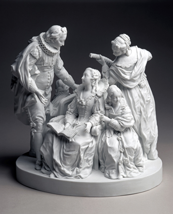
Jean-François Duret, La Mandoline ou La conversation espagnole, 1772 (Collection Sèvres—Cité de la céramique, SCC.2012.2.1)
Raconter l’histoire de la sculpture à Sèvres, de la création de la Manufacture par la volonté de Louis XV et de Madame de Pompadour jusqu’à la période révolutionnaire, permet de dévoiler tour à tour l’excellence du goût des élites de l’Ancien Régime pour la perfection des objets d’art et l’explosion d’une thématique nourrie par le siècle des Lumières.
La sculpture à Sèvres relève d’un processus minutieux partant d’un modèle en terre pour aboutir au biscuit de porcelaine. La surface de porcelaine, non émaillée mais polie, permet ainsi de rivaliser le marbre. Le biscuit de porcelaine, inventé par la Manufacture vers 1752, connait immédiatement un immense succès et a concurrencé la production venant de Chine puis celle de sa grand rivale saxonne, la Manufacture de Meissen.
Les artistes de la Manufacture ont su créer et diffuser des sujets remplis de charme, de délicatesse et de vie sur les thèmes de l’enfance, de la fable et de l’allégorie, de la littérature et de la vie quotidienne tout en innovant dans le domaine du portrait et de l’iconographie politique. Les biscuits exécutés sous la direction des sculpteurs du roi (Falconet, Pajou, Boizot), parfois inspirés par des compositions de Boucher ou de Coypel, ont délecté les amateurs du temps les plus exigeants.
L’exposition présente plus de 80 terres cuites et 120 biscuits de porcelaine, mais aussi des dessins, des estampes, ainsi que des modèles et des moules en plâtre originaux. Cette richesse des collections patrimoniales complétée par des prêts extérieurs, permet de montrer au mieux cette apothéose du goût et de l’excellence artistique que fut la création au XVIIIe siècle des célèbres biscuits de Sèvres.
Cet événement a été rendu possible grâce à la restauration financée par la Fondation BNP Paribas, des modèles originaux en terre cuite du XVIIIe siècle, étape initiale à la production des sculptures en porcelaine.
Après une introduction historique et technique, le parcours de l’exposition se décompose en dix sections. Elles abordent les thèmes du goût pour l’enfance, les animaux, la fable et l’allégorie, le surtout de table, la vie contemporaine, les sujets littéraires, les œuvres religieuses, les portraits, les statuettes des grands hommes et, enfin, la décennie révolutionnaire.
Aujourd’hui, la fabrication de biscuits se poursuit dans les ateliers de la Manufacture de Sèvres, pour certains issus du répertoire de Sèvres, pour d’autres fruits de l’imagination des artistes contemporains invités.
Le commissariat général de l’exposition est assuré par Guilhem Scherf, conservateur en chef au département des sculptures du musée du Louvre, spécialiste de la sculpture du XVIIIe siècle et auteur de nombreux ouvrages. La scénographie est confiée à Cécile Degos.
Le catalogue est édité sous la direction de Tamara Préaud par les éditions Faton. Une première partie traite de la Manufacture de Sèvres, des techniques et de la restauration des terres cuites et du dialogue des arts (l’estampe, la sculpture, le costume). La deuxième est le catalogue des œuvres exposées, selon dix sections. Quant à la dernière partie, elle présente le catalogue sommaire illustré de l’ensemble des sculptures du XVIIIe siècle conservées à Sèvres – Cité de la céramique.
La Cité de la céramique – Sèvres & Limoges et la Société Pyramis Design ont signé un accord de mécénat de compétence en matière de digitalisation 3D. Dans le cadre de l’exposition, grâce à cette technologie, une lecture inédite du surtout de table La Conversation espagnole sera proposée aux visiteurs, en regard de l’œuvre originale.
Tamara Préaud, ed., La Sculpture à Sèvres au XVIIIe Siècle (Dijon: Éditions Faton, 2015), 432 pages, 45€.
Exhibition | Gardens & Groves: George Washington’s Mount Vernon
◊ ◊ ◊ ◊ ◊
Now on view at Mount Vernon:
Gardens & Groves: George Washington’s Mount Vernon
Mount Vernon, Virginia, 22 February 2014 — 30 May 2016
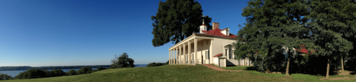
Countless photographs testify to the beauty of Mount Vernon’s landscape. Two hundred years after its creation, it continues to delight. Although the beautiful gardens, sweeping lawns, and inviting paths seem perfectly natural, these features were all carefully planned by George Washington. When he returned to Mount Vernon after the American Revolution, General Washington found the estate in need of extensive repairs and improvements. The buildings and grounds surrounding the Mansion lacked an overall design, having evolved over time with an eye more for practical function than beauty.
Between 1785 and 1787, George Washington completely transformed Mount Vernon’s grounds into a landscape very similar to the one that survives today. During this break from public affairs, few days passed without the General working on the landscape. To update Mount Vernon, Washington had his free and enslaved workers install such picturesque features as sweeping lawns, groves of trees, curving paths, vistas, and hidden walls (called “ha-has”). From laying out paths to tagging trees for transplanting, the General was involved in every aspect of designing and installing his gardens and grounds.
From the exhibition press release (27 January 2014) . . .
Mount Vernon invites visitors to explore George Washington’s design for the grounds of his estate, through the exhibition, Gardens & Groves: George Washington’s Landscape at Mount Vernon, on view until May 2016. Gardens & Groves is the first museum exhibition to focus specifically on Washington’s landmark achievements as a landscape designer combining rarely-seen original documents, artworks, and books with period garden tools, gorgeous landscape photography, and a stunning scale model of the Mount Vernon estate. In Gardens & Groves, visitors can view the first president’s spyglass, watering can, and garden roller, in addition to reading Washington’s notes and instructions for Mount Vernon’s landscape in his own hand.

Kitchen garden at Mount Vernon
“Each year, more than a million visitors enjoy the remarkable beauty of Mount Vernon’s gardens and grounds,” said Mount Vernon curator, Susan Schoelwer. “But few realize that the views that we enjoy today were all carefully planned by George Washington himself. Gardens & Groves aims to change that, as visitors have the opportunity to ‘unpack’ the landscape surrounding the Mansion, following in Washington’s footsteps to examine each of the elements in the design.”
The exhibit presents five 18th-century views of Mount Vernon—oil paintings of both river and land fronts of the Mansion, by Edward Savage; two detailed drawings of the layout of the grounds, by English admirer Samuel Vaughan; and a recently-acquired image of the Washingtons relaxing on the piazza in 1796, by Benjamin Henry Latrobe, architect of the US Capitol Building (due to their fragility, the Vaughan and Latrobe drawings were on view in Gardens & Groves through August 17, 2014).
“Bringing these five important works together presents a rare opportunity to see Mount Vernon through the eyes of artists who visited during George Washington’s lifetime,” said Mount Vernon exhibition curator Adam T. Erby. “These artworks record details of the landscape that we would not otherwise know—information that continues to inform our ongoing research and restoration efforts.”
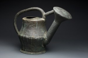
Watering Pot, made in France or England, 18th century, copper, iron.
At the center of Gardens & Groves is a fascinating 8’x 9’x 11’ model of Mount Vernon’s landscape as Washington last saw it in 1799. Developed by Mount Vernon historians, archaeologists, and curators, this state-of-the-art model has returned home from a national tour in Mount Vernon’s traveling exhibition, Discover the Real George Washington: New Views from Mount Vernon. In addition to delighting viewers with its intricate craftsmanship, the model incorporates countless scenes from daily life—laundry drying in the laundry yard, a sailing ship on the Potomac, just-planted trees along the bowling green.
Such details introduce a broad view of the landscape, revealing two separate, but intersecting landscapes that existed at Mount Vernon: the pleasure grounds of the planter and the working spaces of the enslaved community. Gardens & Groves also tells the stories of the men and women, both hired and enslaved, who created and maintained George Washington’s gardens, and visitors will see some actual artifacts that they used, including a copper watering can and archeologically-recovered flower pot fragments.
An interactive touchtable will demonstrate the evolution of the landscape at Mount Vernon over time. Visitors will be able to scroll through three topographical maps created by Mount Vernon’s preservation staff, reconstructing the appearance of the landscape when Washington inherited the property, during an early renovation, and as it finally appeared at the end of Washington’s life. On each of the maps, visitors will be able to click on individual elements to bring up more information about a particular feature.
A list of ten facts about the landscape at Mount Vernon is available here»
◊ ◊ ◊ ◊ ◊
Published this spring in connection with the exhibition:
Susan P. Schoelwer, ed., The General in the Garden: George Washington’s Landscape at Mount Vernon (Mount Vernon: Mount Vernon Ladies’ Association, 2015), 208 pages, ISBN: 978-0931917486, $35.
 The General in the Garden provides an engaging, informative, and richly illustrated introduction to George Washington’s landscape at Mount Vernon—arguably the best-documented, best-preserved complex of gardens and grounds to survive from eighteenth-century America.
The book’s three essays, by Adam T. Erby, J. Dean Norton, and Esther C. White, chronicle Washington’s transformation of the estate in the years between the American Revolution and the Constitutional Convention of 1787, the stewardship of its gardens by the Mount Vernon Ladies’ Association since 1860, and the archaeology that led to the recent restoration of Washington’s showplace upper garden. Mount Vernon assistant curator Adam Erby examines Washington’s critical role in developing Mount Vernon’s landscape, arguing that the general drew on British design sources and gardening manuals but adapted them to his own circumstances, creating a truly American garden. J. Dean Norton, Mount Vernon’s director of horticulture, traces the evolution of the estate’s landscape and recreated gardens across the two centuries since Washington’s death. And Esther White, Mount Vernon’s director of historic preservation and research, shows how groundbreaking archaeological methods facilitated the discovery of Washington-era garden beds and borders of flowers, shrubs, and vegetables in his upper garden—a remarkable find that yielded one of the most significant eighteenth-century garden recreations of our time. Also included is a lavishly illustrated guide to Mount Vernon’s landscape features, introducing Washington’s beloved estate to a modern audience.
An interview with the authors of the book is available here»
Exhibition | New for Now: The Origin of Fashion Magazines
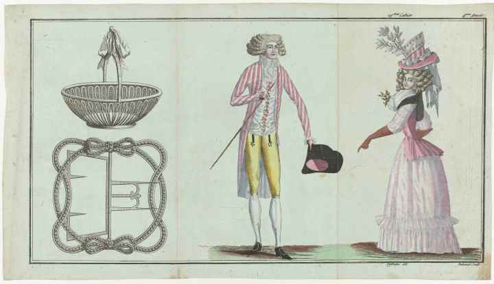
Magasin des Modes Nouvelles Françaises et Anglaises (1 Juin 1789), Pl. 1, 2 et 3
(Amsterdam: Rijksmuseum)
◊ ◊ ◊ ◊ ◊
Press release (20 May 2015) from the Rijksmuseum:
New for Now: The Origin of Fashion Magazines
Rijksmuseum, Amsterdam, 12 June — 27 September 2015
From 12 June, the Rijksmuseum presents a major retrospective of its rich collection of costume and fashion prints for the first time. The change in women’s and men’s fashion from the year 1600 up to and including the first half of the 20th century, and the development of the fashion magazine into the fashion glossies we know today, can be seen in more than 300 prints. The exhibition was designed by designer and co-curator Christian Borstlap, in collaboration with fashion illustrators Piet Paris and Quentin Jones.
The publishers of fashion prints did everything to make their product as attractive as possible. They attracted skilled illustrators for this purpose, some of whom went on to become specialists in this area: true ‘fashion illustrators’. The trick was to portray the models on the prints as skillfully as possible and with a great sense of elegance. The printmaker was responsible for transferring the design sketches onto an engraving that could reproduce the design. A so-called ‘colourist’ subsequently added colours to each individual image by hand.
New for Now shows prints by fashion designer Paul Poiret, among others. His ‘Fashion is Art’ statement marked the beginning of a new era. He presented his designs in two artfully designed series of works in bright opaque colours, which served as an inspiration for a number of artistically high-quality fashion magazines.
Many of the prints shown are from two important collections acquired by the Rijksmuseum in 2009: The Raymond Gaudriault Collection and The MA Ghering-van Ierlant Collection. All 8,000 prints from these collections can be seen online from June 2015. This is the result of a multi-year project in which the prints were catalogued, described and digitalised.
◊ ◊ ◊ ◊ ◊
The catalogue is available from the Rijksmuseum:
Georgette Koning and Els Verhaak, New For Now: The Origin of Fashion Magazines (Amsterdam: Rijksmuseum, 2015), 204 pages, 20€.
 Fashion changes constantly, but the desire to be ‘in fashion’ is eternal. For centuries people have eagerly followed the latest fashion trends. But how did one keep up in an age without internet, fashion blogs, Pinterest and glossy fashion magazines? New for Now explores how trends were spread before Vogue and Harper’s Bazaar appeared on the shelves. From the costume book in the 16th century by way of individual, hand-coloured fashion plates to the first fashion magazine to roll off the presses in 1785: Cabinet des Modes. There was no stopping after this, and one fashion magazine appeared hard on the heels of the other, reaching an absolute high point in the Gazette du Bon Ton in 1912, full of magnificent art deco illustrations.
Exhibition | Tavole Barocche: Banchetti, Feste e Nature Morte

◊ ◊ ◊ ◊ ◊
From Gioia Oggi:
Tavole Barocche: Banchetti, feste e nature morte tra
XVII e XVIII secolo dalla Collezione Corsi di Firenze
Castello Svevo di Gioia del Colle (Ba), 11 April — 28 June 2015
Curated by Francesco Di Ciaula
Nell’anno dell’Expo di Milano, dedicato alle tematiche dell’alimentazione, le suggestive sale del Castello Svevo di Gioia del Colle (Ba) ospitano dall’11 aprile al 28 giugno 2015 la mostra Tavole Barocche, promossa dalla Regione Puglia e dal Comune di Gioia del Colle.
La mostra, a cura di Francesco Di Ciaula ed organizzata dalla società Sistema Museo, espone dipinti raffiguranti nature morte, paesaggi e scene conviviali tra XVII e XVIII secolo, provenienti dalla Collezione Corsi di Firenze conservata presso il Museo Bardini, una delle istituzioni museali più importanti del capoluogo toscano. L’esposizione è allestita nel Castello di Gioia del Colle, tra i più affascinanti manieri realizzati dalle maestranze dell’Imperatore Federico II Hohenstaufen, il Sovrano tedesco che fece della Puglia del XIII secolo la sua terra d’elezione. Tra la magnifica Sala del Trono, così nominata per la presenza dell’imponente seggio reale, la Sala del Camino, la Torre de’ Rossi e il Gineceo, si sviluppa armoniosamente la mostra, ricca di opere importanti per la storia dell’arte del Seicento e del Settecento italiano e fiammingo, come quelle del Gobbo dei Carracci, lo Spadino, Giovan Battista Ruoppolo, Jacopo da Empoli, Gian Domenico Ferretti, della bottega dell’Arcimboldo e del seguito di Pieter Brueghel il Giovane. Due le sezioni di mostra, incentrate sulla cultura del cibo e della tavola: la prima espone la rappresentazione degli alimenti nel genere della natura morta, che si impone in maniera decisiva nel Seicento. I dipinti sono dominati dalla variegata presenza di carni, selvaggina, pesci, frutti e ortaggi realizzati da artisti soprattutto di ambito toscano e romano-napoletano. La seconda sezione, arricchita dalle opere di autori fiamminghi, presenta i piaceri conviviali: prevalgono scene di banchetto e di festa, riscontrabili sia nei rituali opulenti e fastosi delle classi aristocratiche sia nelle immagini di contesti umili e popolari, nei quali l’alimentazione più che piacere della tavola diviene ricerca di appagamento della fame.
Le Sezioni
Il tema delle quaranta opere esposte, il cibo e la tavola, si rifà al mondo fisico puramente rappresentato, in un contesto di pittura profana dell’epoca barocca, il cui chiaro richiamo alle esperienze dei sensi conduce l’osservatore verso una visione seducente delle cose naturali. La nascita della natura morta, al centro della prima sezione della mostra, è paradigmatica di un interesse, presente già negli ultimi decenni del XVI secolo tra Fiandre e Italia settentrionale, della possibilità di indagare il reale negli aspetti più dettagliati e “microscopici”, considerati “laterali” nella pittura di storia. L’illusionismo, tutto teatrale, di credere di poter toccare, annusare, assaggiare i cibi sul piano della tela, accentua questa visione di una riproduzione della realtà riconoscibile come vita e vissuto quotidiano dove gli stessi alimenti, fuori da ogni intendimento retorico, suscitano desideri e ricordi sensoriali. Il processo di crescita e decadenza della frutta e dei vegetali, in connessione con l’idea del tempo che scorre, pone la natura morta come specchio della vita della materia, le cui forme assumono più o meno colore e spessore dall’impatto con la luce, l’unico elemento in grado di interagire con lo spazio della scena. Nella seconda sezione della mostra, illustrante i piaceri conviviali, i dipinti di ambito fiammingo e francese, raffiguranti feste aristocratiche tra parchi e boschi, fanno riferimento alla fusione del momento della tavola con l’intrattenimento di danze e musiche. Sempre fiamminghe le scene campestri illustranti i pasti del mondo contadino e le colazioni borghesi, mentre nelle vedute urbane del Settecento fiorentino si osserva la vita brulicante delle città, tra fiere e mercati. Le dispense e le cucine, come luoghi della conservazione e della cottura dei cibi, assumono anch’esse una rilevanza artistica, espressione di una concezione fortemente naturalistica e verosimile della realtà, priva ormai del puro idealismo del Rinascimento.
Le Opere
Come incipit del percorso di visita, accanto al trono di Federico, sono collocate la Primavera, l’Estate e l’Inverno eseguiti dalla bottega dell’Arcimboldo, l’enigmatico pittore lombardo cinquecentesco, il quale inventò la conversione del corpo umano in figura vegetale, facendo delle sue opere una prefigurazione della nascita della natura “in posa”. Nell’insieme delle nature morte qui presenti spiccano i dipinti, la Frutta e la Natura morta con cacciagione e frutta, legati a due tra gli esponenti più rappresentativi del genere in Italia, come Pietro Paolo Bonzi, detto il Gobbo dei Carracci e il Maestro S.B., noto come lo Pseudo Salini, i quali riflettono le innovazioni caravaggesche dei primi capolavori romani del Merisi, connotate da un intenso e “contemplativo” naturalismo. Nel caso del secondo pittore si nota la ripresa di modelli nordici, nell’iconografia degli animali da selvaggina, e una carica cromatica tipica della scuola napoletana del Seicento alla quale egli era legato, che in mostra è splendidamente rappresentata dalla tela attribuita a Giovan Battista Ruoppolo, la Natura morta di cucina. La natura morta fiorentina è presente nelle opere della cerchia di Jacopo da Empoli, il pittore che, formatosi sulla pittura manierista fiorentina, “importa” a Firenze nei primi decenni del XVII secolo il nuovo genere proveniente dalle botteghe romane, tramite la presenza nelle collezioni Medicee di varie tele raffiguranti “pose” di animali e vegetali. I fasti del Barocco romano sono evocati dalla Natura morta di frutta e zucche di Giovanni Paolo Castelli detto lo Spadino, e la grande tela di Michelangelo Pace detto da Campidoglio, Natura morta di fiori e frutta con papere che si abbeverano ad una fontana. La seconda parte della mostra è aperta dai convivi immersi liberamente nel contesto naturale di parchi, boschetti e giardini, con l’allusione all’imprescindibile legame tra cibo ed Eros. La cornice fiabesca delle tele fiamminghe qui esposte, Festa nel parco del Castello e Convivio, con i meravigliosi sfondi di castelli dall’aspetto ancora medievale, dona alla scena un’atmosfera sognante e ovattata, tipica della vita di corte. Ancora di scuola fiamminga, della prima metà del Seicento, sono le due tele che illustrano la piacevolezza del mangiare immersi nella natura, il Banchetto all’aperto e il Paesaggio estivo, nei quali gli atteggiamenti dei personaggi richiamano una disinvoltura borghese nell’atto della consumazione dei pasti e dello stare a tavola. La presenza in mostra di un’opera come Interno di osteria con contadini, attribuibile a un artista del seguito di Pieter Brueghel il Giovane, ci permette di cogliere l’elemento grottesco di una scena di festa contadina, dove l’aspetto di preparazione e consumazione del pasto assume una grandissima forza espressiva, tipica dell’arte bruegheliana. La descrizione della vita umile degli ultimi, in una chiave legata ai costumi alimentari, viene espressa dalla presenza di una tela del pittore del Settecento bolognese, Stefano Gherardini, Interno di osteria con personaggi, formatosi sulla scia del Crespi, e da Il Pulcinella malato, eseguito da un seguace di Pier Leone Ghezzi, il grande caricaturista romano attivo nella Roma della prima metà del XVIII secolo. In posizione dominante, nella bellissima Sala del Camino, svetta il Bacco e Arianna del pittore Rococò fiorentino Gian Domenico Ferretti, il cui dipinto celebra il Dio del vino, dell’ebbrezza, della trasformazione e della rigenerazione della vegetazione. Seguendo un suadente percorso tra dipinti ricolmi di frutta, selvaggina, pesci, tavole imbandite e paesaggi animati da feste aristocratiche, colazioni campestri e fiere cittadine, si assiste alla rivelazione di una cultura artistica dominata dal trionfo della Natura mater, la procreatrice dei prodotti della terra, raffigurata nei paesaggi come luogo di bucolico abbandono, dove Eros e le Dee della fertilità e dell’abbondanza giacciono felici sul verde rigoglioso di un prato primaverile.
Il Castello
Tra le opere fortificate di epoca federiciana presenti in Puglia, il castello di Gioia del Colle è una di quelle che conservano più integro l’impianto architettonico, definito dall’ampio cortile quadrangolare, le poderose torri angolari e le cortine con paramento a conci bugnati. L’originaria struttura di epoca bizantina fu ampliata in epoca normanna. Fin dal 1500 storici, viaggiatori e studiosi hanno attribuito a Federico II la sistemazione definitiva del castello così come appare attualmente. Parte integrante della visita al monumentale Castello di Gioia del Colle sono le sale del Museo Archeologico, dove è presente una sistematica esposizione dei numerosi corredi delle necropoli di Monte Sannace e Santo Mola che coprono un ampio arco cronologico, dall’inizio del VI al III/II secolo a.C. Vasi geometrici e figurati, armi in bronzo, fibule e statuine fittili definiscono la consueta composizione dei corredi funerari del glorioso centro indigeno, ma anche delle più ampie comunità peucete.
◊ ◊ ◊ ◊ ◊
The catalogue is available from Artbooks.com:
Francesco Di Ciaula, Tavole Barocche: Banchetti, feste e nature morte tra XVII e XVIII secolo dalla Collezione Corsi di Firenze (Foggia: Claudio Grenzi, 2015), 96 pages, ISBN: 978-8884315830, $53.
Exhibition | Rich and Tasty: Vermont Furniture to 1850
On view this summer at the Shelburne Museum:
Rich and Tasty: Vermont Furniture to 1850
Shelburne Museum, Shelburne, 25 July — 1 November 2015

Stand, attributed to Lemuel Bishop, Charlotte, Vermont, ca. 1815. Cherry, birch, mahogany, basswood and brass, 28 x 18 x 15 inches. Private Collection
This exhibition and accompanying catalogue will introduce and identify Vermont high style furniture, previously known only to decorative arts scholars, historians, and collectors. The project arrives twenty years after Shelburne Museum published a seminal checklist of early Vermont Furniture and is the result of two decades of scholarship. The exhibition will feature pieces that will illuminate the craft practices and regional economics that help define Vermont furniture’s stylistic features and unexpected aesthetic innovations, referred to as “rich and tasty” by one Vermont cabinetmaker.
◊ ◊ ◊ ◊ ◊
Jean M. Burks and Philip Zea, eds., Rich and Tasty: Vermont Furniture to 1850 (Shelburne, Vermont: Shelburne Museum, 2015), 180 pages, ISBN: 978-0939384112, $30.
Two landmark 1995 publications, The Best the Country Affords: Vermont Furniture 1765–1850 and Vermont Cabinetmakers & Chairmakers Before 1855: A Checklist, reintroduced Vermont high style furniture to decorative arts scholars, historians, and collectors. Equipped with this seminal knowledge, a small cadre of Vermont connoisseurs started scouring country auctions, adding signed and well-documented pieces to their private collections. Twenty years later, it is time to bring these pieces together and share them with the public. This catalog and the accompanying exhibition advances the understanding of Vermont high style furniture—from its features, craftsmanship, and economics, to its unexpected aesthetic innovations. The authors identify key eighteenth-century Vermont pieces before covering a variety of topics, including clockmaking, chairmaking, the half sideboard, furniture from Woodstock, and furniture from Vermont factories. Seventy-five full-color photographs by acclaimed Boston photographer David Bohl and extended catalog entries display furniture from all over the Green Mountain State.
Exhibition | Treasure Ships: Art in the Age of Spices

Scenes of Traders in Nagasaki, mid-eighteenth century, detail from a pair of hand scrolls, opaque watercolour, ink and gold on paper, box, wood, paper and ink, each 313 x 35 cm (Art Gallery of South Australia, Adelaide)
◊ ◊ ◊ ◊ ◊
Press release (April 2015) from the Art Gallery of South Australia:
Treasure Ships: Art in the Age of Spices
Art Gallery of South Australia, Adelaide, 13 June — 30 August 2015
Art Gallery of Western Australia, Perth, 10 October 2015 — 31 January 2016
Curated by James Bennett and Russell Kelty
Treasure Ships: Art in the Age of Spices is the first exhibition on view in Australia to present the complex artistic and cultural interaction between Europe and Asia from the sixteenth to the nineteenth centuries—a period known as the Age of Spices. The exhibition includes 300 outstanding and rarely seen works of ceramics, decorative arts, furniture, metalware, paintings, prints, engravings and textiles from both public and private collections in Australia, India, Portugal, Singapore and the United States.
Nick Mitzevich, Director, Art Gallery of South Australia sees this landmark exhibition and its publication as highlighting the Gallery’s international reputation for presenting spectacular exhibitions of historical Asian and European art. Treasure Ships showcases a diverse collection of luxury objects, many of which have never previously been seen on public display in Australia. This has been made possible through the extensive cooperation and support the Gallery has received from institutions, collectors and scholars in Portugal, India, Singapore, Indonesia and the United States, as well as the partnership with the Art Gallery of Western Australia. The Gallery’s two curators James Bennett and Russell Kelty have worked researching the exhibition for over three years, and their professional commitment has ensured the success of this much-anticipated exhibition.

China and Europe–Japan, Surcoat (jinbaori), with mon, late 18th century with 19th-century repairs, brocade created in China, velvet and factory print created in Europe, possibly France, garment constructed in Japan, cotton, wool, silk, velvet, metallic thread, natural dyes, supplementary weft and plain weave, wood, 101 x 85 cm (Helen Bowden Gift Fund 2015, Art Gallery of South Australia, Adelaide)
The works of art selected reveal how the international trade in spices and other exotic commodities inspired dialogue between Asian and European artists, a centuries old conversation whose heritage is the aesthetic globalism we know today. Europe’s infatuation with pepper, nutmeg and cloves has often been explained in terms of the necessity to preserve cooked foods in the days before the invention of refrigeration. “This is a half-truth, which takes little account of the complex reasons the condiments of luxury and status were so avidly sought, often at great expense to human lives,” said Bennett.
The exhibition commences with the small country of Portugal. Located on the periphery of Europe, Portugal re-mapped the West’s view of the world and created a mercantile spice empire stretching halfway around the globe during the fifteenth-sixteenth century. In 1498 Vasco Da Gama’s small fleet became the first to reach India, landing with the famous words, ‘we come in search of Christians and spices’. Within a decade, the Portuguese soldier—aristocrat Francisco de Almeida (1450–1510) had ruthlessly seized control of the Indian Ocean spice trade and established Portugal’s permanent presence in Asia that lasted four hundred years.
Treasure Ships also presents the story of the slave trade, piracy and shipwrecks, as well as illustrating the astonishing beauty of Chinese porcelain, known as ‘white gold’, and celebrating the vibrant Indian textiles created for export around the world. There are several highlights in this exhibition including two works from the personal collection of Queen Adelaide (1792–1849), after whom the city of Adelaide was named in 1836: artefacts retrieved from the Batavia, which sank off the Western Australian coast in the seventeenth century, and a magnificent early 19th-century Chinese punchbowl depicting Sydney Cove that locates Australia within this global history.
It is most appropriate that this exhibition should originate in Adelaide as this is the only Australian city founded on the vision of a Eurasian—the surveyor Colonel William Light (1786–1839) whose Mother was of Malaysian descent and whose remarkable self-portrait features in the exhibition said James Bennett.
Treasure Ships also examines the impact of the Age of Spices on the ‘discovery’ of the Australian continent and the commencement of English occupation in 1788. The colonial art of the period displays the aesthetic reverberations that continued in the Australasian region long after European ships had ceased carrying cargoes of nutmeg and cloves.
James Bennett and Russell Kelty, Treasure Ships: Art in the Age of Spices (Adelaide: Art Gallery of South Australia, 2015), ISBN: 978-1921668227, $70.
Exhibition | Vices of Life: The Prints of William Hogarth

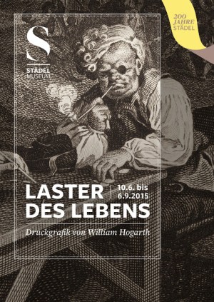
William Hogarth, After (detail), 1736, etching and engraving, 41 x 33 cm
(Städel Museum, Frankfurt am Main)
◊ ◊ ◊ ◊ ◊
Press release for the exhibition now on view at the Städel Museum:
Vices of Life: The Prints of William Hogarth
Laster des Lebens: Druckgrafik von William Hogarth
Frankfurt’s Städel Museum, Frankfurt, 10 June — 6 September 2015
Schloss Neuhardenberg, Brandenburg, TBA
Curated by Annett Gerlach
From 10 June to 6 September 2015—in its bicentennial year ‘200 Years Städel’—Frankfurt’s Städel Museum will be presenting prints by the English painter, engraver and etcher William Hogarth (1697‒1764). Altogether seventy works including the famous printmaking series A Harlot’s Progress (1732), A Rake’s Progress (1735) and Marriage à la Mode (1745) will be on view in the exhibition hall of the Department of Prints and Drawings. These visual novels from the Städel holdings take the fashions, vices and downsides of modern life in the London metropolis as their themes. Hogarth conceived of his artworks as printed theatre of his times and with them he laid the cornerstone for socio-critical caricature in England. The prints owe their special quality to the keen powers of perception and caustic humour of an artist who contributed so greatly to shaping the image of his era that it is still referred to as ‘Hogarth’s England’ today. Executed during Johann Friedrich Städel’s lifetime, the engravings are among the Städel’s oldest holdings and mirror the critical spirit inherent to this institution since its founding.
 William Hogarth was born in London in 1697. In keeping with an early eighteenth-century fashion, his father Richard opened a coffee house at which only Latin was spoken. The business failed, and Richard Hogarth had to serve five years in London’s notorious Fleet Prison for failure to pay his debts. As was usual at the time, his wife and children had to accompany him. In 1713, after his father’s release, William Hogarth began an apprenticeship as a silver engraver where he also learned the rudiments of the complex techniques of intaglio printing—engraving and etching. Following his seven-year training, he went into business for himself as an engraver and attended the privately run St Martin’s Lane Academy, an art school in London, to acquire the art of painting. In 1724 he also became a member of the academy of royal court painter James Thornhill (1675‒1734), whose daughter Jane he married in 1729. It was not with his paintings, however, that Hogarth achieved a breakthrough with the public, but with the prints made after his works on canvas. With the series A Harlot’s Progress, produced in the early 1730s, he founded a new genre he later dubbed modern moral subjects. Hogarth conceived of these subjects as contemporary, moral-didactic history scenes. He thus took a stand against the hierarchization of the visual arts, a firmly entrenched principle of academy doctrine which granted classical history painting pride of place. With his printmaking works, he succeeded in creating a new, up-to-date genre based on the keen observation of reality. In 1755 Hogarth was elected to the Royal Society of Arts, which he quit again just two years later on account of artistic and personal differences. His appointment as royal court painter followed in 1757, but never led to any commissions. The final years of the artist’s life were overshadowed by bitter disputes between himself and his critics. A stroke in 1763 left Hogarth severely handicapped and he died the following year in his home in Leicester Fields, a district of London.
The presentation in the exhibition gallery of the Department of Prints and Drawings focuses primarily on those of William Hogarth’s printmaking series that earned him international fame: A Harlot’s Progress, A Rake’s Progress und Marriage à la Mode. There is a very simple reason for the fact that his works on paper secured him a place in art history: prints can be circulated far better than paintings. It was by these means that the artist reached the enlightened and educated public of his day in large numbers. Already the first edition of A Harlot’s Progress (1732) comprised 1,240 sold copies. In six episodes, this series describes the rise and fall of a young woman who has come from the country to the city to find work. To earn a living she ends up as a prostitute and lands in prison as a result. The final scene shows the wretched funeral of the protagonist, whose life has already come to an end at the age of twenty-three. Hogarth had numerous real and literary models to look to for his creation of this figure. Inspired by his great interest in the social characterization of his time, he directed his critical, ironical gaze to all strata of society, from the highest nobility to the most abject circumstances. The sick and needy of all generations formed the downside of the economic boom enjoyed by the colonial and commercial metropolis and its many profiteers.
In his second series, A Rake’s Progress (1735), consisting of eight prints, Hogarth tells the story of the social decline of Tom Rakewell, who brainlessly squanders his inheritance and is thrown first into debtors’ prison and then the madhouse. Rakewell’s incarceration on grounds of indebtedness is reminiscent of the artist’s own biography. Entirely unlike his father, however, William Hogarth was an excellent businessman and very clever at taking advantage of the London press—which was flourishing in his day—and its public impact for his own purposes. In newspapers such as the London Daily Post, the General Advertiser or the London Journal he published announcements of his prints and advertised them for subscription.
Hogarth borrowed the title of his third major series, published in 1745, from a comedy by John Dryden (1631‒1700). Marriage à la Mode is about an espousal arranged by the two spouses’ fathers. Neither the bride nor the groom is the least bit interested in the other, both amuse themselves on the side, and the situation comes to a dramatic conclusion. Hogarth’s protagonists feign innocence and practise deception, abandon themselves to their passions and founder on their false ideals. Looking to true stories for orientation and integrating well-known persons and recognizable sites, he warned his public of the dangers of modern life—dangers still very real today. In 1751, with his popular prints Beer Street and Gin Lane, he supported a public campaign against the excessive consumption of gin. The former scene presents the enjoyment of beer as healthy and beneficial in contrast to the destructive effects of gin portrayed in the latter.
From mid century onward, in addition to socio-critical themes Hogarth also devoted himself to matters of national and political relevance, which represent a further focus of the exhibition. In several works, the artist addressed the relationship between France and England, which were at war. The Gate of Calais (1748) was his response to his arrest on suspicion of espionage during one of his trips to France. In 1756, in The Invasion, he again caricatured the French as grotesque, haggard figures who are after the tasty beer and luscious roast beef of the English. Some fifteen years later, in the print The Times, Plate 1 (1762), Hogarth made an urgent appeal for the cessation of the Seven Years’ War.
In 1753, Hogarth published his own art-theoretical deliberations in the book The Analysis of Beauty. In it he concerned himself with the foundations of visual-artistic production and particularly the matter of how to achieve beauty and grace. Hogarth considered the study of nature to be the key to beauty. He called upon his readers to perceive the objects of nature with their own eyes and judge them according to rational criteria. The German writer Christlob Mylius (1722–1754) was in London when Hogarth’s Analysis came out, and he translated it into German the very next year. Johann Friedrich Städel had a copy of this translation in his library, and it will be on display in the show.
In conjunction with the exhibition, the Städel Museum is publishing a catalogue by Annett Gerlach with approximately 50 pages, 10€. Following its presentation at the Städel Museum, the show will be on view at Neuhardenberg Castle. The exhibition is being sponsored by the Hessische Kulturstiftung.
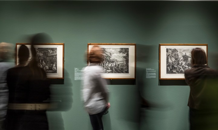
Installation view of the exhibition Vices of Life: The Prints of William Hogarth at Frankfurt’s Städel Museum (June 2015)
Exhibition | A Kingdom of Images: French Prints in the Age of Louis XIV

Louis XIV, King of France and Navarre, Robert Nanteuil after Nicolas Mignard, 1661
(Los Angeles: The Getty, 2010.PR.60)
◊ ◊ ◊ ◊ ◊
Press release (27 May 2015) from The Getty:
A Kingdom of Images: French Prints in the Age of Louis XIV, 1660–1715
Getty Research Institute, Getty Center, Los Angeles, 16 June — 6 September 2015
Bibliothèque Nationale de France, Paris, 2 November 2015 — 31 January 2016
Curated by Louis Marchesano, Christina Aube, Peter Fuhring, Vanessa Selbach, and Rémi Mathis
Louis XIV’s imperialist ambitions manifested themselves in every activity under his dominion, which included the production of etchings and engravings. Fully appreciating the beauty and utility of prints, he and his advisors transformed Paris into the single most important printmaking center in Europe, a position the city maintained until the 20th century. Fueled by official policies intended to elevate the arts and glorify the Sun King, printmakers and print publishers produced hundreds of thousands of works on paper to meet a demand for images that was as insatiable then as it is now.
On view at the Getty Research Institute (GRI) at the Getty Center June 16 through September 6, 2015, A Kingdom of Images: French Prints in the Age of Louis XIV, 1660–1715 was organized by the Getty Research Institute in special collaboration with the Bibliothèque nationale de France. This major exhibition surveys printmaking in the era of Louis XIV and commemorates the 300th anniversary of his death.
“In art history, too often certain media are neglected in favor of what is popular, such as painting and sculpture,” said Thomas W. Gaehtgens, director of the Getty Research Institute. “However, the truth is that at a time when France was positioned as the cultural capital of Europe, printmaking asserted itself as a fine art while printmakers successfully inserted themselves into the official art academy that had previously been the stronghold of painters and sculptors. Indeed, our understanding of the history of art and culture in France is a history told in French prints. A Kingdom of Images addresses a significant lacuna in scholarship and shows the rise of French printmaking to be richer and more complex than has been generally recognized.”

Mademoiselle d’Armagnac in a Dressing Gown, Antoine Trouvain, 1695 (Paris: Bibliothèque nationale de France, Département des Estampes et de la Photographie)
A Kingdom of Images features nearly 100 works produced during the golden age of French printmaking—from grand royal portraits to satiric views of everyday life, and from small-scale ornamental designs to unusually large, multi-sheet panoramas of royal buildings. The exhibition was curated by Louis Marchesano, curator of prints and drawings at the GRI; Christina Aube, curatorial assistant at the GRI; prints specialist Peter Fuhring of the Fondation Custodia in Paris; and Vanessa Selbach and Rémi Mathis, curators of seventeenth-century prints at the Bibliothèque nationale de France.
“No other medium served the Crown as well as prints,” said Marchesano. “Through prints, allies and enemies alike bore witness to the refinement of French technical skill, aesthetics, and taste. They not only learned about Louis XIV, they also saw that French fashion, design, and inventiveness had outmatched the rest of Europe. One of the reasons that this period has not been the subject of a large exhibition is that curators and scholars dismissed many of the prints as propaganda, the kind of over-the-top imagery in which the king appears, for example, as a mythological figure or a Roman emperor. While I do not disagree with the ‘propaganda’ label, I would urge viewers to consider the sophistication of both the message and the way that message is delivered. Also, I would argue that we need to think of propaganda in a wider sense. Remember, Louis XIV wanted to demonstrate to the world that France was the new cultural capital and in this respect it was under his reign that prints accomplished two goals. First, as works of art they attained unparalleled artistic sophistication and influence, which we can see for example in the portraits by Robert Nanteuil; and second, they carried a message that the rest of Europe came to envy: France was the center of fashion, design, and elegance.”
The works on display include fashion prints, portraits, religious and moralizing images, maps and views, and works depicting the fine and decorative arts, architecture, and lavish festivals. The first section of the exhibition, ‘Glory of the King’, contains one of the most exquisite portraits of Louis XIV ever created (Nanteuil’s engraving of 1676), along with huge illustrated calendars showing the king in various guises. In one he is a heroic warrior, and in another, an elegant dancer in exquisite garb.
The ‘Fashion’ section contains marvelous works of the greatest rarity, including a pair of figures whose engraved clothing has been replaced with real fabric from the late 1600s. These are commonly referred to as ‘dressed prints’. Images of design and style are not strictly limited to this section, but can be seen throughout the entire exhibition.
The section devoted to architecture highlights Louis XIV’s greatest building programs: the Louvre, the church of the Invalides, and the palace and gardens of Versailles. The megalomaniacal impetus behind the construction of these buildings also informed the unusual monumentality of the prints that represented them; these works were produced by the best printmakers of the day: Etienne Baudet, Antoine Coquart, Pierre Lepautre, and Jean Marot.
For Louis XIV, festivals were one way in which to keep the aristocracy entertained and in line. Festivals had to impress and overwhelm audiences and those organized by the Crown were so costly that they sometimes threatened the budget of the government. The illustrated books designed to record those events, several of which are on display in the ‘Festivals and Events’ section, were made with the highest production values. A notable example is The Pleasures of the Enchanted Island, a publication featuring the etchings of Jean Lepautre, whose work allowed the world to witness the perpetual entertainments of a mythological realm ruled by a benevolent king.
A Kingdom of Images is one four exhibitions across the Getty that mark the 300th anniversary of the death of Louis XIV.
• Coinciding with A Kingdom of Images, the exhibition Louis XIV at the Getty at the J. Paul Getty Museum June 9, 2015 to July 31, 2016 is a special installation in the Museum’s South Pavilion that will focus attention on a variety of extraordinary pieces in the Getty’s collection made during Louis’s lifetime when France became the leading producer of the luxury arts in Europe.
• Louis Style: French Frames, 1610–1792 on view at the Getty Museum September 15, 2015 – January 3, 2016 will draw on the Museum’s large collection of French frames, Louis Style presents a survey of the exquisite carved and gilded frames produced during the reigns of four French kings.
• Woven Gold: Tapestries of Louis XIV, exclusively on view at the Getty Museum December 15, 2015 through May 1, 2016, will be the first major museum exhibition of tapestries in the Western United States in four decades. The exhibition will feature 15 larger-than-life tapestries ranging in date from about 1540 to 1715 and created in weaving workshops across northern Europe. In an exclusive loan from the French nation, most of the tapestries are from the collection of the Mobilier National, which preserves the former royal collection.
Louis XIV Online
Starting May 30, curators and other experts will be blogging regularly about the exhibition and related themes on The Getty Iris under the series title Louis XIV at the Getty. Audiences can join the conversation about the Sun King and his artistic legacy on @thegetty Twitter with the weekly series #SunKingSunday.
◊ ◊ ◊ ◊ ◊
From The Getty Store:
Peter Fuhring, Louis Marchesano, Rémi Mathis, and Vanessa Selbach, eds., A Kingdom of Images: French Prints in the Age of Louis XIV, 1660–1715 (Los Angeles: Getty Publications, 2015), 344 pages, ISBN: 978-1606064504, $80.
 Once considered the golden age of French printmaking, Louis XIV’s reign saw Paris become a powerhouse of print production. During this time, the king aimed to make fine and decorative arts into signs of French taste and skill and, by extension, into markers of his imperialist glory. Prints were ideal for achieving these goals; reproducible and transportable, they fueled the sophisticated propaganda machine circulating images of Louis as both a man of war and a man of culture.
This richly illustrated catalogue features more than one hundred prints from the Getty Research Institute and the Bibliothèque nationale de France in Paris, whose print collection Louis XIV established in 1667. An esteemed international group of contributors investigates the ways that cultural policies affected printmaking; explains what constitutes a print; describes how one became a printmaker; studies how prints were collected; and considers their reception in the ensuing centuries.
A Kingdom of Images is published to coincide with an exhibition on view at the Getty Research Institute from June 18 through September 6, 2015, and at the Bibliothèque nationale de France in Paris from November 2, 2015, through January 31, 2016 (Images du Grand Siècle, l’estampe française au temps de Louis XIV, 1660–1715).
Peter Fuhring works at the Fondation Custodia, Paris, where he is in charge of Frits Lugt’s Marques de collections de dessins & d’estampes. Louis Marchesano is curator of prints and drawings at the Getty Research Institute. Rèmi Mathis and Vanessa Selbach are curators of seventeenth-century prints in the dèpartement des Estampes et de la Photographie at the Bibliothèque nationale de France in Paris, where Vanessa Selbach is also head of the Rèserve and old master prints service.
Exhibition | Fighting History

Gavin Hamilton, Agrippina Landing at Brindisium with the Ashes of Germanicus, 1765–72 (London: Tate)
◊ ◊ ◊ ◊ ◊
Press release (8 June 2015) from Tate Britain:
Fighting History
Tate Britain, London, 9 June — 13 September 2015
Curated by Greg Sullivan with Clare Barlow
Fighting History celebrates the enduring significance and emotional power of British history painting through the ages, from 18th-century history paintings by John Singleton Copley (1738–1815) and Benjamin West (1738–1820) to 20th-century and contemporary pieces by Richard Hamilton (1922–2011) and Jeremy Deller (b.1966). Juxtaposing work from different periods, the exhibition explores how artists have reacted to historical events, and how they capture and interpret the past.
Often vast in scale, history paintings engage with important narratives from the past, from scripture and from current affairs. Some scenes protest against state oppression, while others move the viewer with depictions of heroic acts, tragic deaths and plights of individuals swept up in events beyond their control. Amy Robsart exhibited in 1877 by William Frederick Yeames (1835–1918), which has been newly conserved for this exhibition, casts a spotlight on a historical mystery while John Minton’s (1917–1957) The Death of Nelson 1952 offers a tender perspective on the death of one of England’s greatest naval commanders.
During the 18th century, history painting was deemed the pinnacle of an academic painter’s achievements. These paintings traditionally depicted a serious narrative with moral overtones, seen in John Singleton Copley’s The Collapse of the Earl of Chatham in the House of Lords, 7 July, 1778 1779–80. The way history was presented in these works was not a precise description of events, but aimed more towards the Italian istoria—a narrative that pleased the eye and stimulated the mind.
While some conventional accounts suggest that history painting died off in the 19th century, this exhibition shows the continuing vibrancy of the genre, as new artists have engaged with its traditions to confront modern tragedies and dilemmas. Richard Hamilton’s The citizen 1981–3 offers one illustration of this, highlighting the ‘troubles’ in Northern Ireland in the late 20th century. Jeremy Deller’s The Battle of Orgreave 2001, a re-enactment of the 1984 clash between miners and police in South Yorkshire, is also featured. Comprising a film, map, miner’s jacket and shield amongst other things, the room immerses visitors in a pivotal moment in the history of the miners’ strike. In addition, Malcom Morley’s triptych Trafalgar-Waterloo 2013 venerates Admiral Lord Nelson and the Duke of Wellington, who are separated by a cannon based on one from the HMS Victory protruding from the canvas in the central panel.
The exhibition also compares traditional and contemporary renderings of historical events from scripture, literature and the classical world. There is a room dedicated to interpretations of the Deluge—the biblical flood that symbolises both the end and the beginning of history—including J.M.W. Turner’s (1775–1851) The Deluge 1805 and Winifred Knights’ (1899–1947) The Deluge 1920, which contains unmistakeable references to the former. There is also a section focusing on depictions of antiquity, seen in works such as Sir Edward Poynter’s (1836–1919) A Visit to Aesculapis 1880 and James Barry’s (1741–1806) King Lear Weeping over the Dead Body of Cordelia 1786–8, which frames the Shakespearian tragedy in a scene of ancient Britain.
From Ancient Rome to the Poll Tax Riots, Fighting History looks at how artists have transformed significant events into paintings that encourage us to reflect on our own place in history. It is curated by Greg Sullivan, Curator British Art 1750–1830, Tate Britain with assistance from Assistant Curator Clare Barlow.
◊ ◊ ◊ ◊ ◊
Clare Barlow, Mark Salber Phillips, Dexter Dalwood, and M. G. Sullivan, Fighting History (London: Tate Publishing, 2015), 64 pages, ISBN: 978-1849763585, £13.
Fighting History is the first book to engage with the story of British history painting and its survival into contemporary practice today. Beautifully illustrated with works from the Tate collection, as well as a number of paintings from other institutions and from practicing artists, the book traces the tradition of history painting from the baroque allegory of the seventeenth-century court to contemporary works by Dexter Dalwood, Jeremy Deller, Michael Fullerton, and others. Three short essays address themes in history painting, from the question of the shifting meanings of ‘history painting’ to an account of the great radical artists in the genre. In an interview with Dexter Dalwood, one of Britain’s most celebrated contemporary painters, the artist explains the enduring significance of history painting in twentieth-century art and in his own practice.







leave a comment